lego — an intergrated ad campagin
the process.
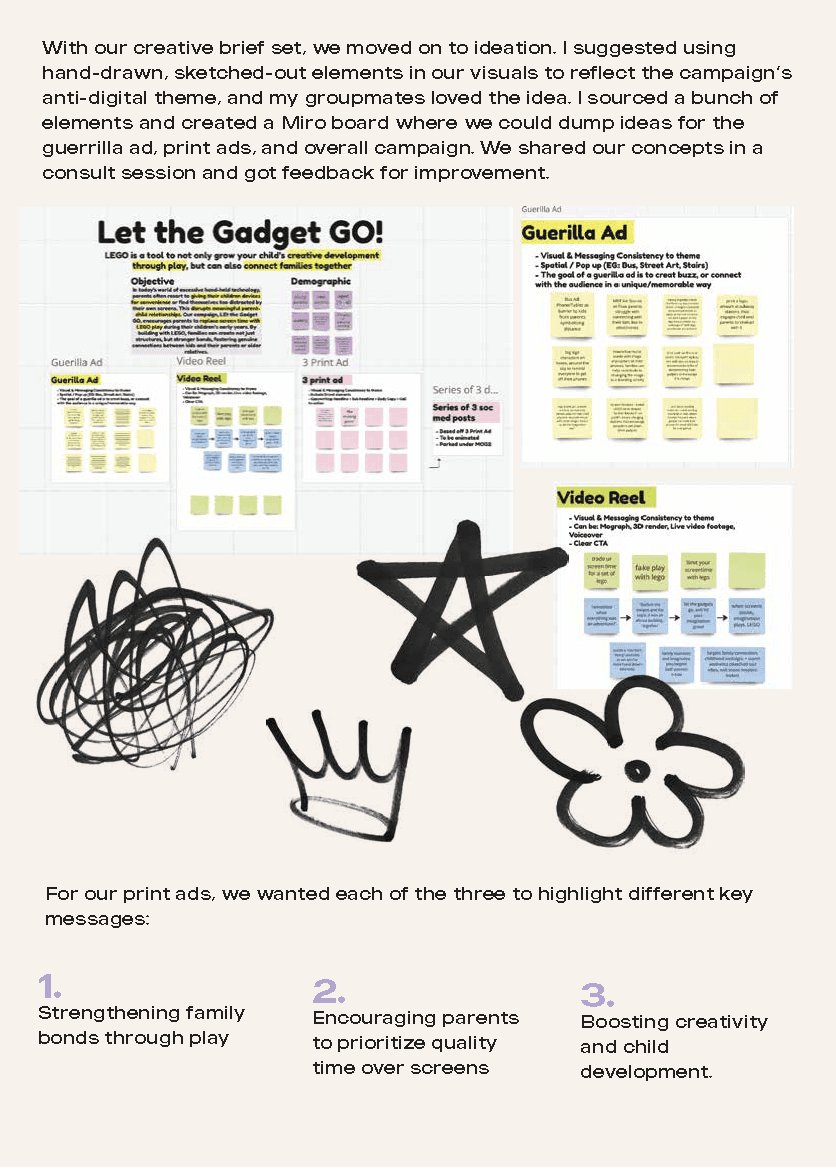
the idea
what i set out to create.
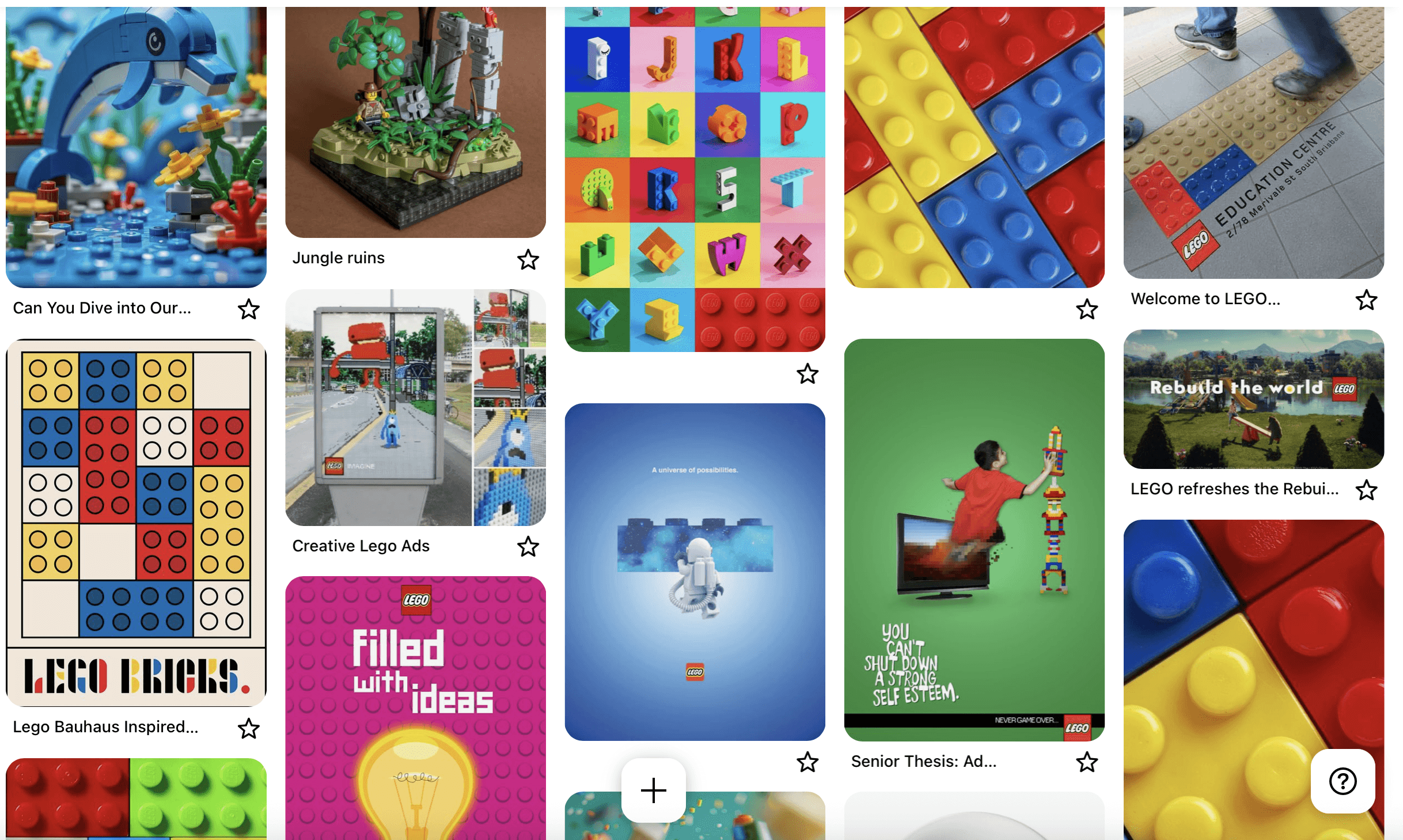
have a look at some fan edits that i made at 13 - 14!
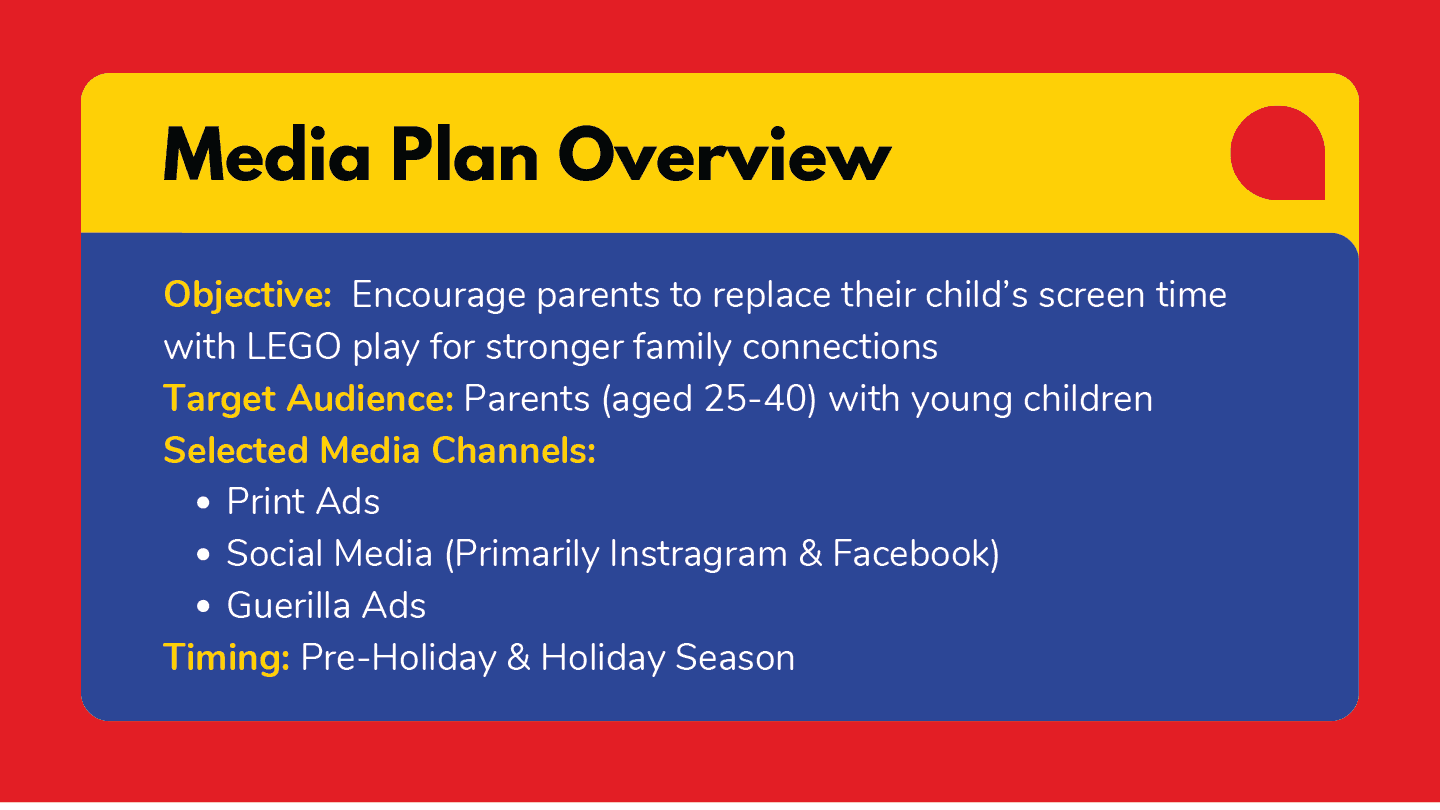
This was a group project focused on developing a fully integrated advertising campaign for a real-world brand. I naturally stepped into the leadership and art direction role, guiding both creative direction and execution.
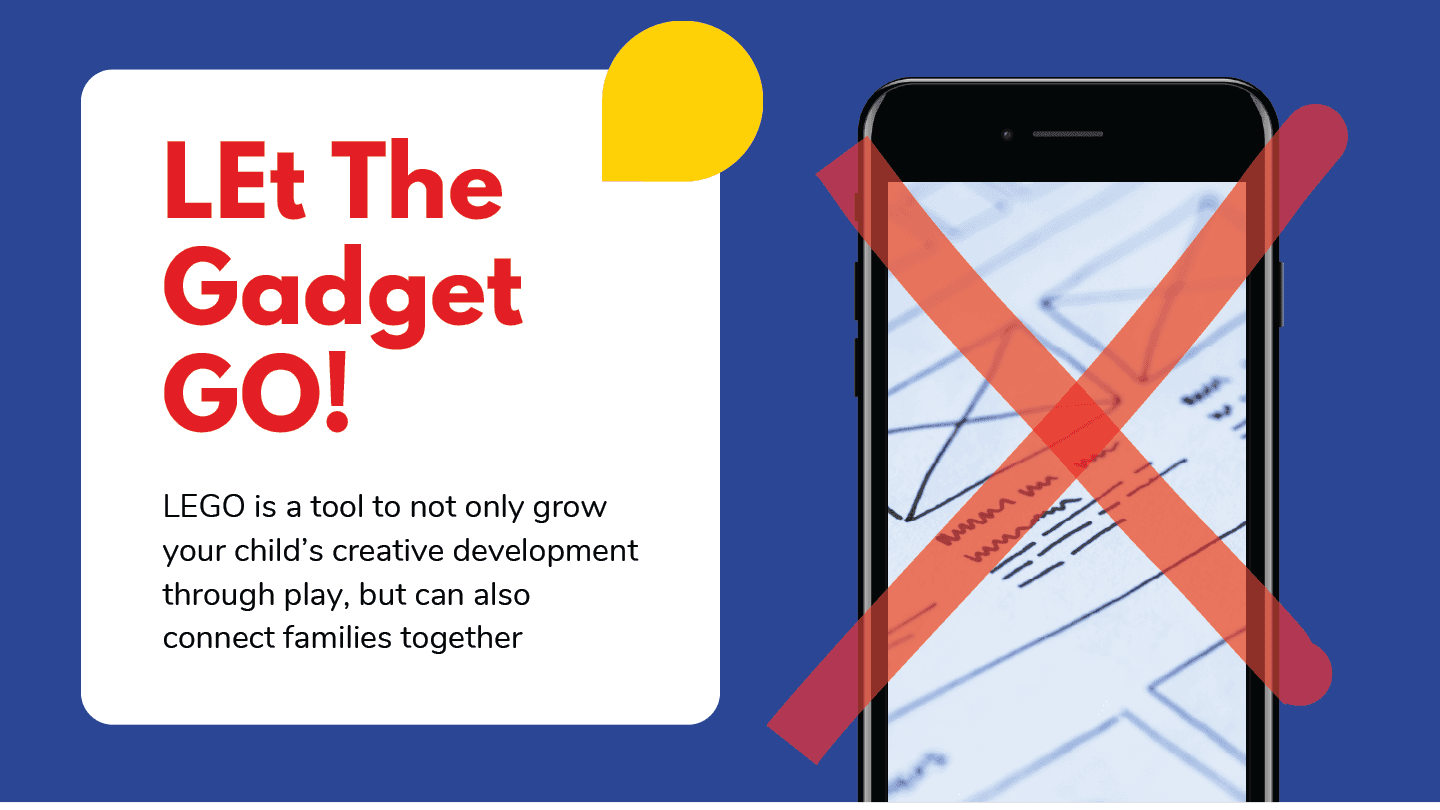
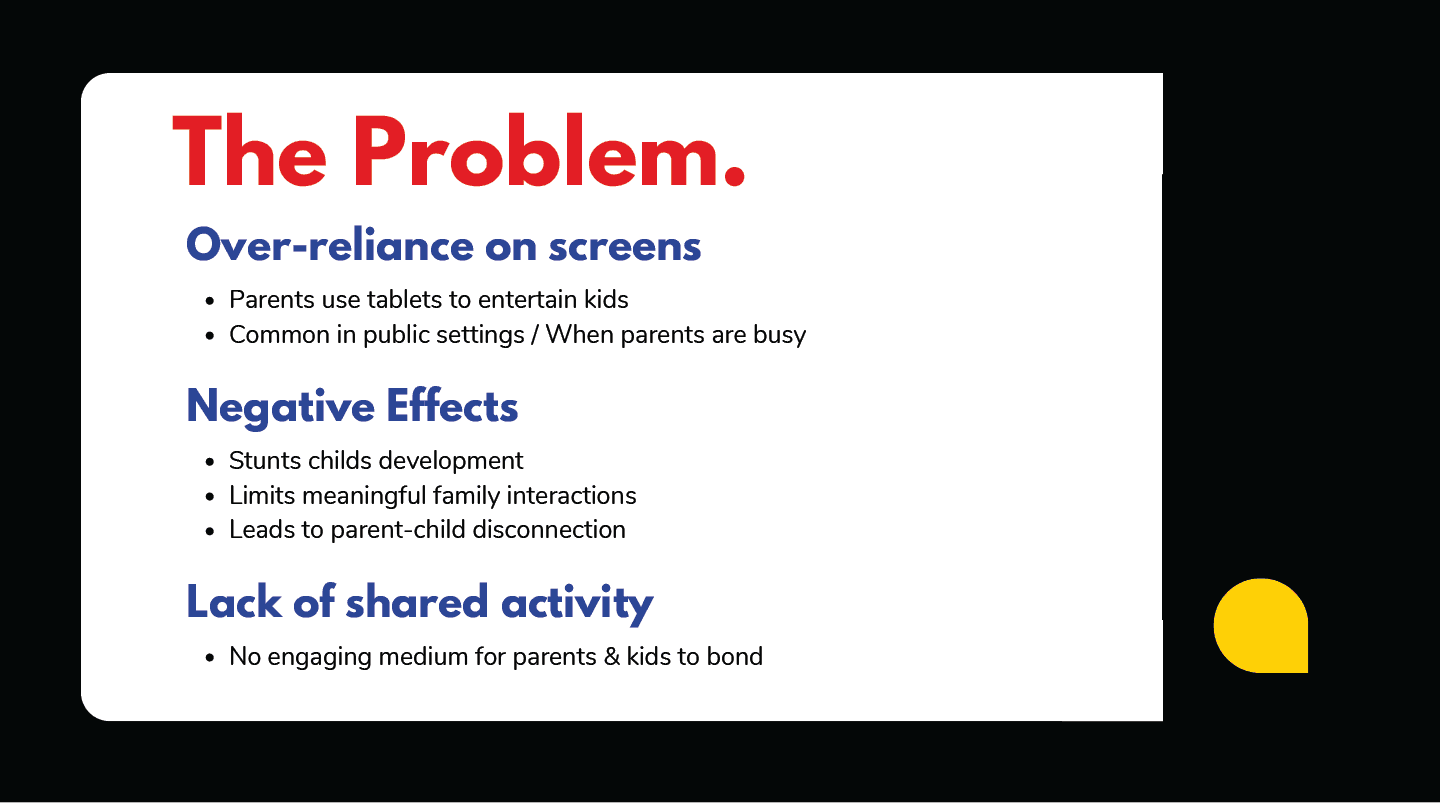
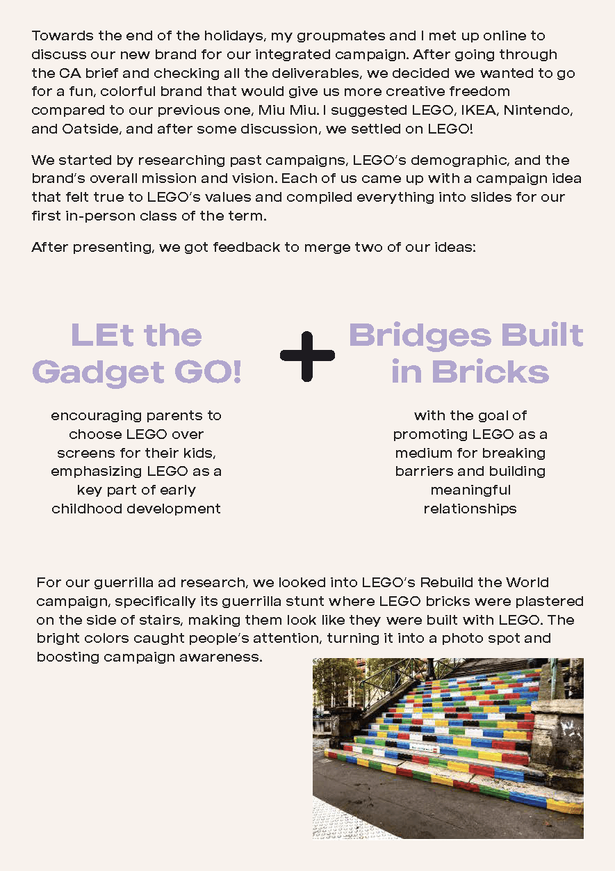
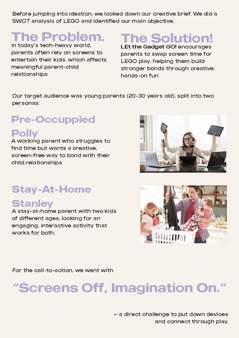
While we initially leaned toward Nike, I proposed pivoting to LEGO, a brand that allowed us to craft a more emotionally resonant and intimate narrative. Unlike Nike’s fast-paced, performance-driven energy, LEGO gave us the opportunity to explore something that felt more meaningful: the quiet disconnect between parents and children in a screen-saturated world.
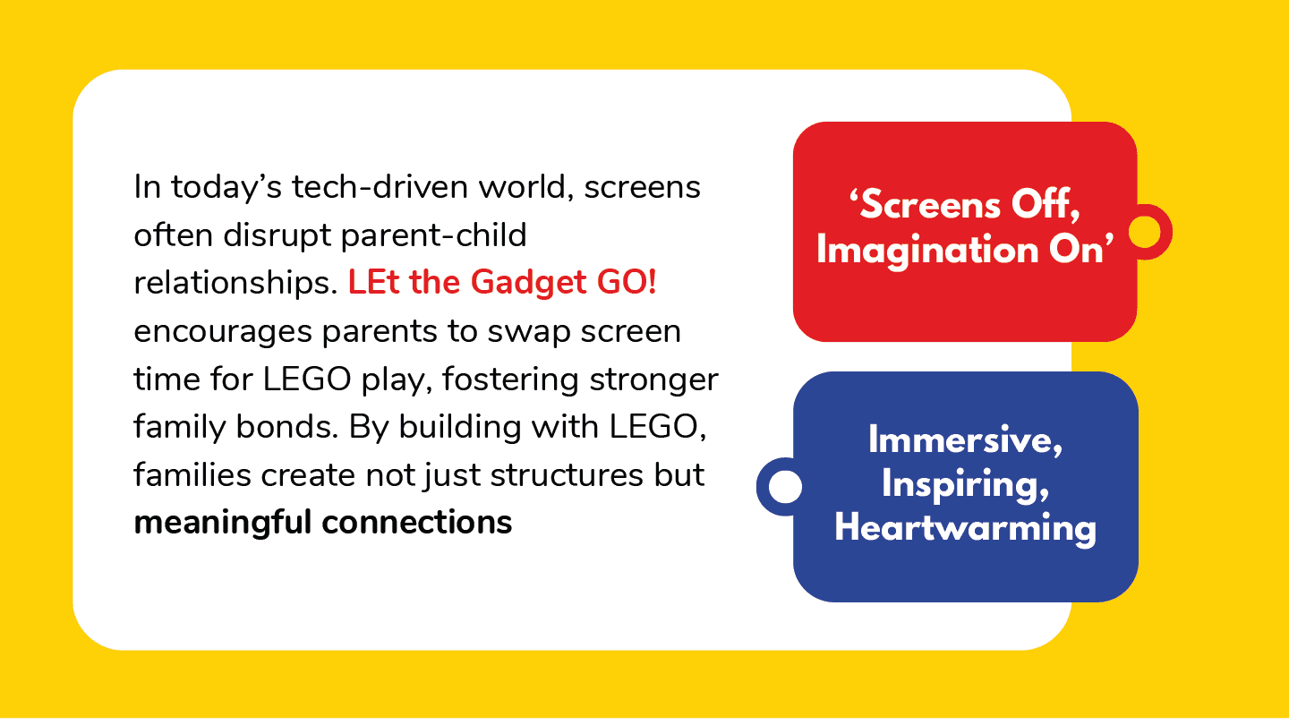
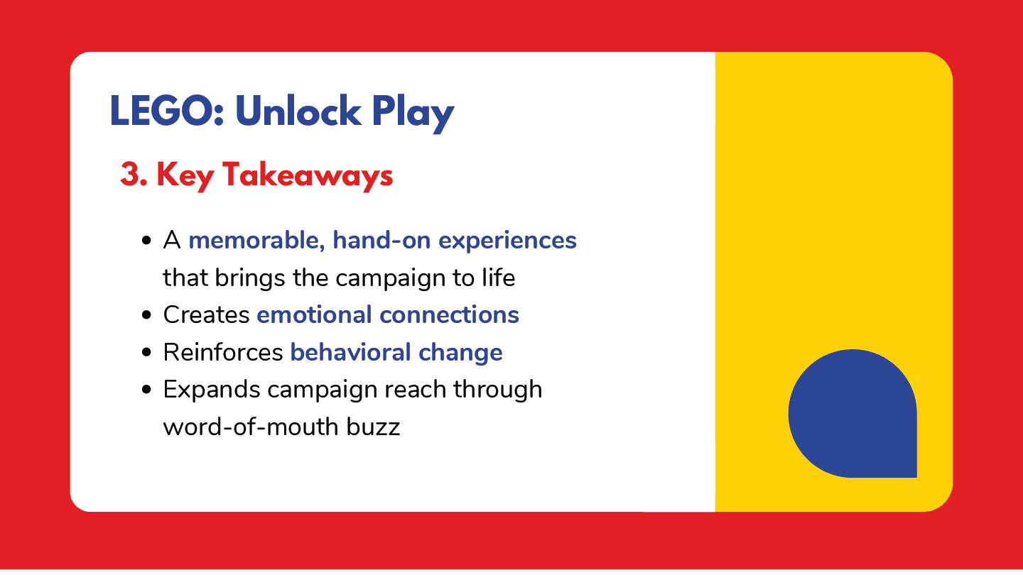
Our final concept, “LEt the Gadget GO!”, reimagined LEGO as more than just a toy. It became a creative, analog solution to digital distraction — a playful tool for families to reconnect, not just entertain. The campaign aimed to prompt parents to set down their devices and pick up something that builds not just toy models, but memories too.
Executed across print, guerrilla, social, and out-of-home touch points, this campaign invited families to pause the noise of the digital world and rediscover the joy of imagination — one brick at a time.
the process
from brainstorms to building blocks.
me when i first joined SP! young & learning.
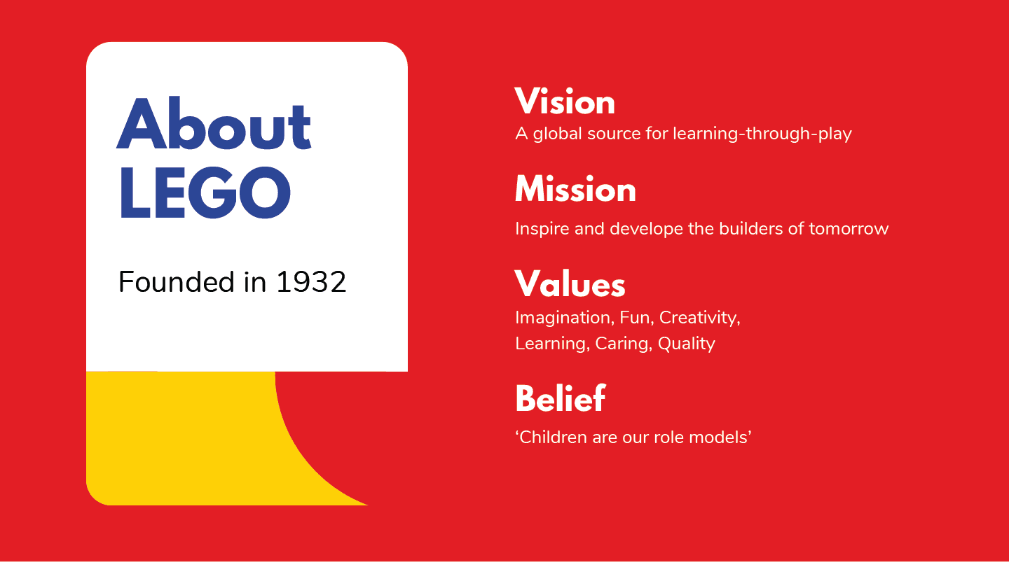
We began with deep research into LEGO’s brand philosophy and past campaigns like Rebuild the World, which emphasized creativity and open-ended play. But instead of focusing on children — LEGO’s usual audience — we shifted the lens toward parents, the ones often handing over the iPads.
Our key insight was simple but powerful:
Modern parents aren’t careless — they’re just exhausted. In their burnout, the first thing to disappear is creativity in how they connect with their kids.
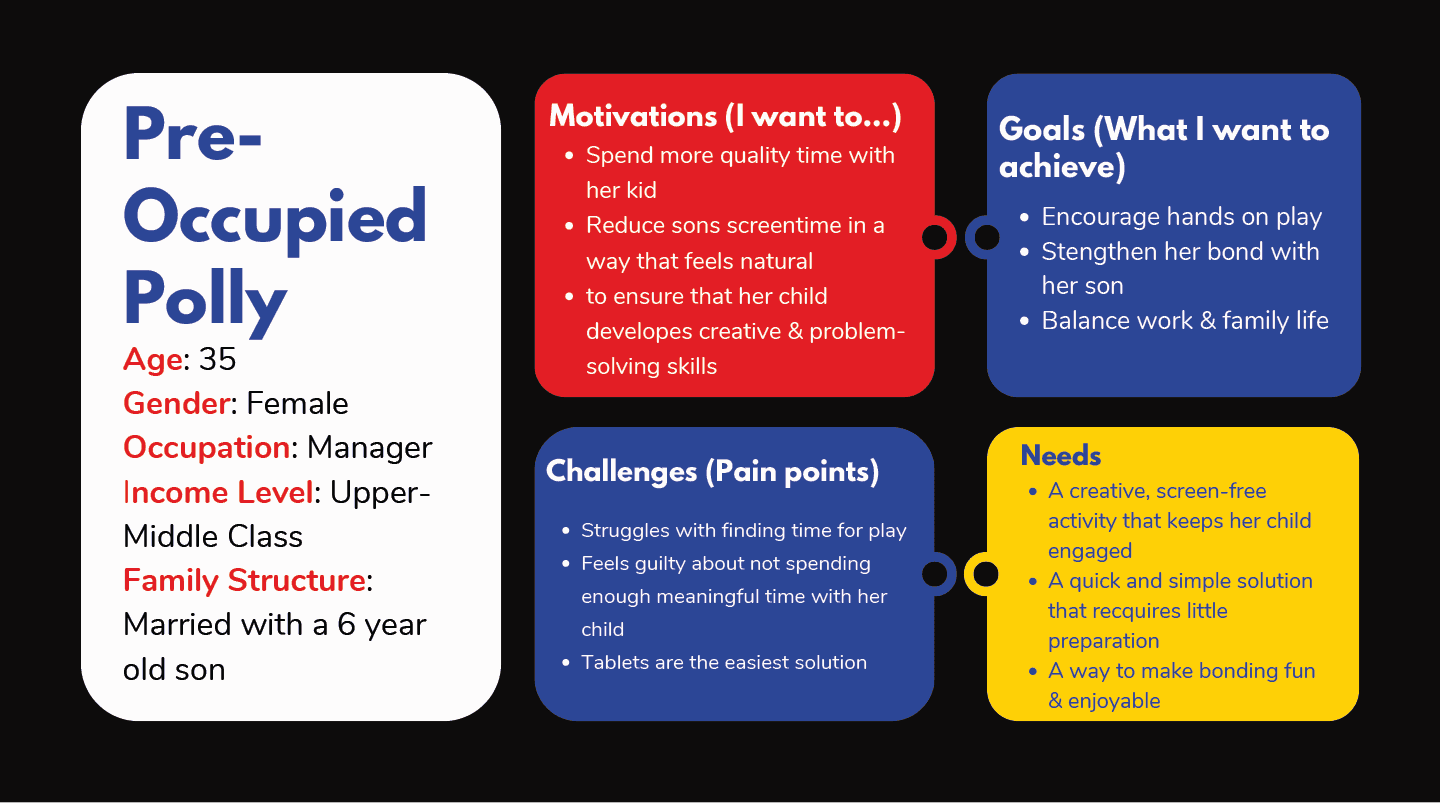
To ground this insight, we built out two detailed personas:
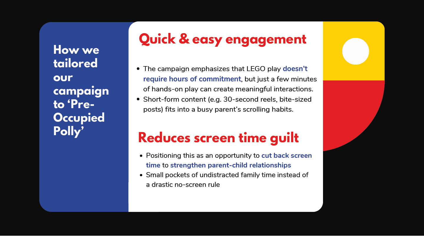
Preoccupied Polly – A working mum constantly on the move, struggling with guilt over using screen time as a crutch
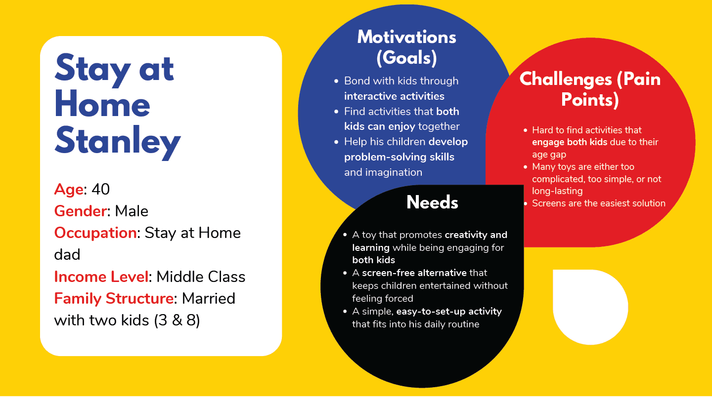
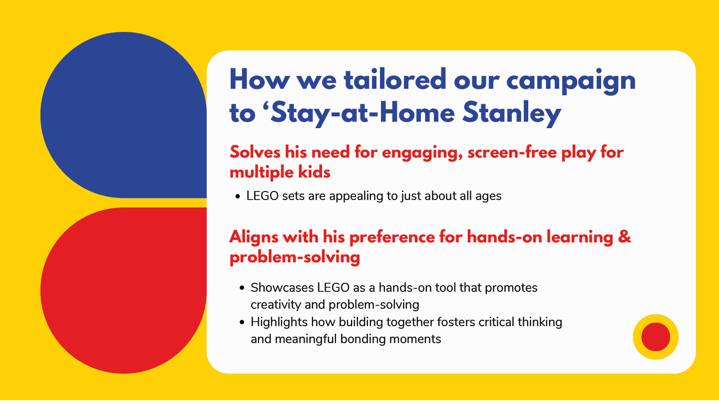
Stay-at-Home Stanley – A hands-on dad with two kids, looking for a shared activity that doesn’t involve a screen
From there, I led the visual direction and moodboarding, aiming to create a campaign world that felt warm, imperfect, and human — everything digital devices are not. We opted for a hand-drawn, sketchy illustration style, evoking the spontaneity of childhood imagination and the tactile joy of real play.
Our campaign structure was built around three pillars:
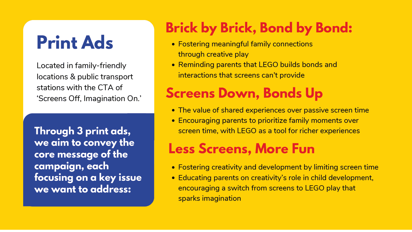
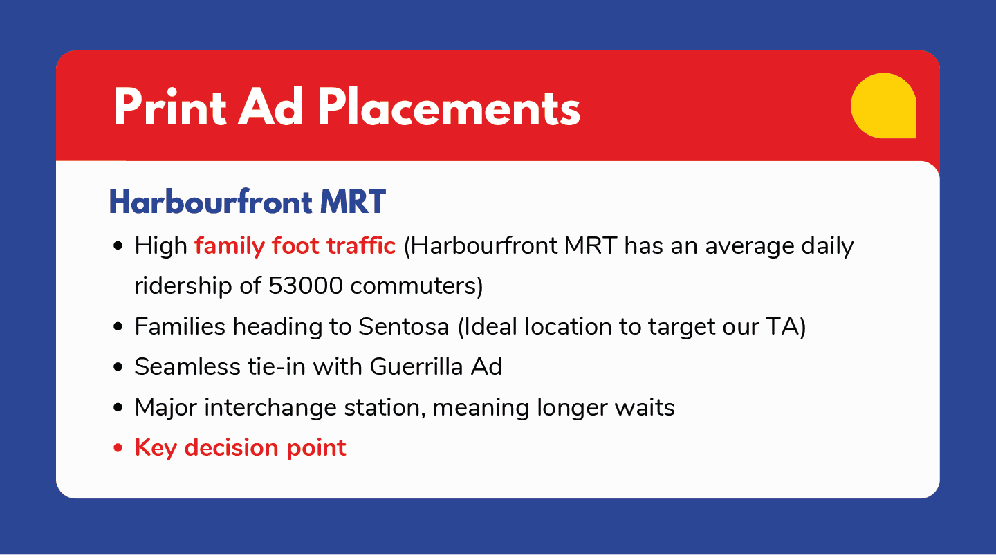
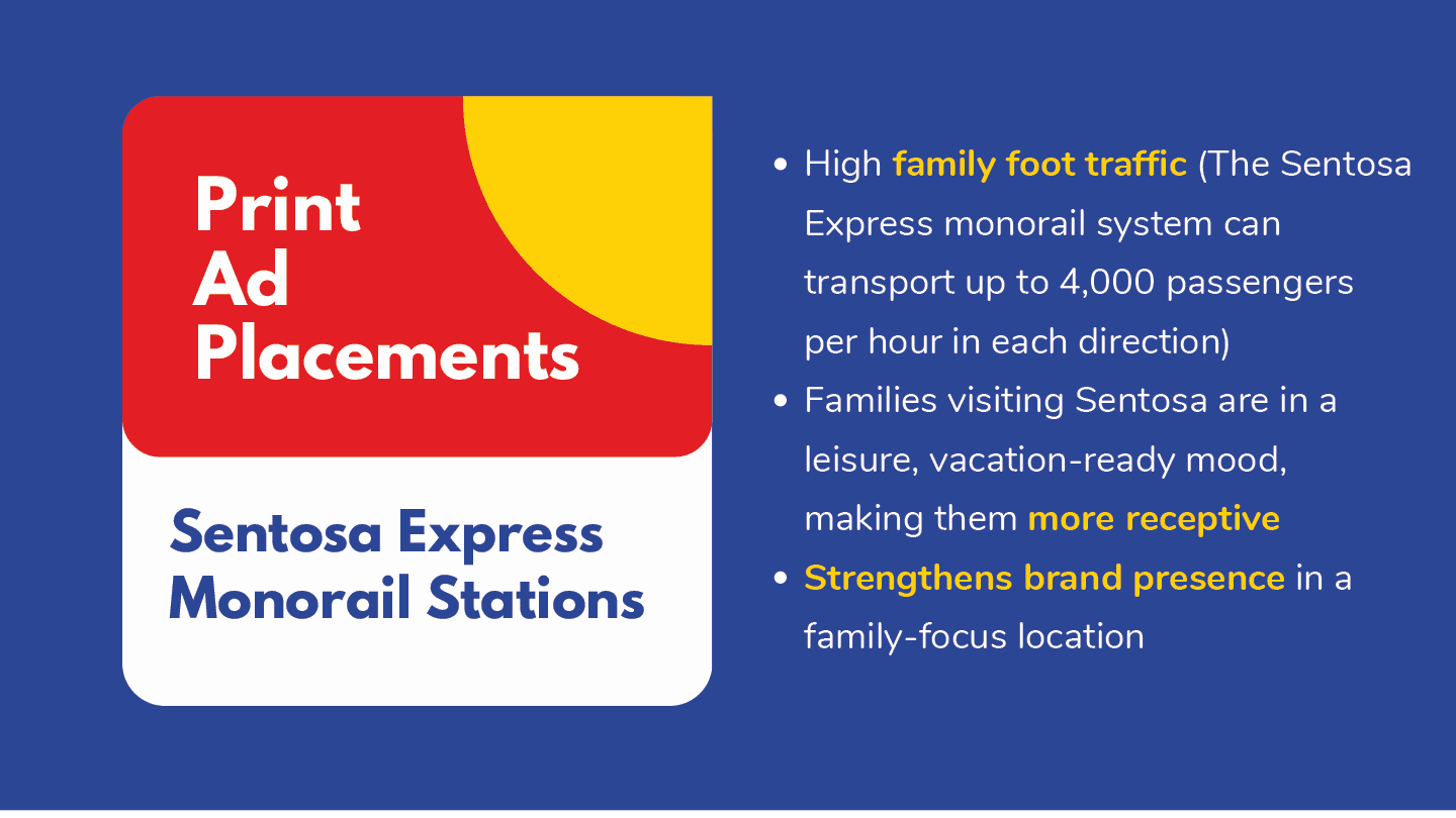
Three print ads targeting emotional and developmental aspects of screen reliance
A guerrilla pop-up installation designed for physical engagement and visibility
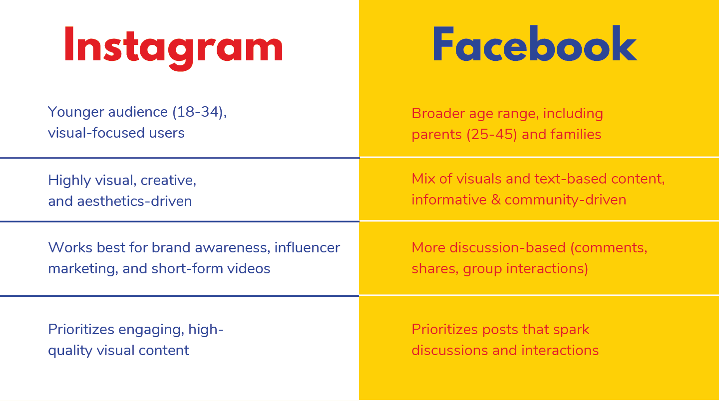
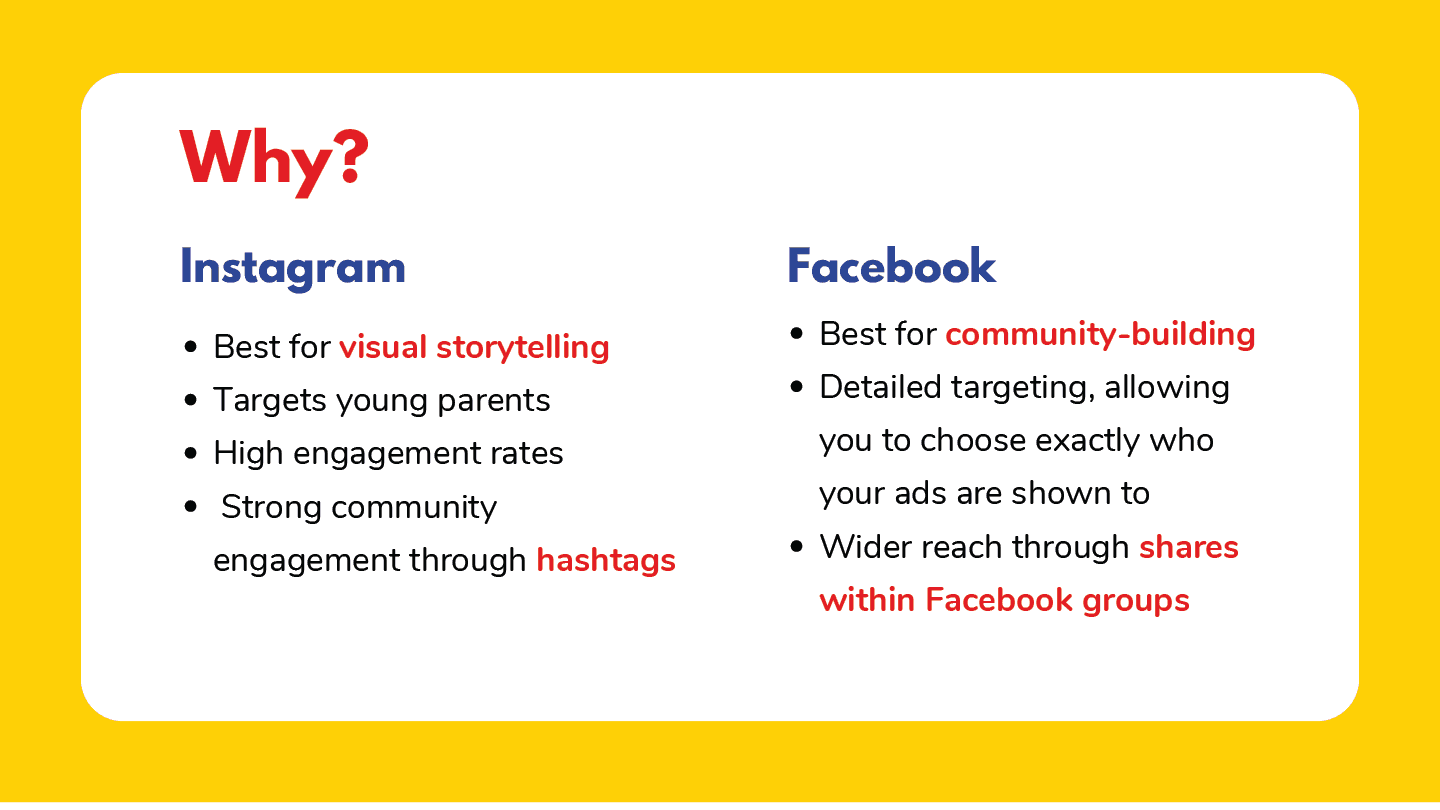
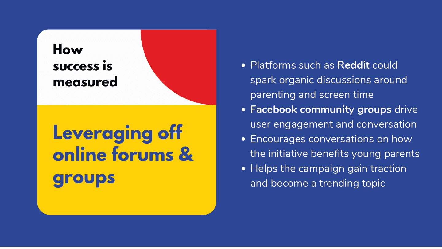
A digital rollout strategy optimized for Instagram and Facebook, our key platforms for reaching millennial parents
The campaign’s visual direction — raw, doodled, and bursting with imagination — served as a direct counterpoint to the overly smooth, screen-based content that dominates today’s media.
the making
bringing it all to life.
me doing what i love!
I executed the majority of the design work, from visuals to layout to overall art direction, ensuring every element felt like it came from the same hand-drawn world of wonder.
Print Ads:
I illustrated and animated three full-page ads, each tackling a unique emotional narrative:
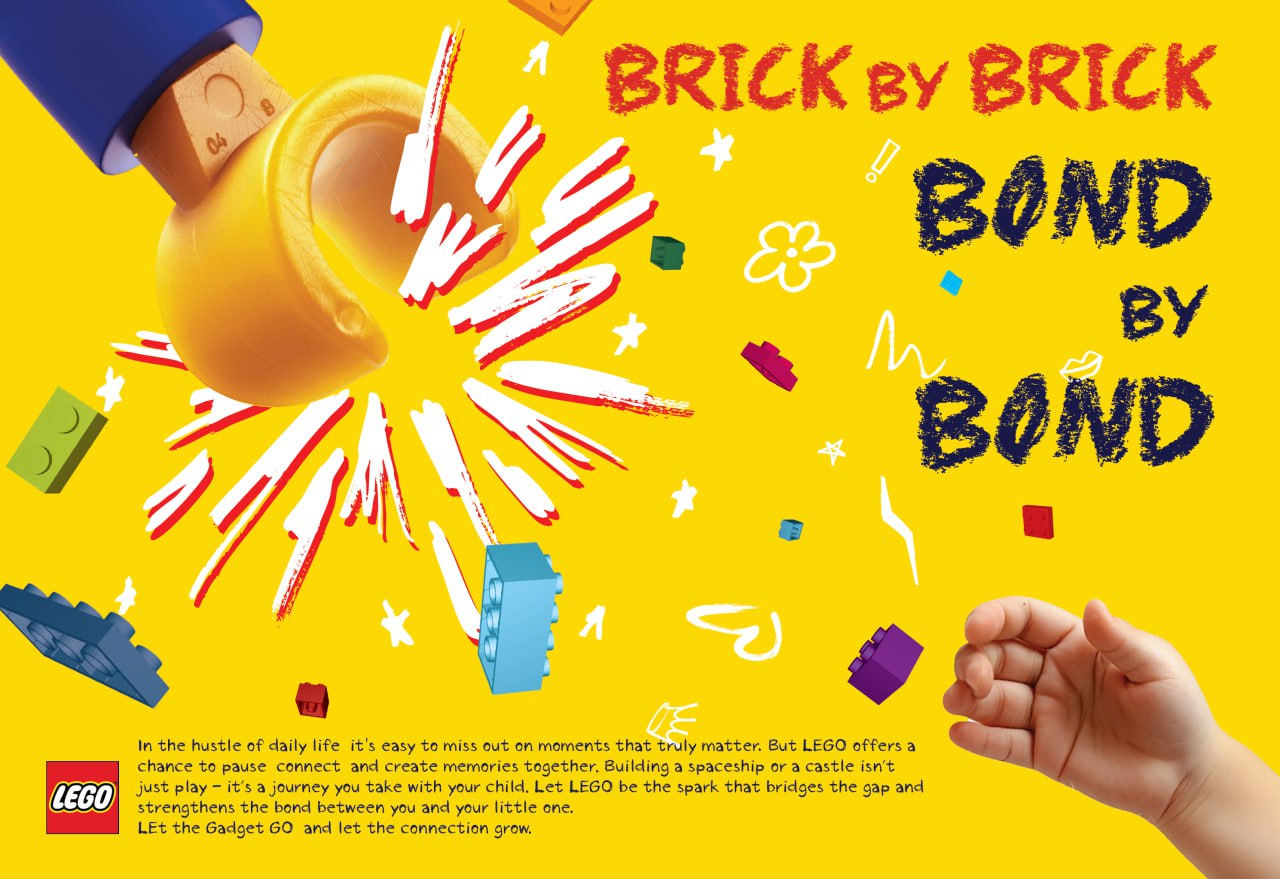
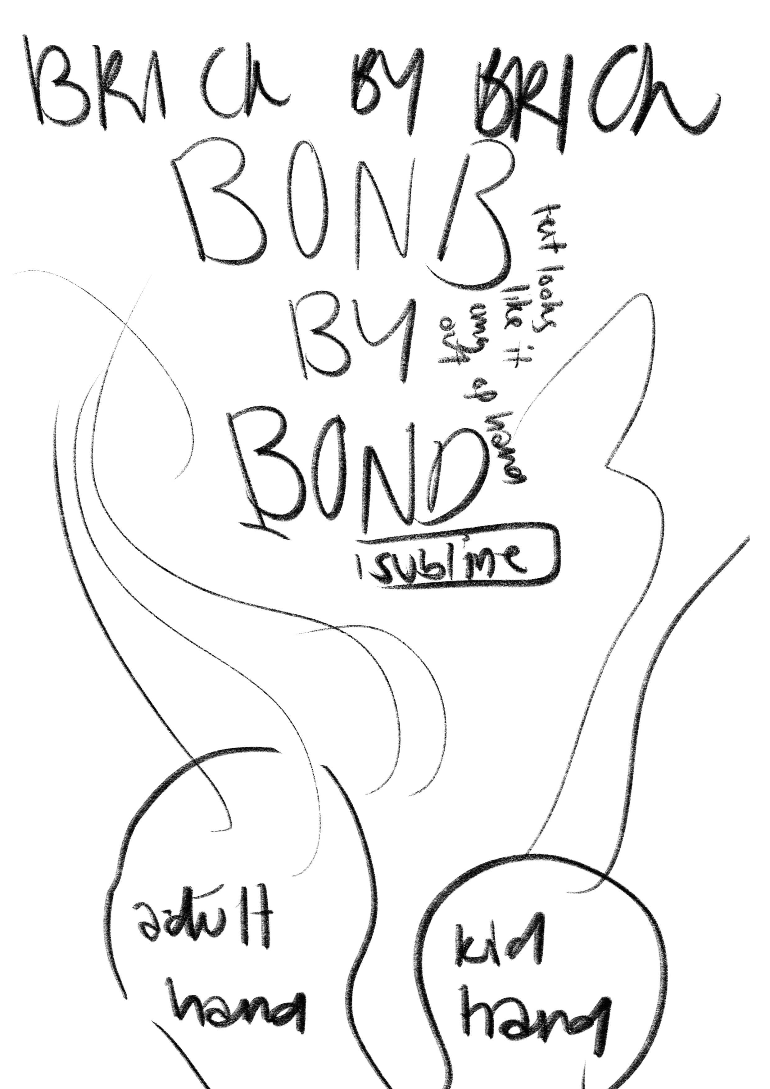
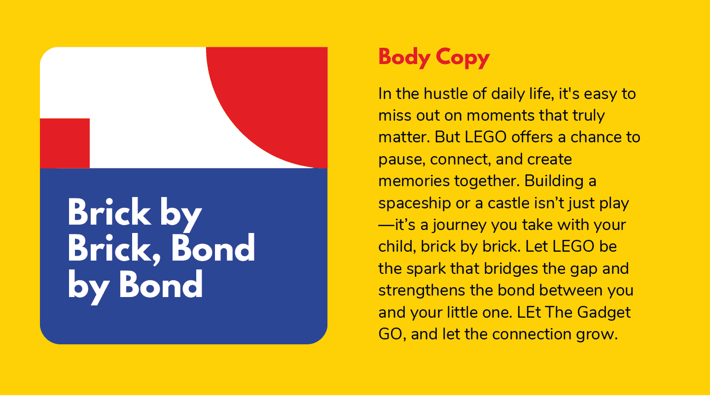
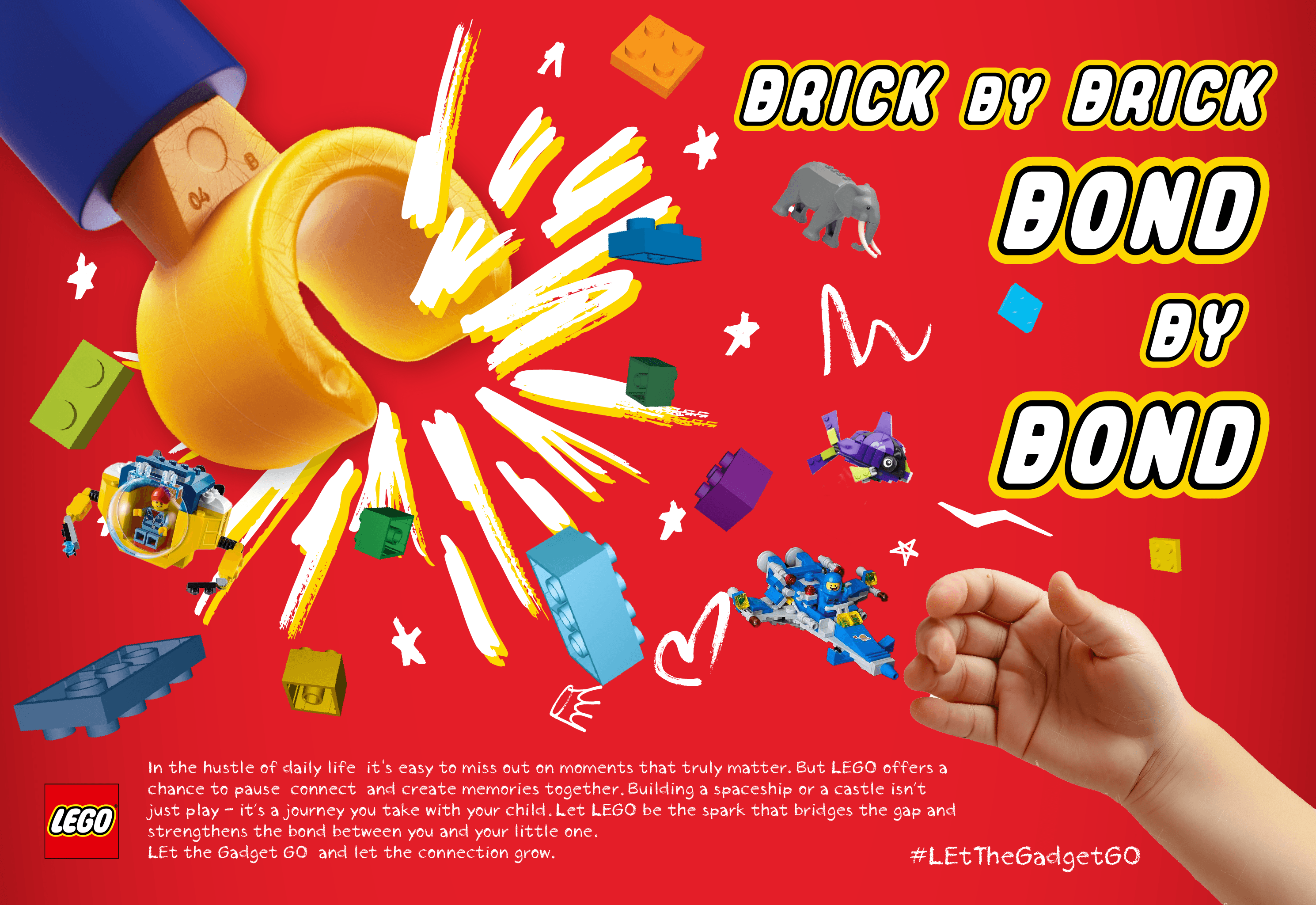
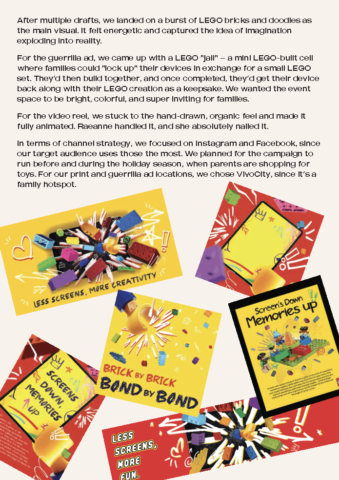
“Brick by Brick, Bond by Bond” – Focused on the joy of shared building and co-creation
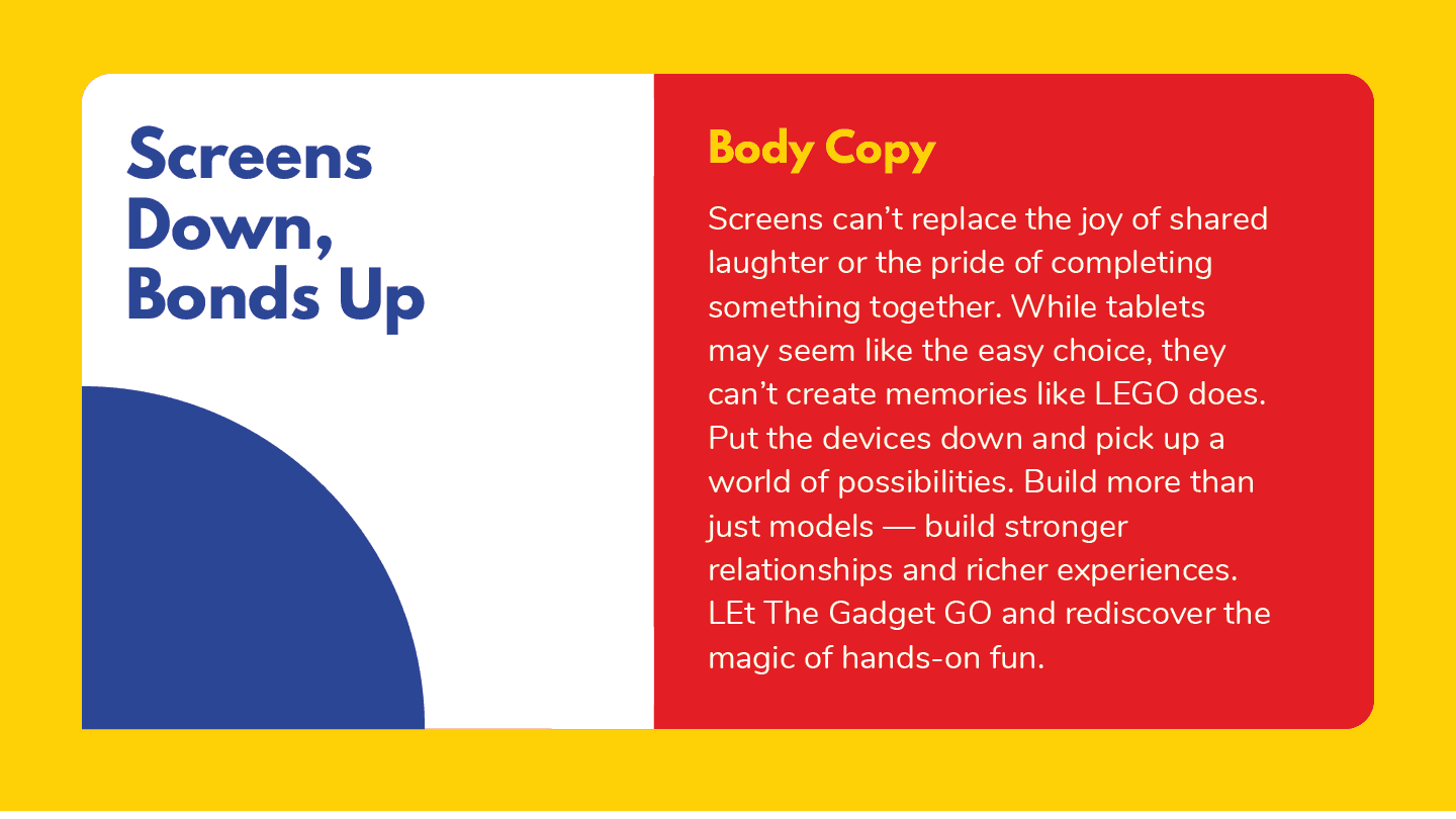
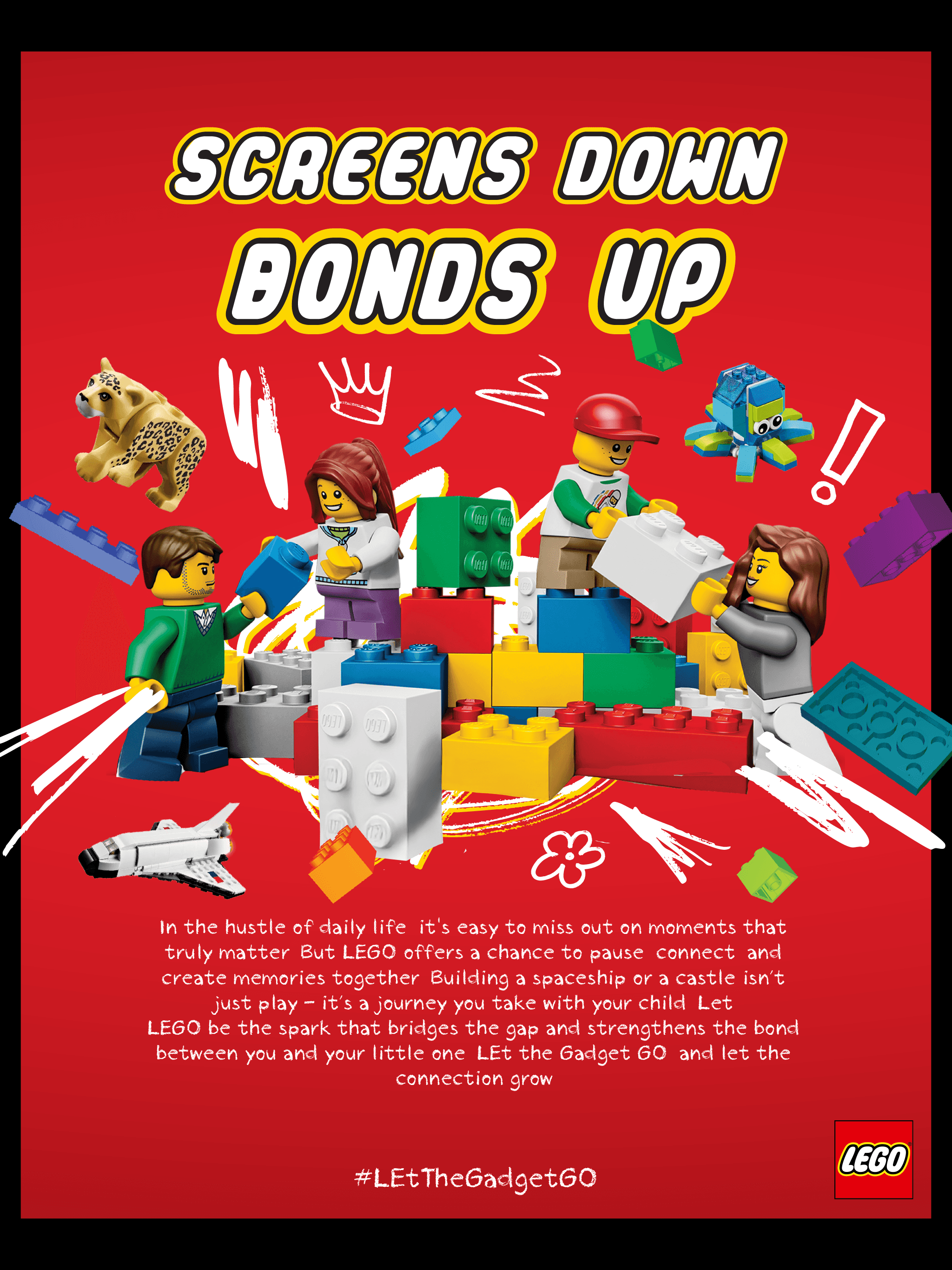
“Screens Down, Bonds Up” – Challenged passive screen time and highlighted meaningful moments
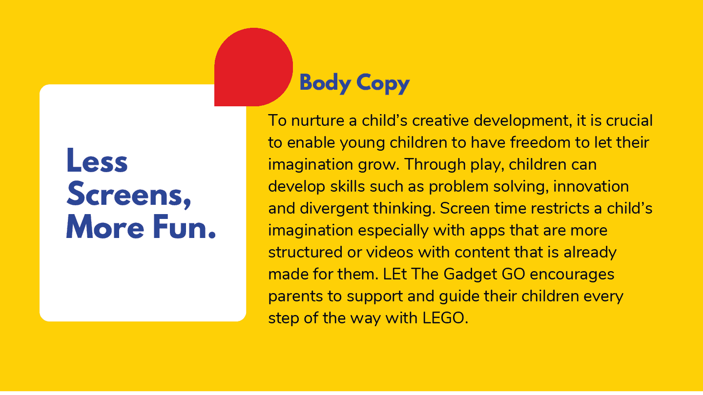
“Less Screens, More Fun” – Advocated for creative development and imaginative growth
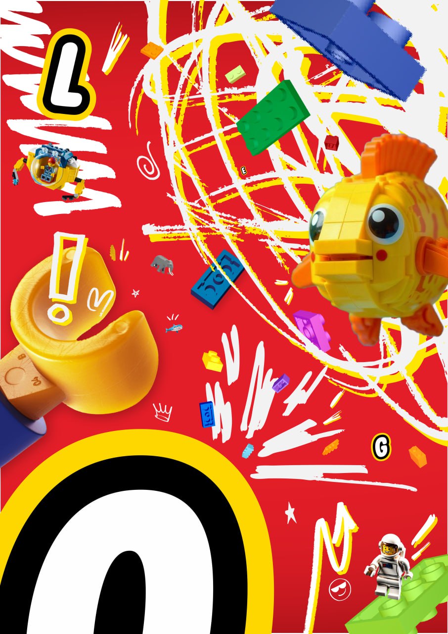
Each visual featured sketchy LEGO brick bursts, hand-drawn doodles, and childlike linework. This style evoked warmth, authenticity, and real-life messiness — something slick digital ads often lack.
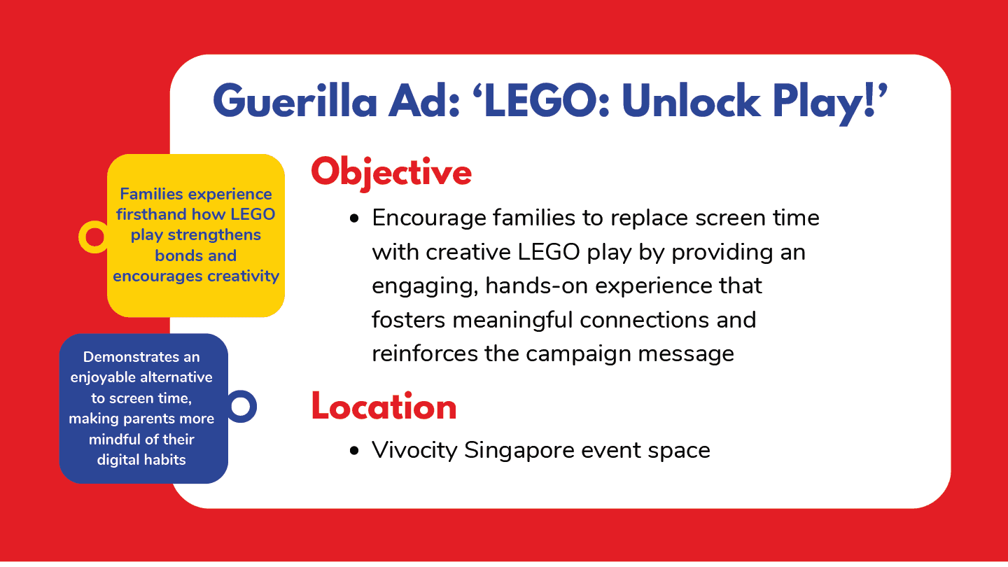
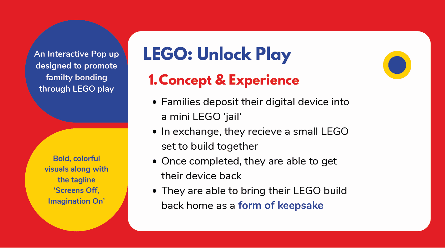
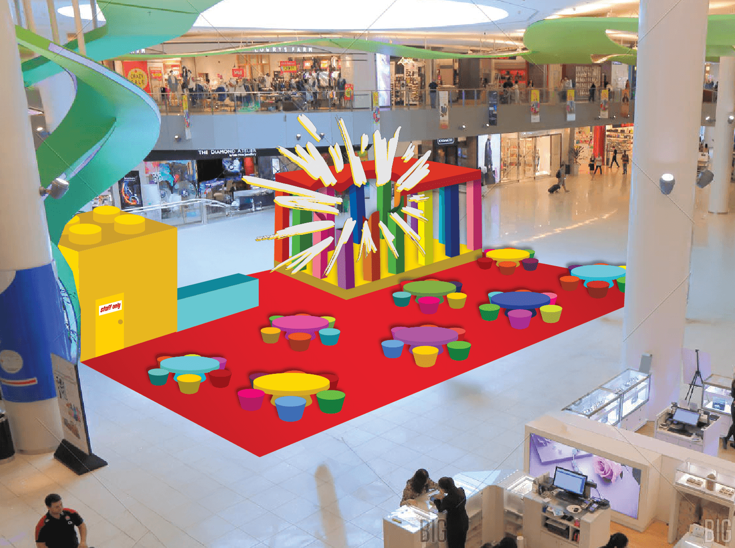
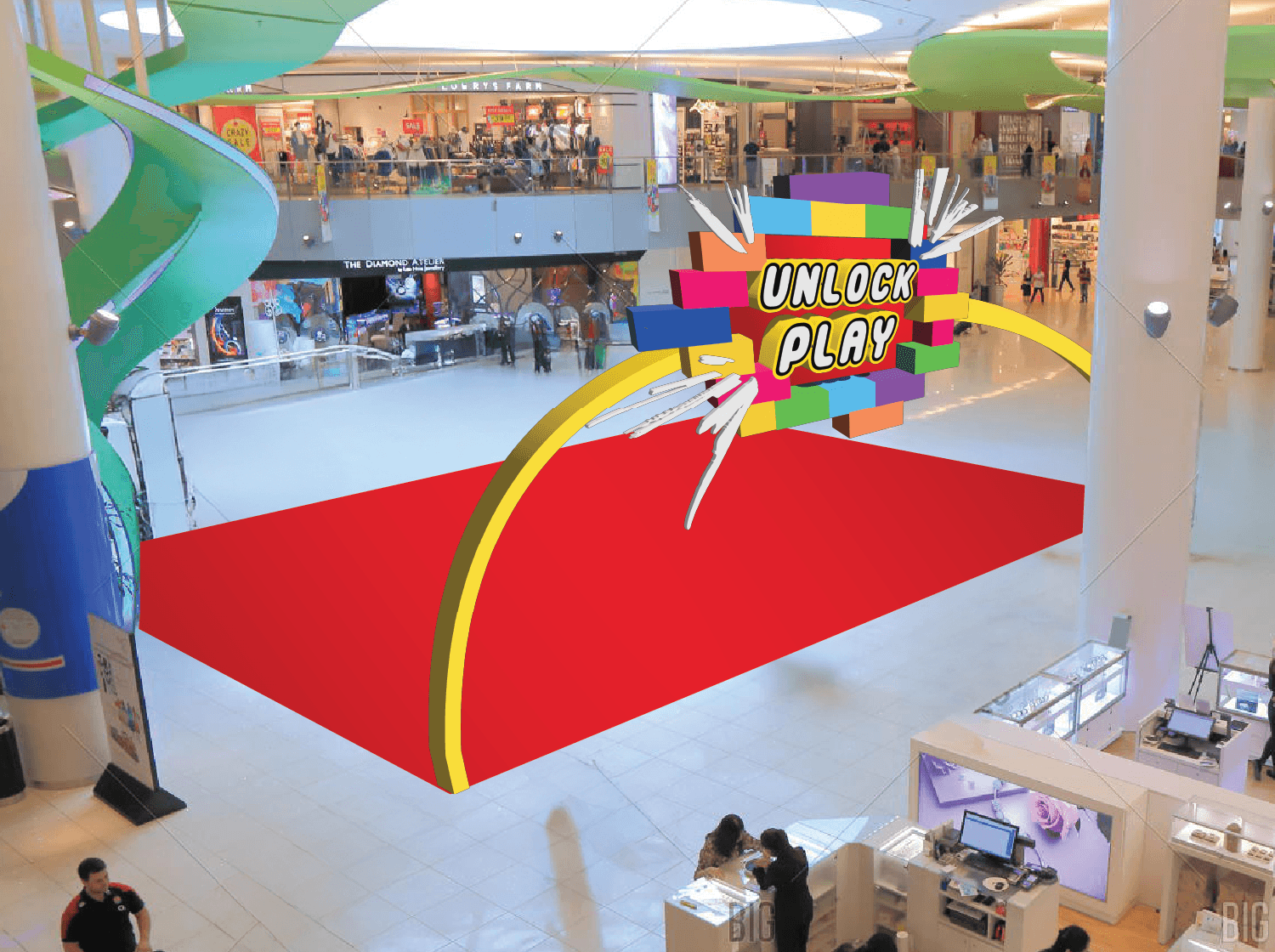
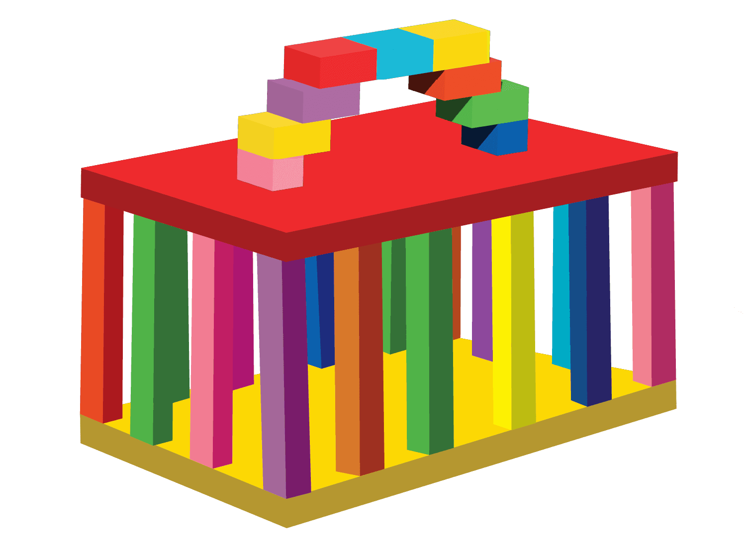
Guerrilla Activation – “LEGO Jail”:
We conceptualized an interactive pop-up installation at VivoCity, one of Singapore’s busiest family malls:
Parents would “lock up” their phones in a physical LEGO-built cell
They’d receive a mini LEGO set and build it together with their child
Once done, they’d “unlock” both the model and their device — walking away with both a keepsake and a moment of connection
It isn’t just a quirky idea — it became a sweet moment of togetherness, turning a simple build into something a little more meaningful.
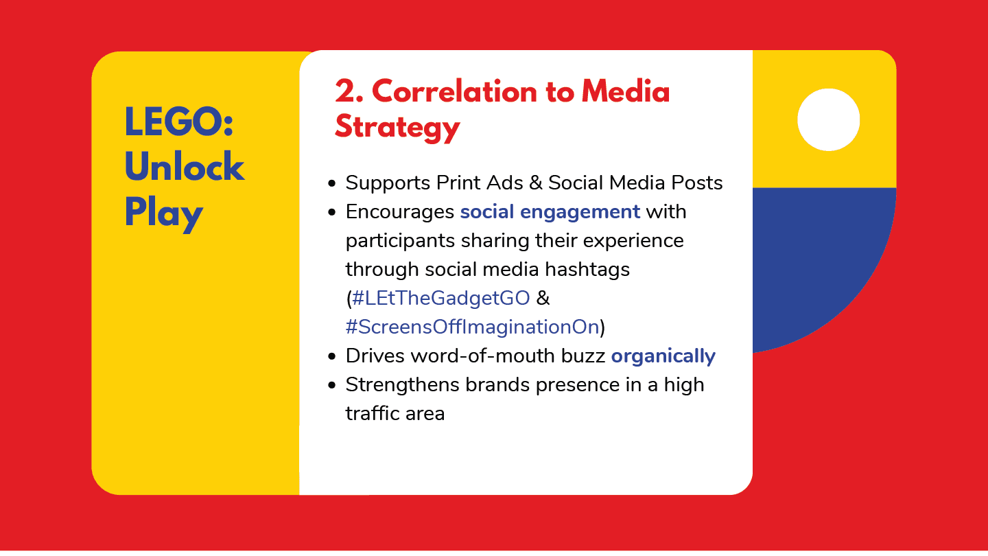
Social Media Rollout:
To extend the campaign online, we proposed:
An Instagram Reel (made by my group mate), featuring a story presented in a stop-motion like animation
Animated posts, each coming with its own caption, thoughtfully written to match the vibe of the platform it appeared on
Tone of voice that was soft and affirming
Every element from visuals to captions reinstated the campaign’s goal: a gentle but powerful reminder that LEGO offers more than entertainment — it offers a reason to pause, sit down, and build something together as a family.
the outcome
what i managed to deliver.

me doing what i love!
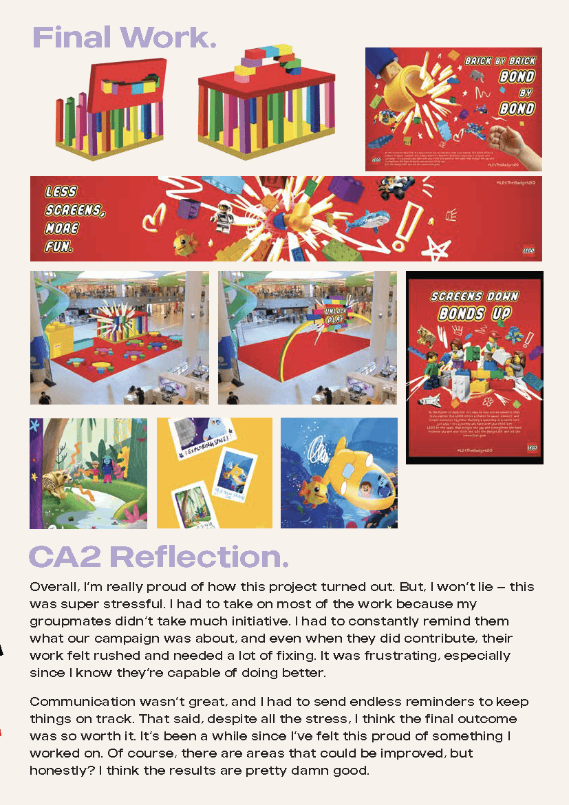
Our final campaign package delivered a fully realised, insight-driven system that spanned print, physical activation, digital platforms, and pitch-ready strategy decks — all unified by a clear emotional message and handcrafted visual identity.
Here’s what we produced:
Three fully illustrated print ads, each tied to a unique messaging pillar:
“Brick by Brick, Bond by Bond” – Emotional connection
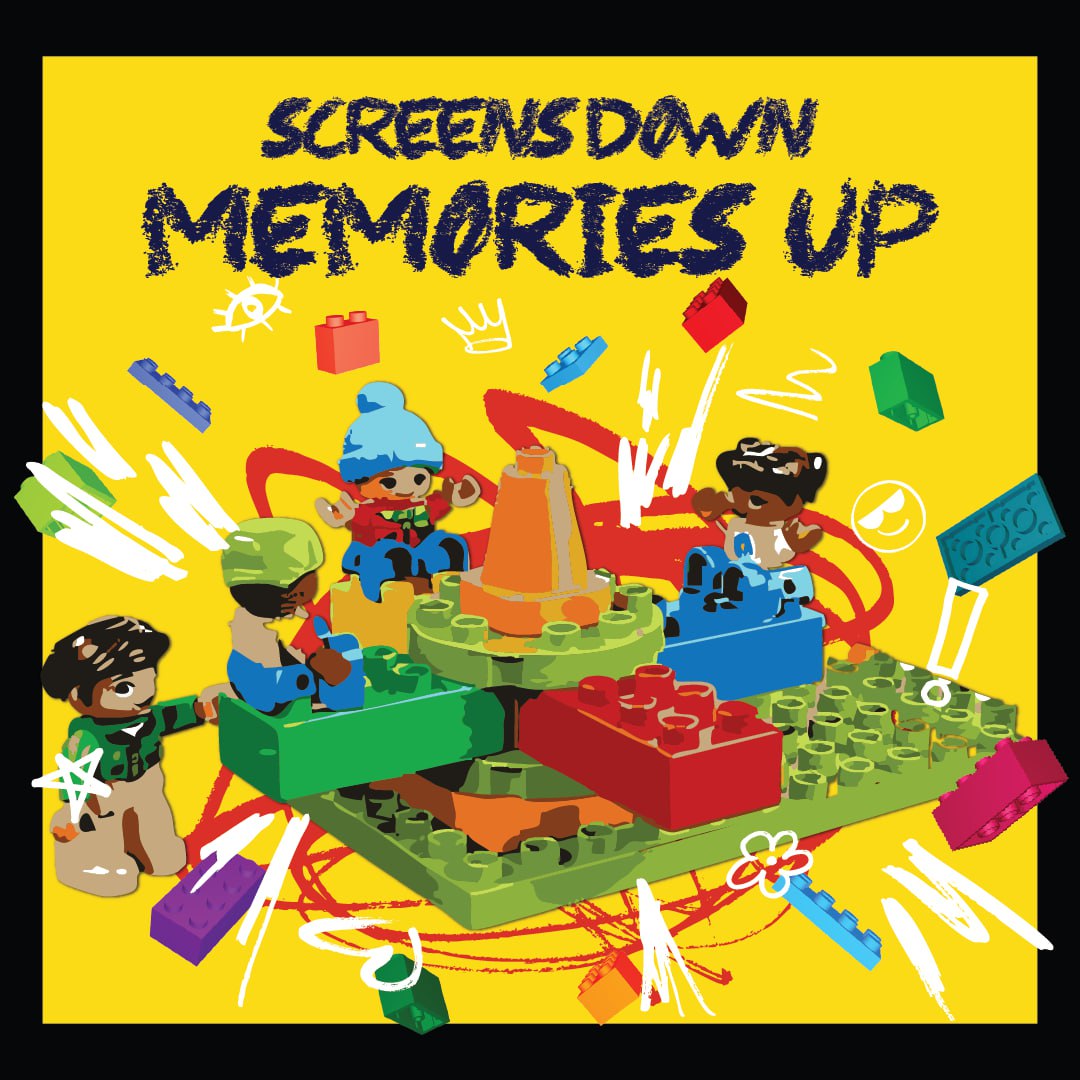
“Screens Down, Memories Up” – Shared experience over convenience
“Less Screens, More Creativity” – Cognitive and creative development
Each ad was built with strong headlines, body copy, and a CTA that supported the campaign’s primary slogan: “Screens Off, Imagination On.”
A guerrilla marketing experience — the "LEGO Jail" — with:
Physical mockups
A call-to-action that invited families to pause, play, and reconnect
Pop-up design tailored for VivoCity, a high-traffic family environment
Social media rollout assets, including:
Fully animated Instagram Reel
Instagram + Facebook posts with playful captions mirroring family moments
Platform-specific tone of voice: warm, gentle, affirming — never preachy
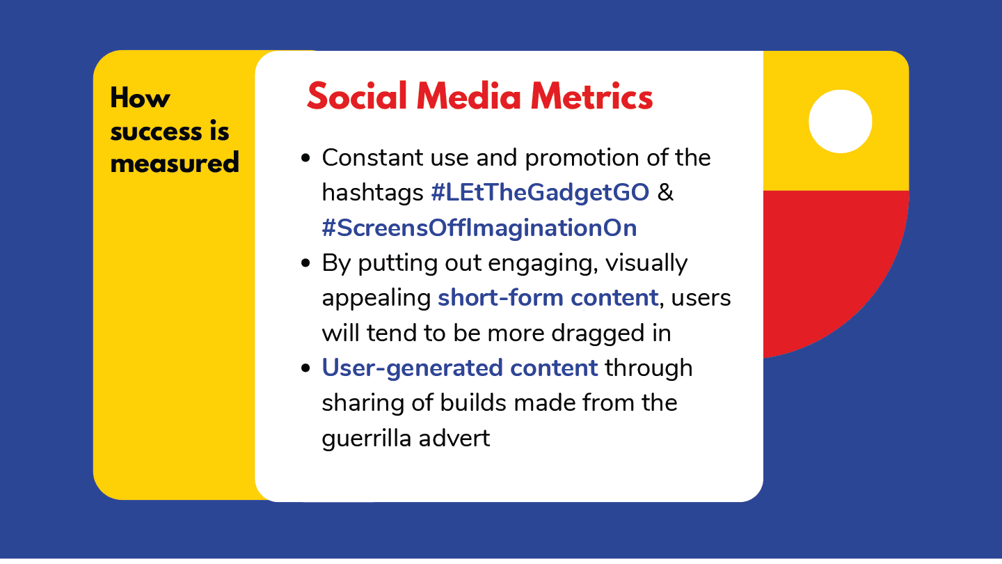
Hashtag strategies such as #LEtTheGadgetGO and #ScreensOffImaginationOn
Digital and print mockups showing campaign adaptation across OOH (bus stops, banners) and in-feed mobile placements
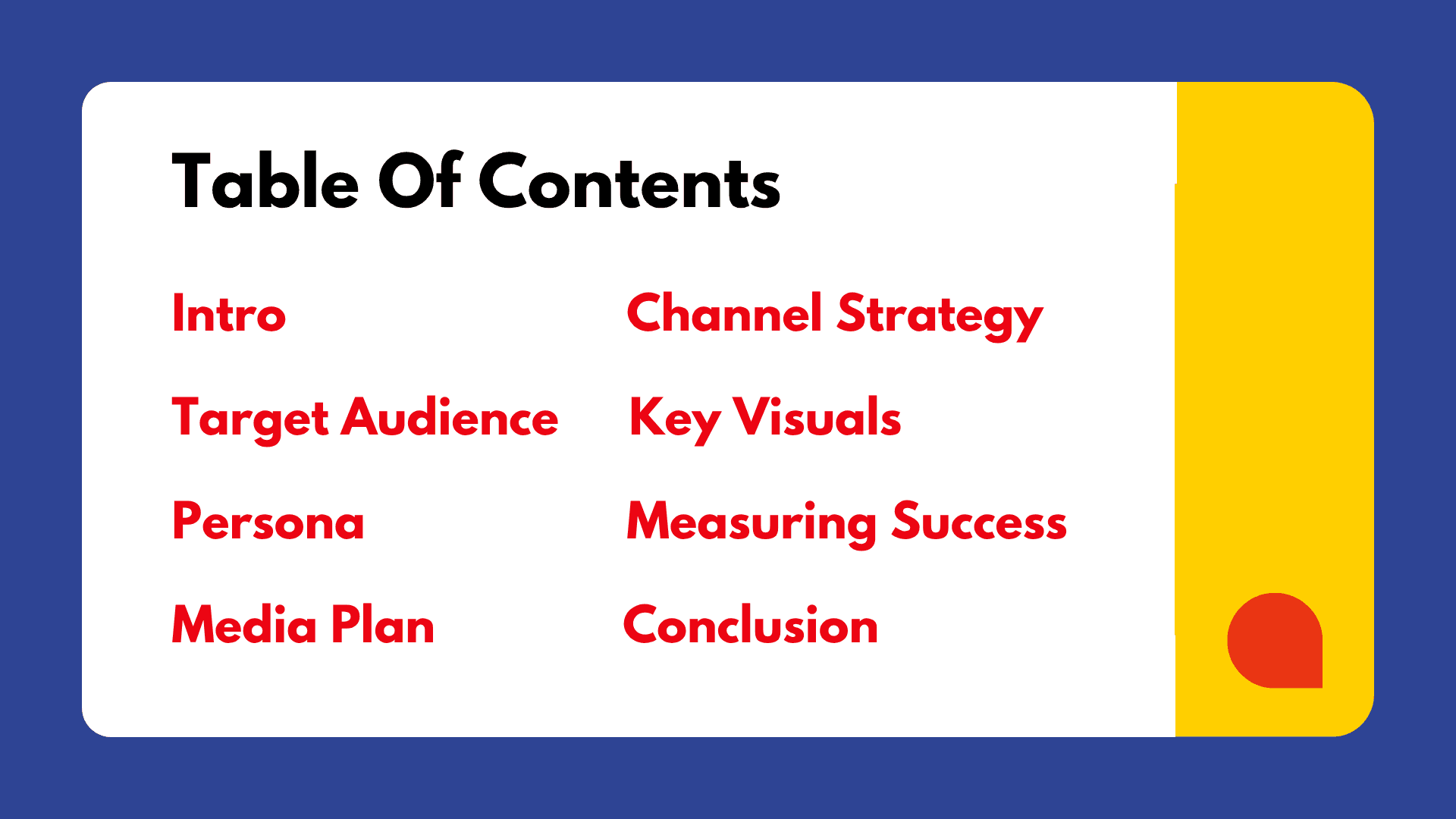
Pitch deck presentation, covering:
Brand and audience insights
Persona profiles (Preoccupied Polly & Stay-at-Home Stanley)
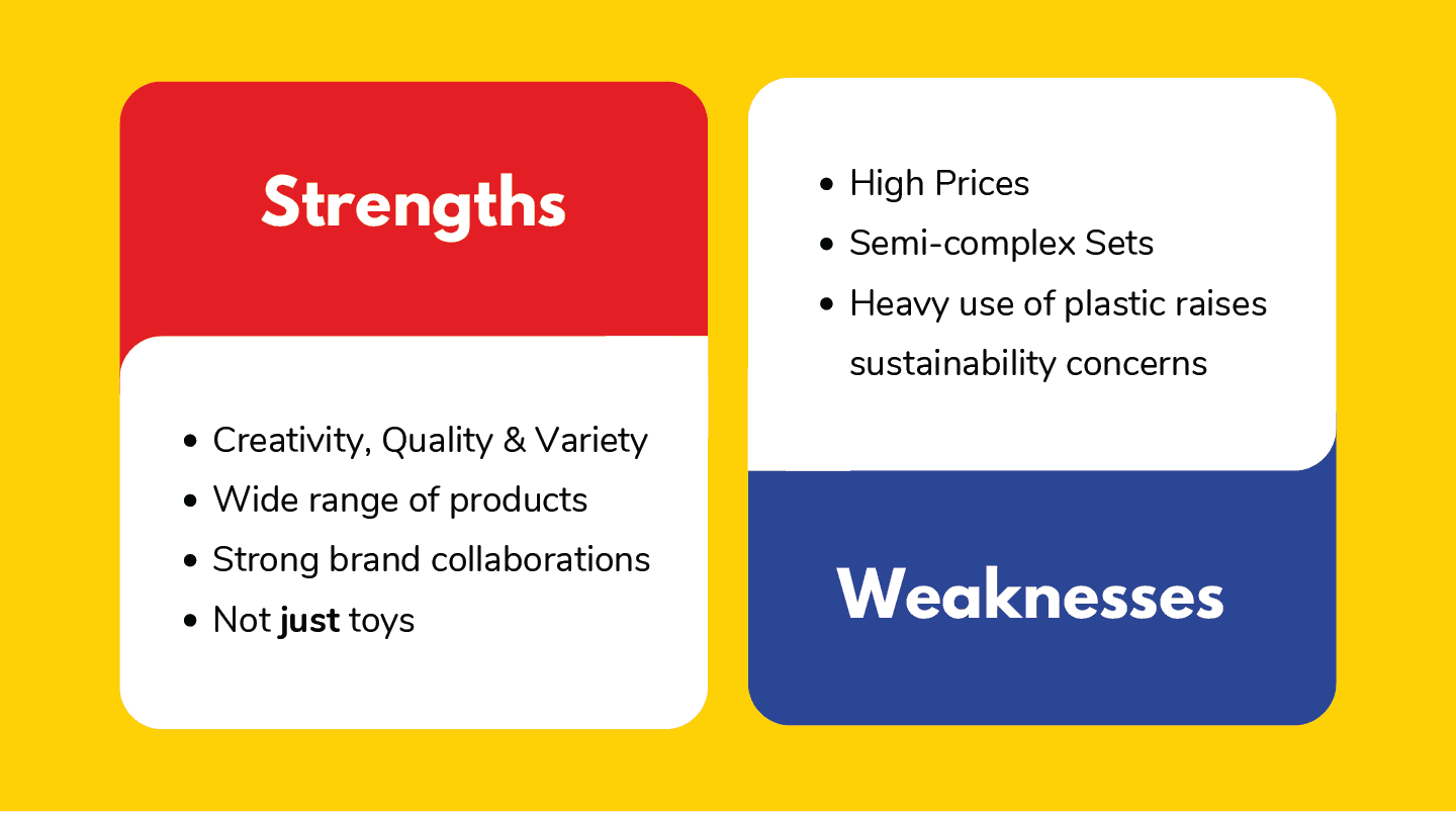
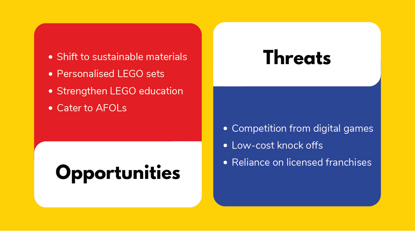
SWOT analysis
Campaign flow with channel strategy breakdown
Moodboards, tone & manner references, and visual justification for our sketch-based style
Supporting documentation, including:
Creative brief
Strategic messaging pyramid
Campaign architecture showing how print, guerrilla, and digital work in sync
“Big Idea” rationale and key message logic
The result? A campaign that not only looked and felt like LEGO, but felt like the stories LEGO aims to help create. Visually distinctive, emotionally relevant, and structurally sound.
We didn’t just design a campaign, instead we built a world where LEGO becomes the spark for reconnection. One that parents don’t just see, but feel.
the troubles
what almost ruined it — and how i pushed through.
take a look at my final slidedeck!
Honestly? Team communication was messy. While this was a group project, I often found myself taking the lead by default — chasing deadlines, clarifying direction, and cleaning up rushed work. We had a lot of back-and-forth on what the campaign should visually feel like, and not all of us were always on the same page.
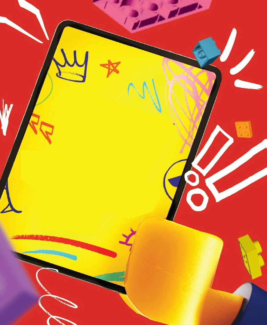
One particular point of tension came during our consults, where feedback from our lecturer pushed us to remove certain elements — like the iPad visual we initially included. It was a tough but necessary call to make the message clearer and less literal. These sessions helped sharpen our thinking, but they also revealed how loosely some parts of the team were holding onto the core concept.
In the end, I kept the standard high, earning us an A, not because it was required, but because I genuinely believed in the strength of the idea. I wanted the campaign to feel thoughtful, emotional, and complete — even if that meant carrying more than my fair share.
the takeaways
what i learned; and what i plan to do differently.
my creative process journal (for a deeper insight into this project!)
This project reminded me that being a leader doesn’t always mean giving orders; sometimes, it just means getting things done when no one else will. I learned how to stick to a concept I believed in, while still listening and adjusting when needed. It taught me how to tie visuals, messaging, and emotion together in a way that actually made sense across different platforms.
If I could do it again, I’d definitely push for clearer timelines and roles from the start, and I’d probably be a bit firmer about boundaries too. But in the end, I’m proud of how it turned out. It made me realise how much I love storytelling — not just to say something, but to actually make people feel something.