kueh ee, tiny treats, big delights — infographic poster
the process.
the idea
what i set out to create.
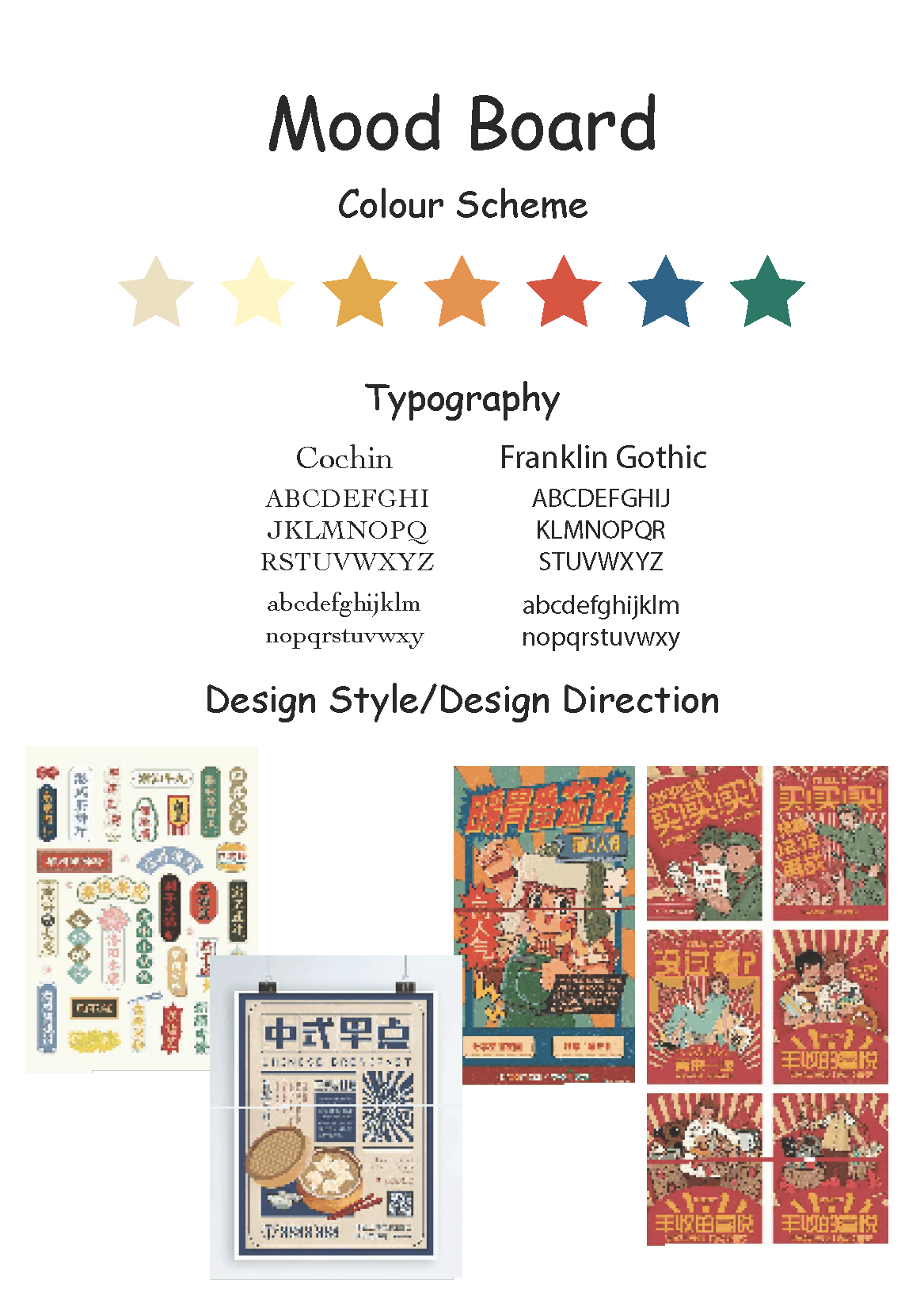
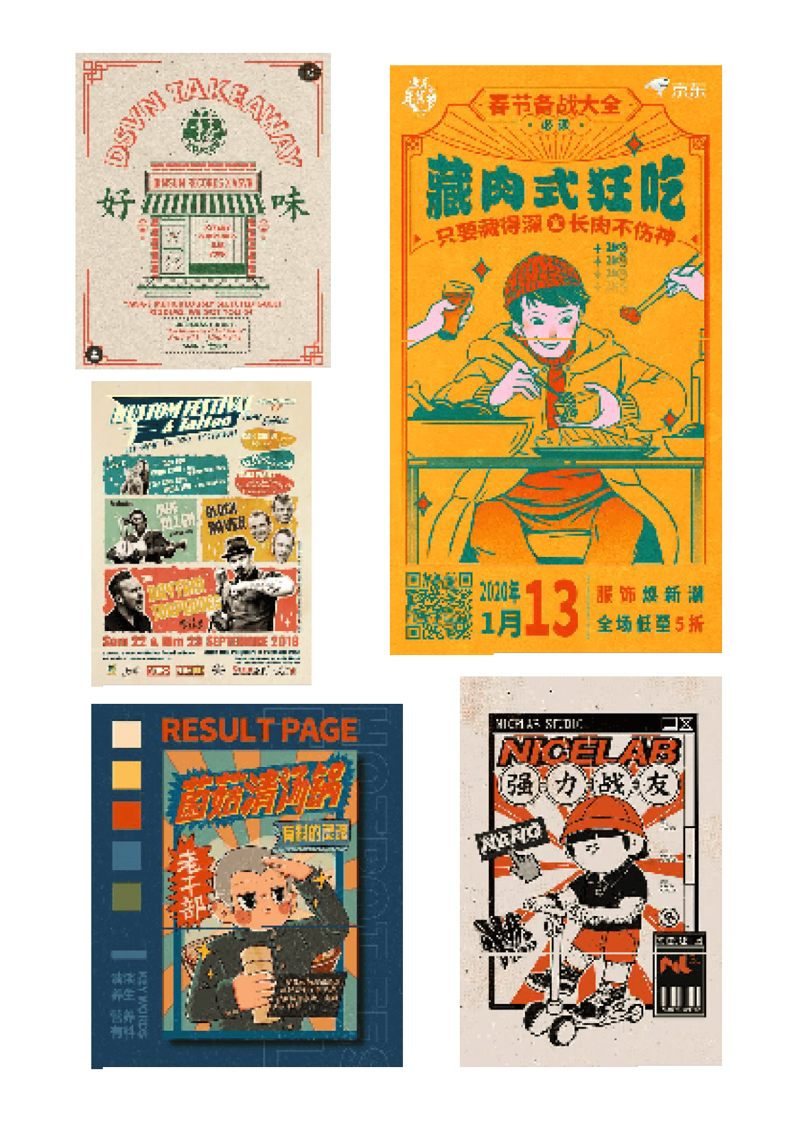
moodboard
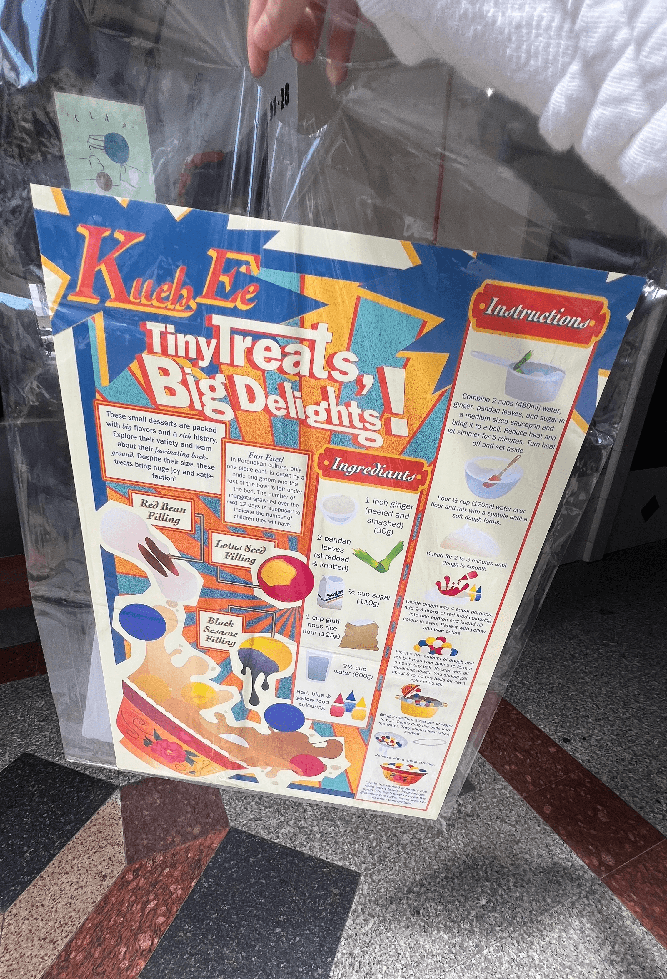
I knew early on that I didn’t want to overcomplicate the story behind Kueh Ee. It’s a humble, heartfelt dish that carries meaning in every chewy bite — often served during birthdays or celebrations for longevity and unity. I wanted the visual approach to reflect that warmth and nostalgia, but still look bold enough to catch attention.
So instead of a minimalist or modern aesthetic, I leaned into a playful retro poster feel — something that felt a bit like a nostalgic snack ad or vintage cereal box. It made sense with the theme of "tiny treats, big delights." This style gave me the space to blend informative breakdowns with fun, exaggerated illustrations. I thought: if this was a poster hanging in someone’s kitchen, it should make them want to immediately try making Kueh Ee.
the process
from brainstorms to building blocks.
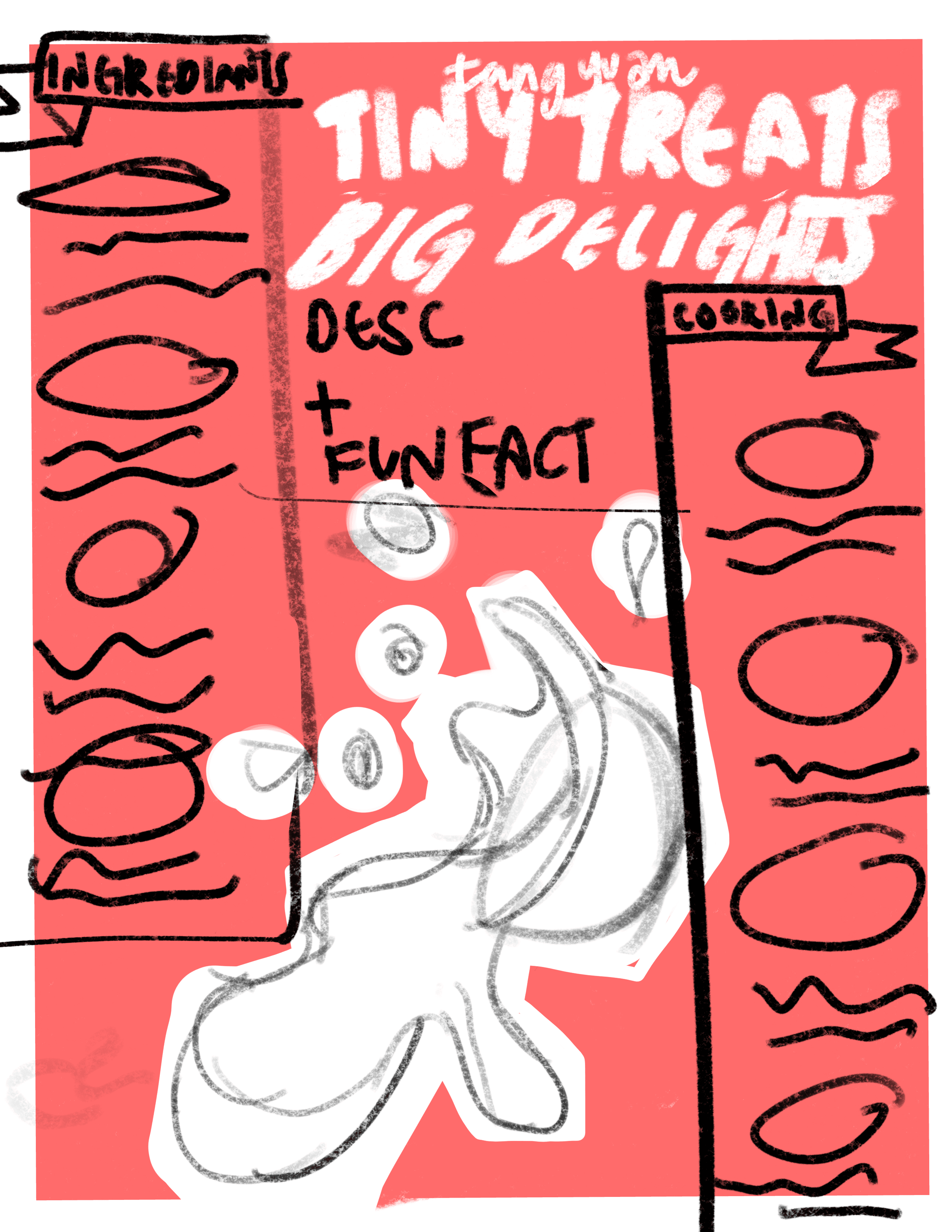
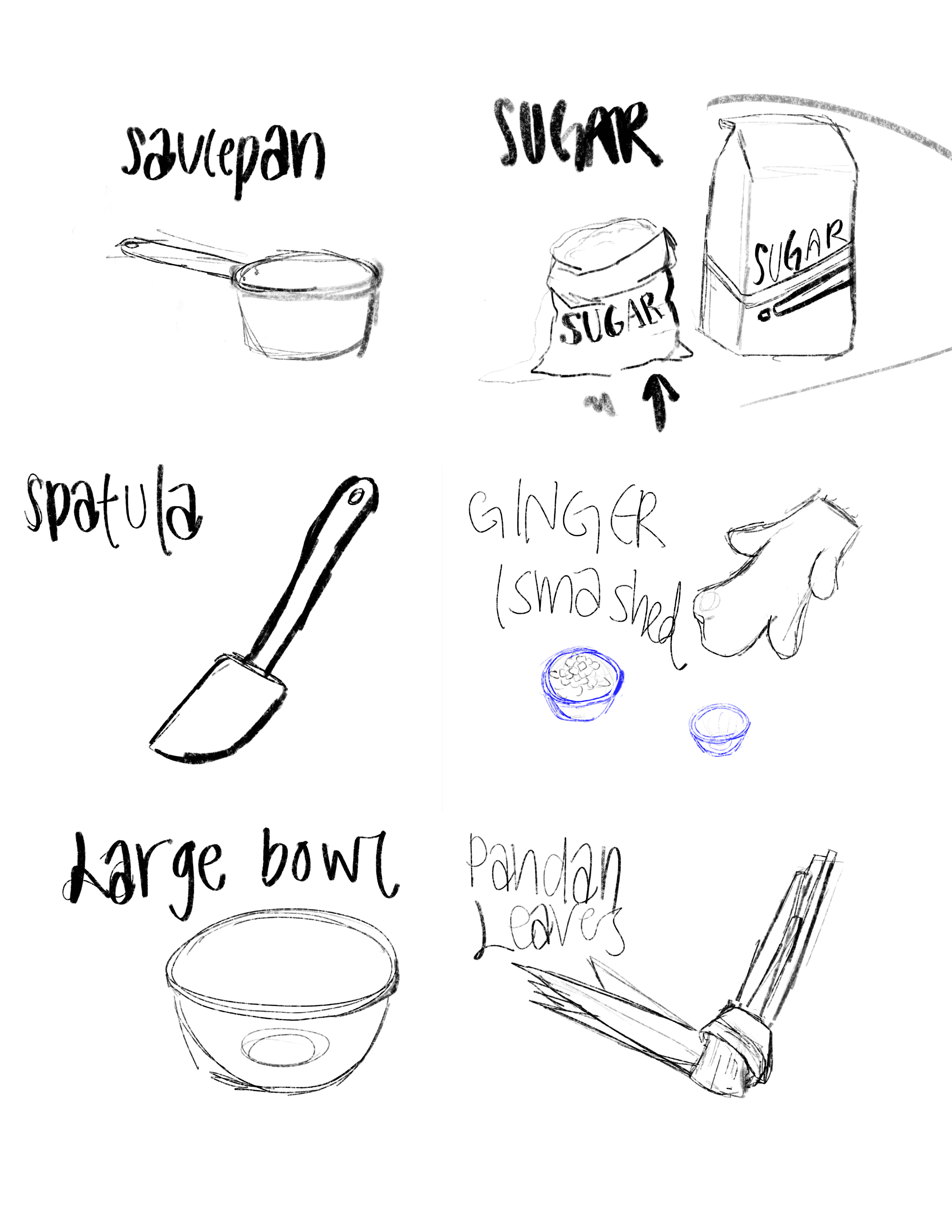
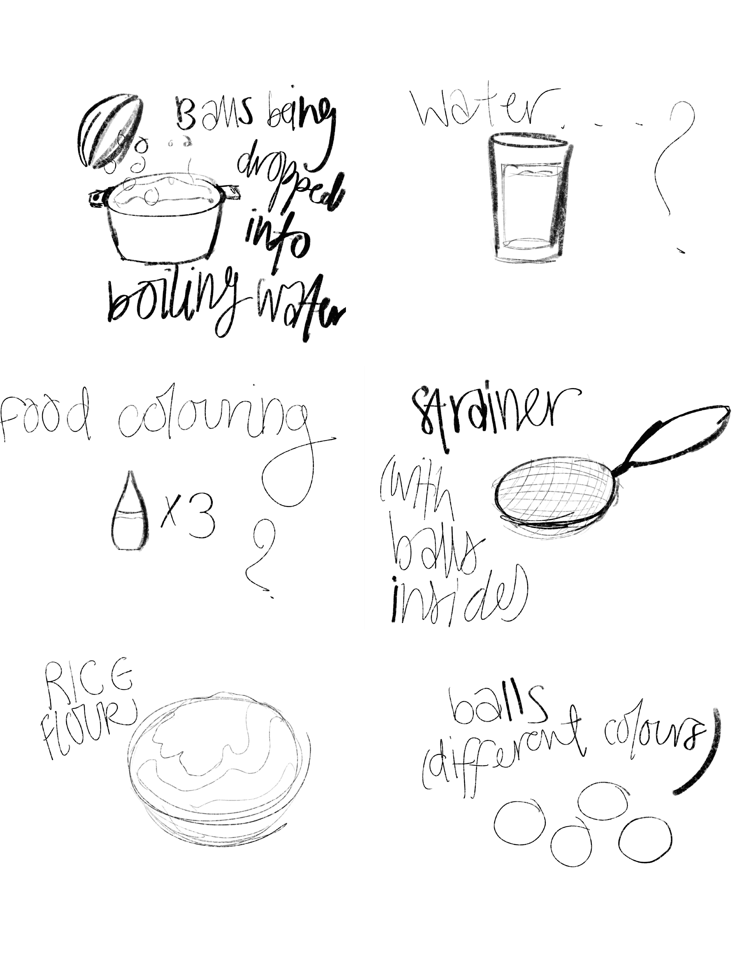
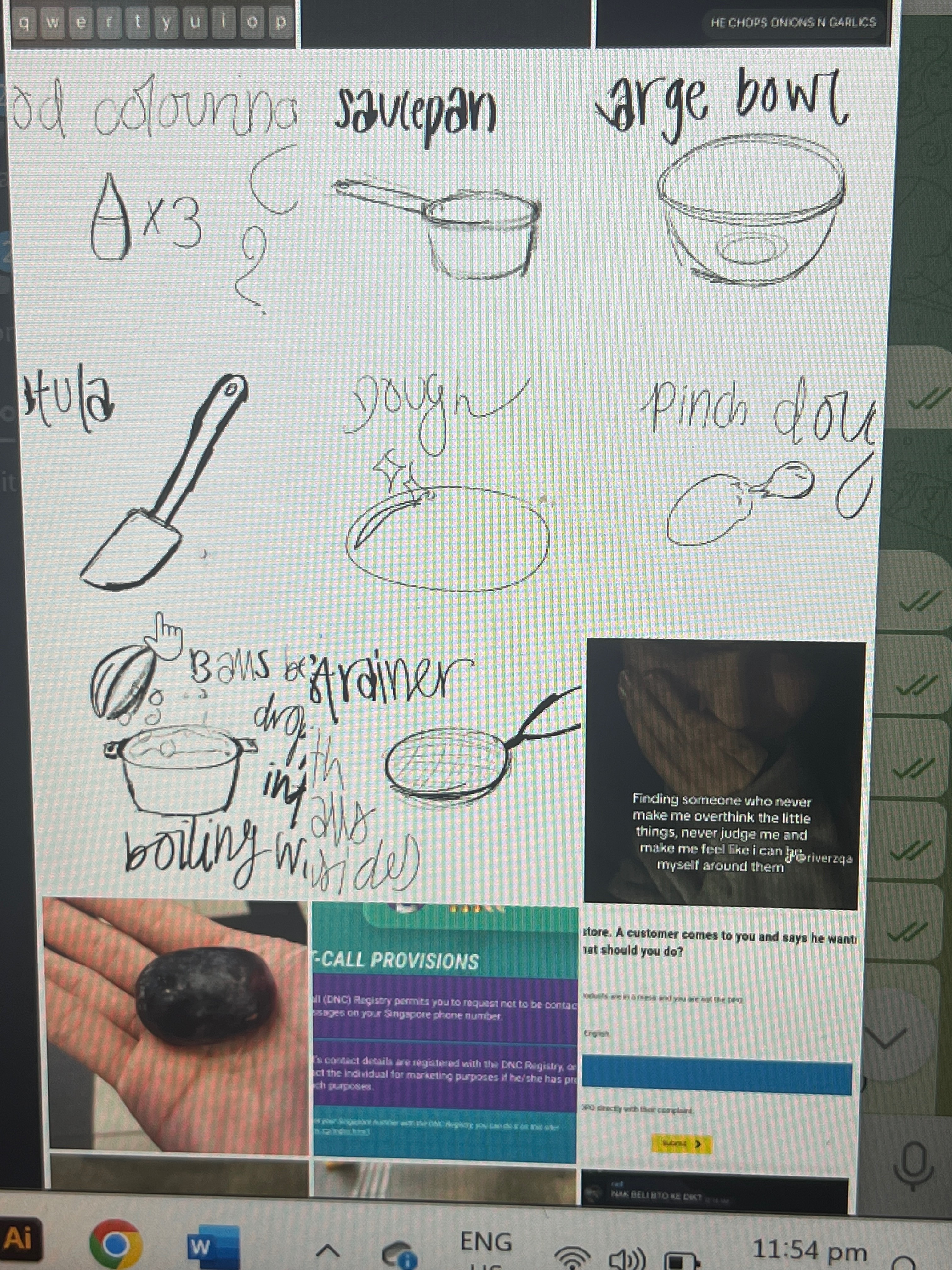
layout sketch + individual item sketches
I started by sketching every single detail on my iPad — from the ingredients like glutinous rice flour, pandan leaves, and food colouring, to all the steps: mixing, kneading, rolling, boiling, and serving. I broke the process down into bite-sized steps (pun intended), making sure each one had a supporting visual.
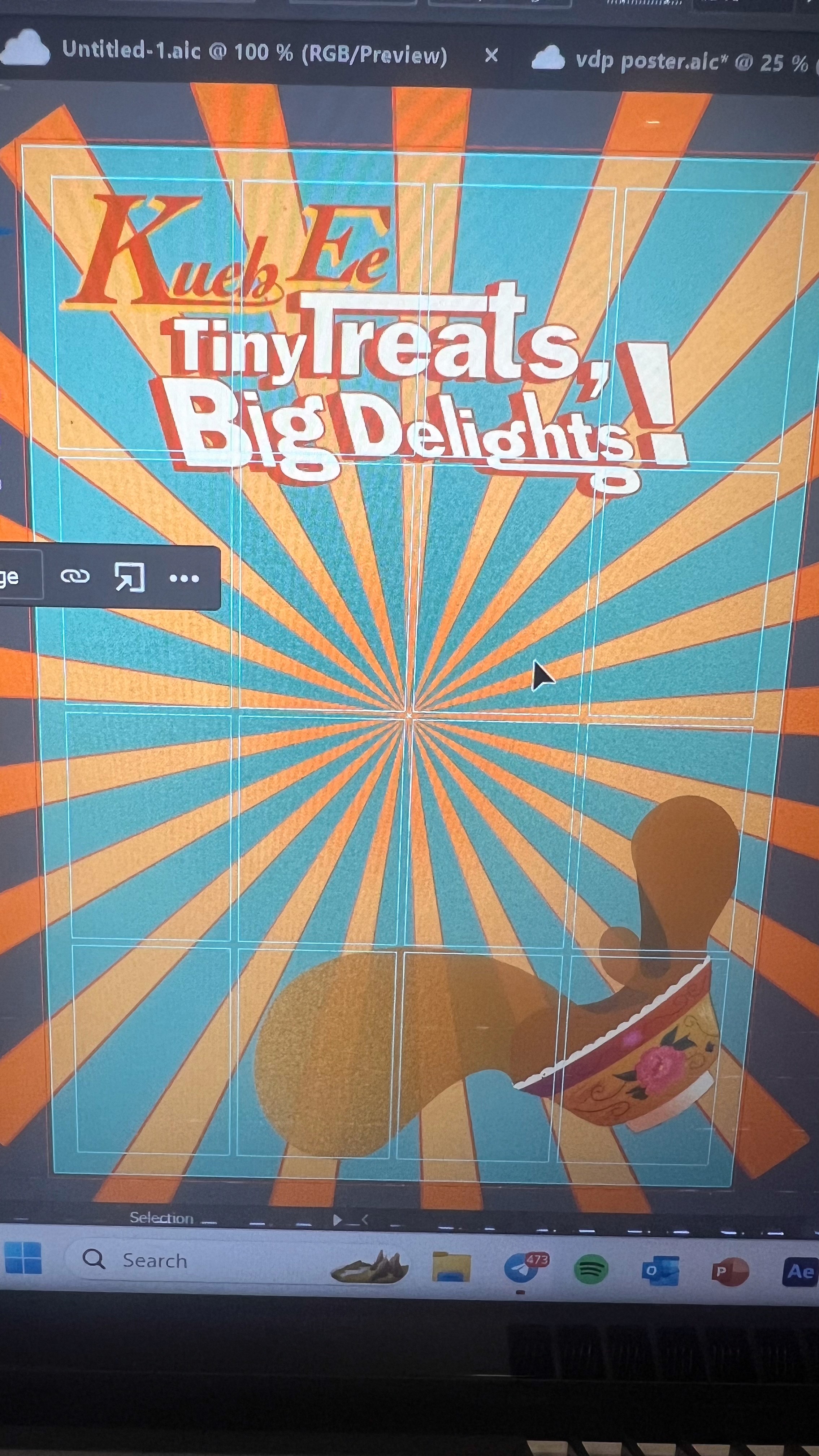
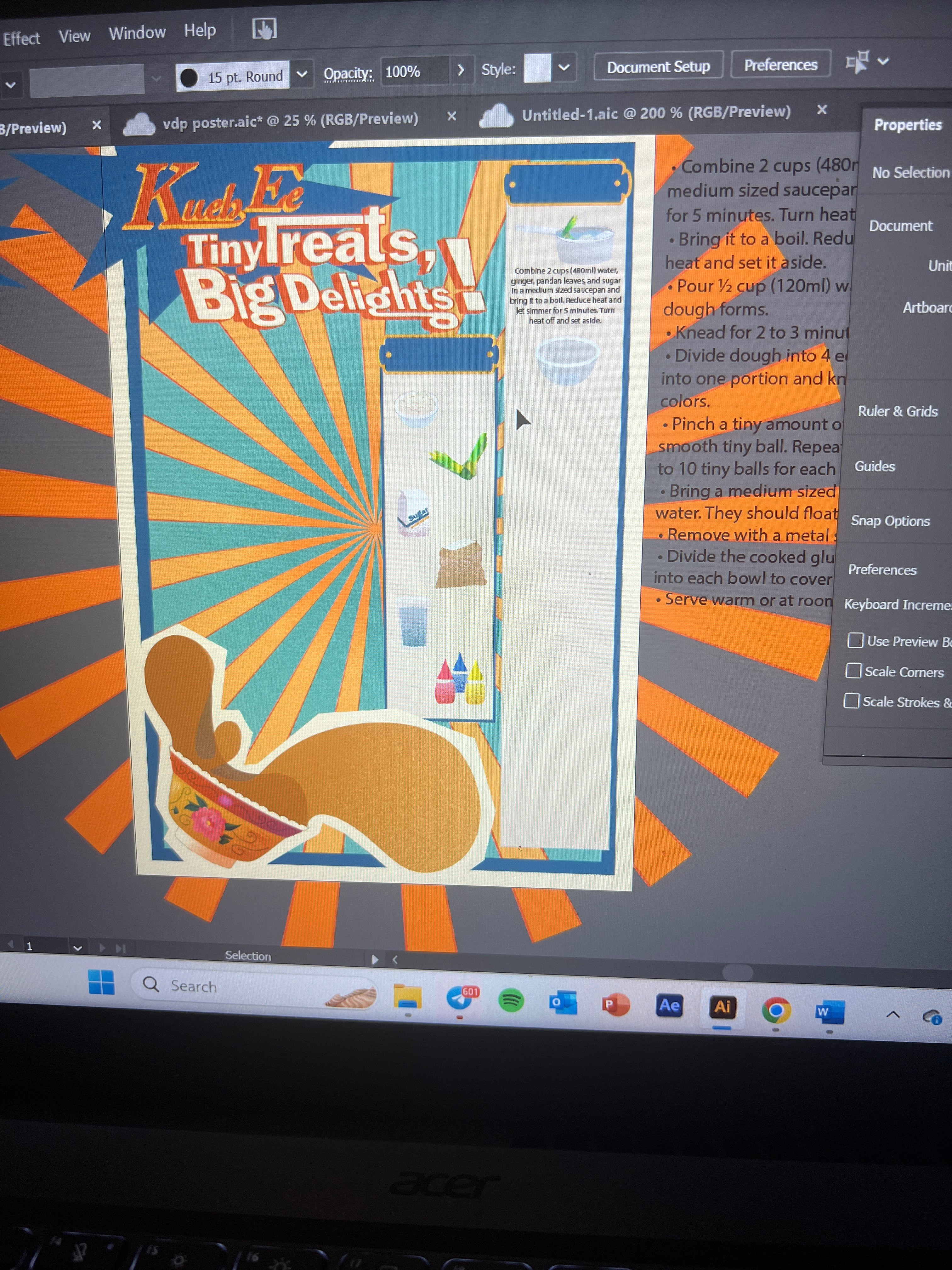
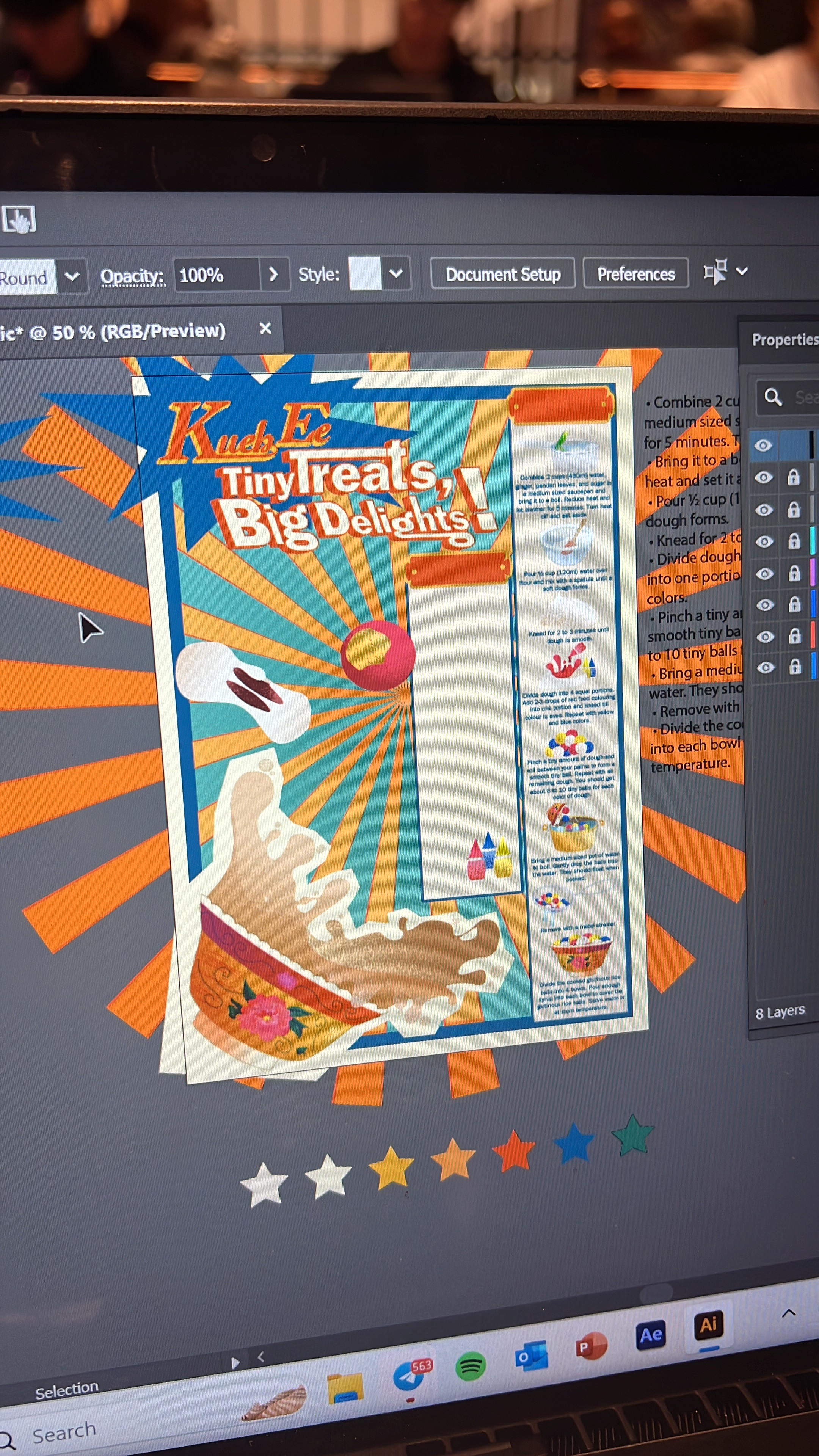
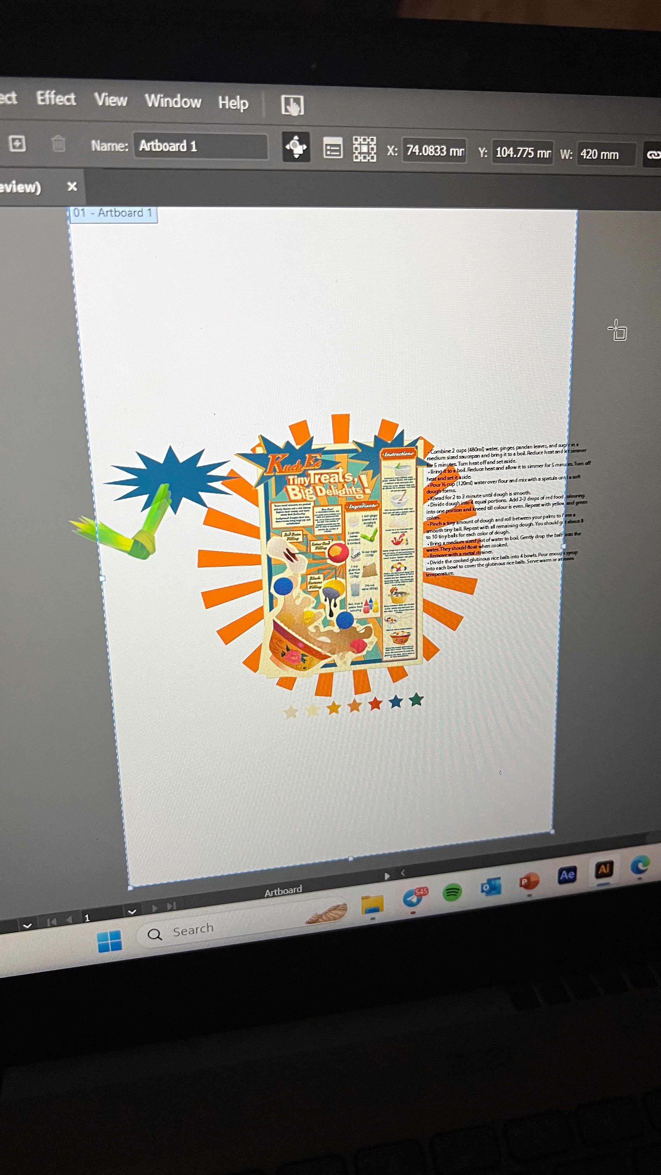
Then I brought everything into Illustrator. That’s when the real fun started — cleaning up strokes, converting rough sketches into clean vectors, and carefully layering textures and gradients to keep that hand-drawn charm. The pot, strainer, and even the flying splash of coconut milk were drawn with lots of care to keep them dynamic and full of movement.
It was all about balance — making sure the colours were vibrant without being chaotic, and that the text placement never competed with the visuals.
the making
bringing it all to life.
short clips of the process on illustrator
The final style is a mashup of vintage advertisement + playful kitchen signage, inspired by classic packaging design and old-school local snack posters. From the bold sunburst background to the chunky display type, every choice was made to feel slightly theatrical but rooted in nostalgia.
I used Cochin and Franklin Gothic, the two fonts from my moodboard. Cochin gave it a warm, traditional serif feel for headers, while Franklin Gothic helped with legibility for the smaller step instructions.
The colour palette was made up of warm creams, punchy oranges, reds, and deep blues — colours that nod to retro food packaging and local branding. The combination gave it that slightly aged, hawker-inspired vibe while keeping it energetic and fun.
the outcome
what i managed to deliver.
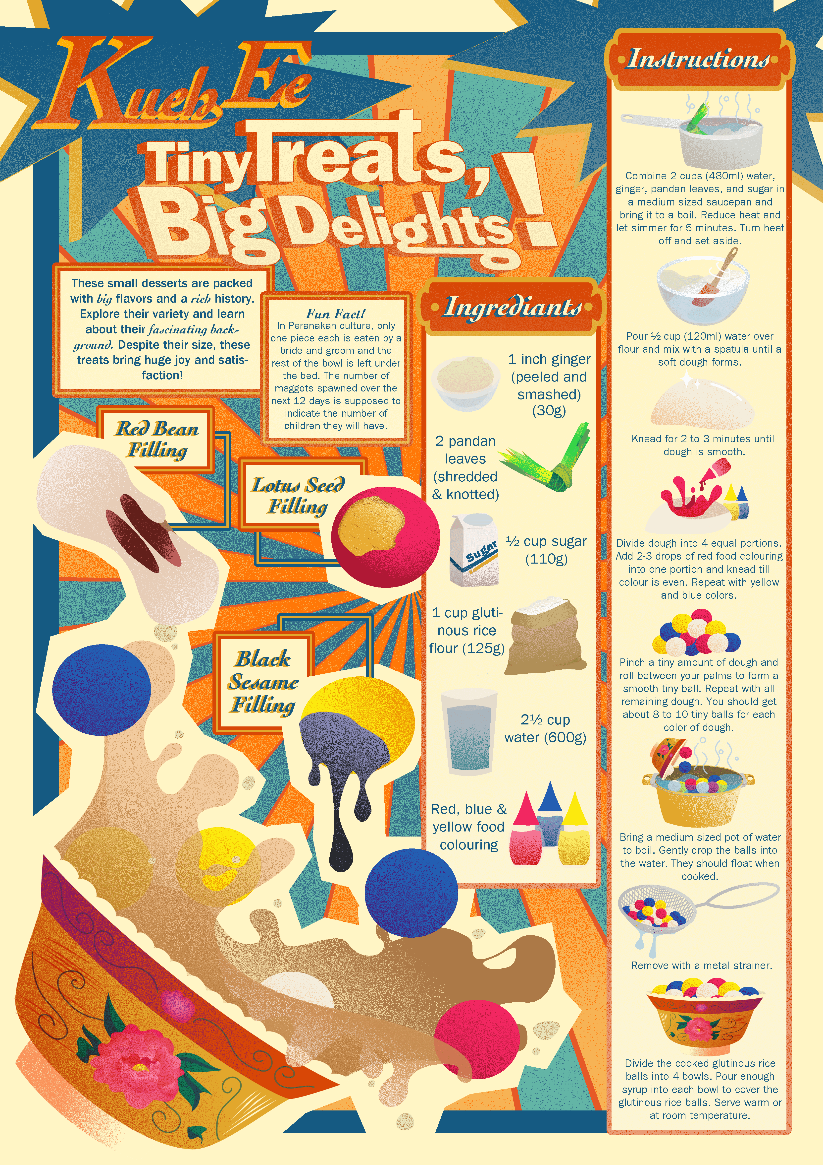
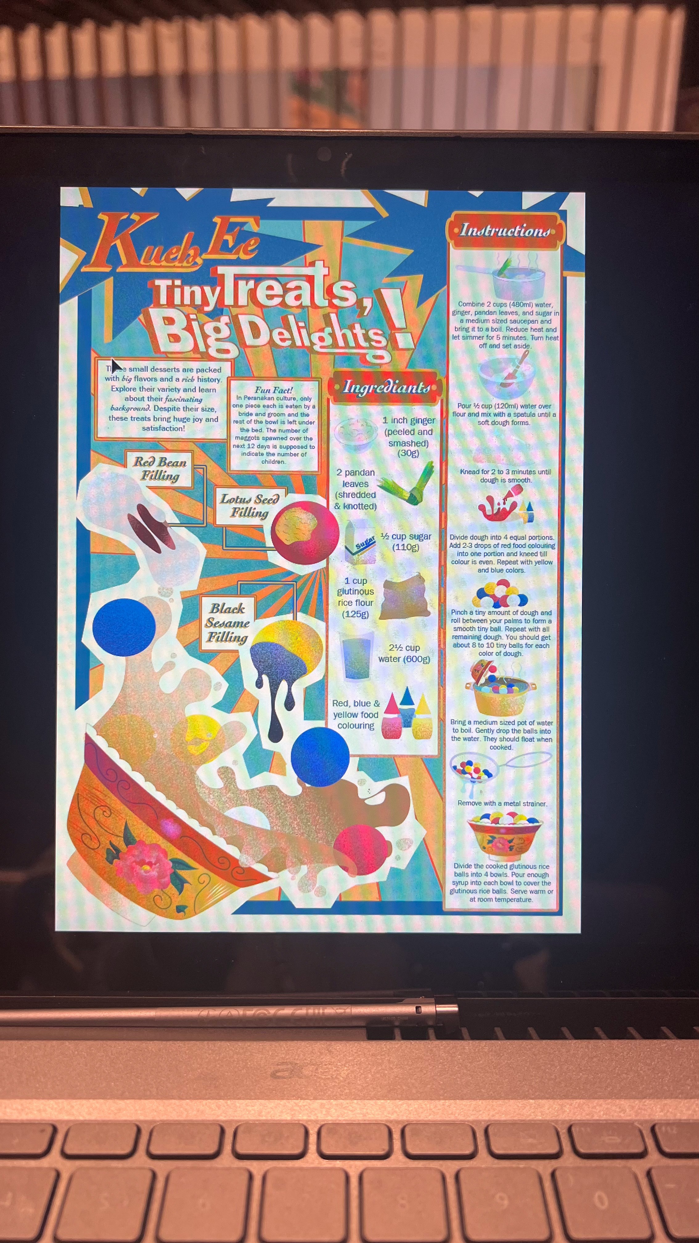
the final infographic + it printed out!
The final piece is a step-by-step infographic poster that explains how to make Kueh Ee from scratch — ingredient by ingredient, step by step. The layout moves vertically with supporting visuals next to every stage, and the large bowl illustration at the bottom which includes all kinds of flavours Kueh Ee carries — acts like a “landing zone” where all the steps visually feed into.
Delivered:
Fully illustrated and vectorised infographic
Clear visual breakdown of process and ingredients
Consistent colour scheme, layout, and type hierarchy
Cultural accuracy and tone matched to the dish’s background
• • A playful, retro-inspired design ready to be printed or displayed as an educational graphic
the troubles
what almost ruined it — and how i pushed through.
the absolute headache that was getting my computer to run smoothly
Getting the visuals to balance was tough — especially because the retro style relies heavily on contrast and layering. Some icons looked too modern at first, so I kept having to tone them down and rework outlines.
The real challenge was spacing: making sure the step-by-step visuals didn’t feel cramped while keeping them large enough to read. There was a point where the pot and strainer felt like they were just floating around awkwardly. I had to shift things around more than a few times to get the flow right.
Also, working with so many shades of orange and red got tricky fast — I kept having to tweak colours to make sure they popped but didn’t clash.
the takeaways
what i learned; and what i plan to do differently.
This was the first time I really saw how infographics can be both beautiful and useful. I loved the challenge of taking something as humble as Kueh Ee and turning it into something loud, proud, and fun — without losing its roots.
Overall, I walked away knowing how to mix illustration, layout, and cultural context into something that actually teaches, without being boring.