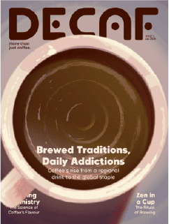
decaf — an e-zine
the process.
the idea
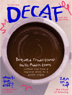
what i set out to create.
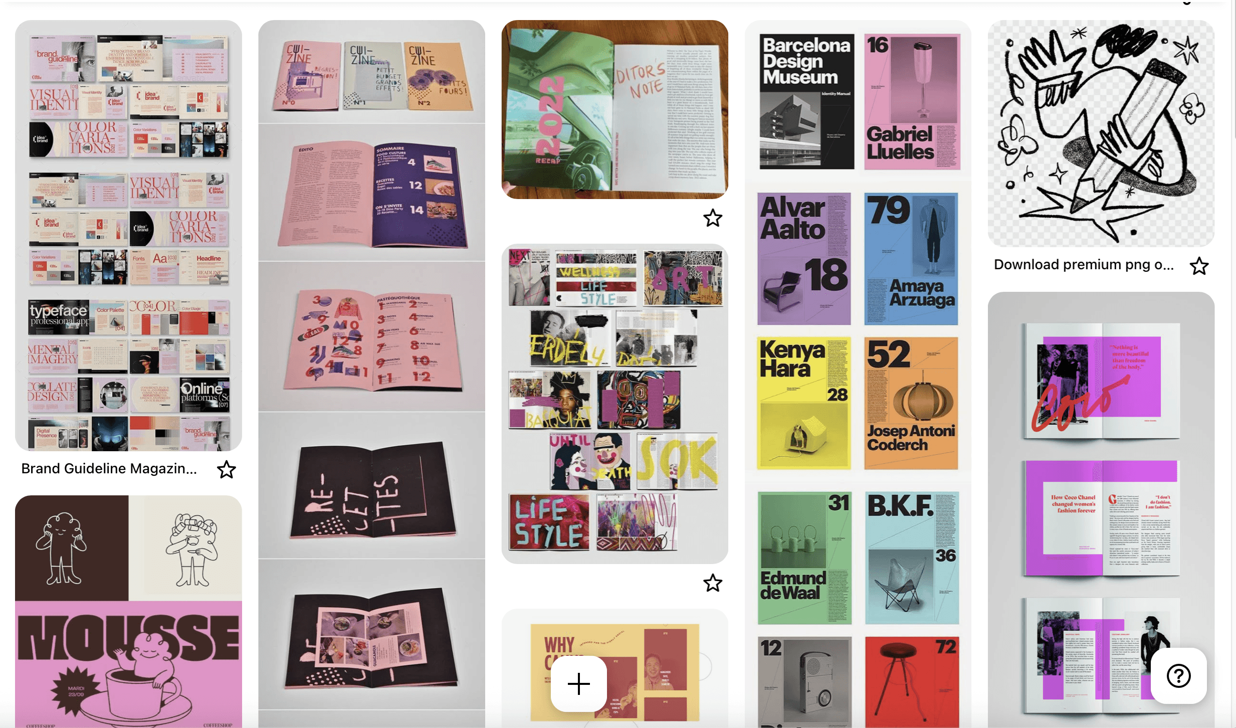
moodboard + initial ideation stage
I knew exactly what I wanted to do the second I read the brief. As someone who’s borderline obsessed with coffee (and has even worked in cafes just to be around it more), choosing coffee culture as my topic was a no-brainer. But instead of focusing purely on facts or reviews, I wanted to explore the emotional side of it — the rituals, the creativity, the slow moments.
That’s how “DECAF” was born.
DECAF isn’t your typical coffee zine. It’s not just about what beans to buy or how to brew a pour-over. It’s for people who see coffee as more than just a drink — people who find meaning in their morning cup, who appreciate the mindfulness in brewing, or who just love quirky cafés and cozy spaces.
I wanted the zine to feel fun, sketchy, warm, and filled with movement — a mix of quiet energy and creativity, much like coffee itself.
the process
from brainstorms to building blocks.
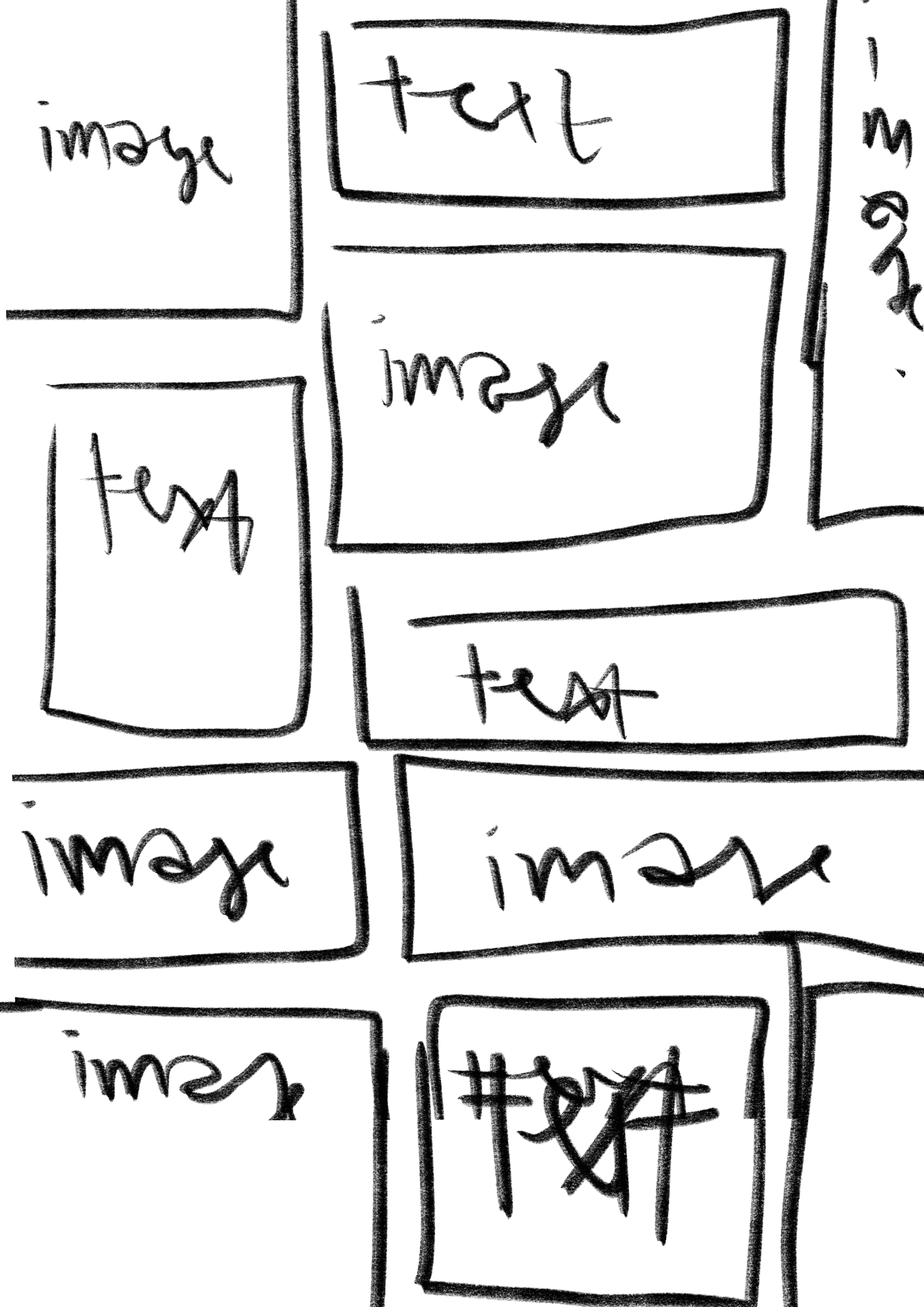
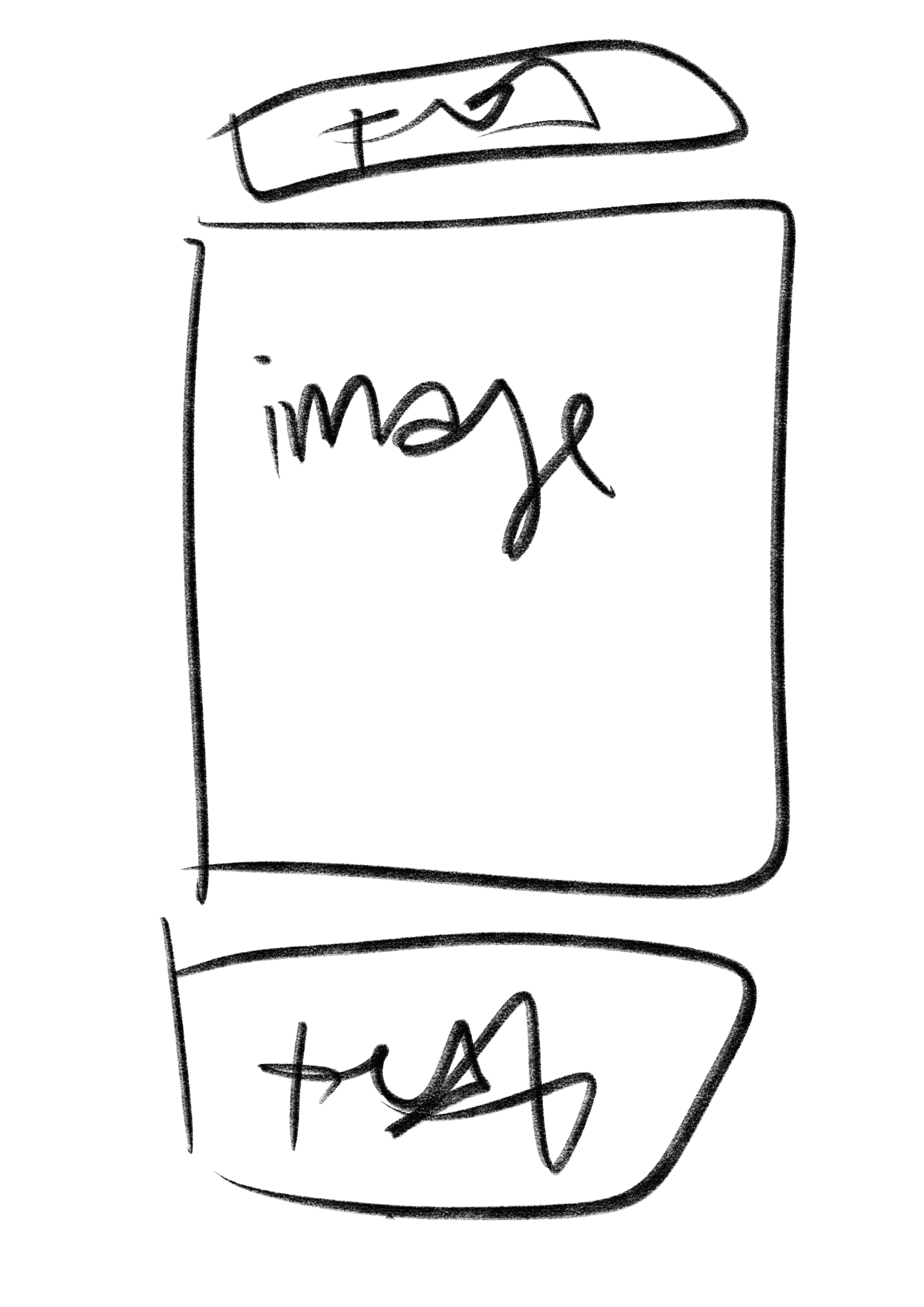
potential layouts + masthead ideas
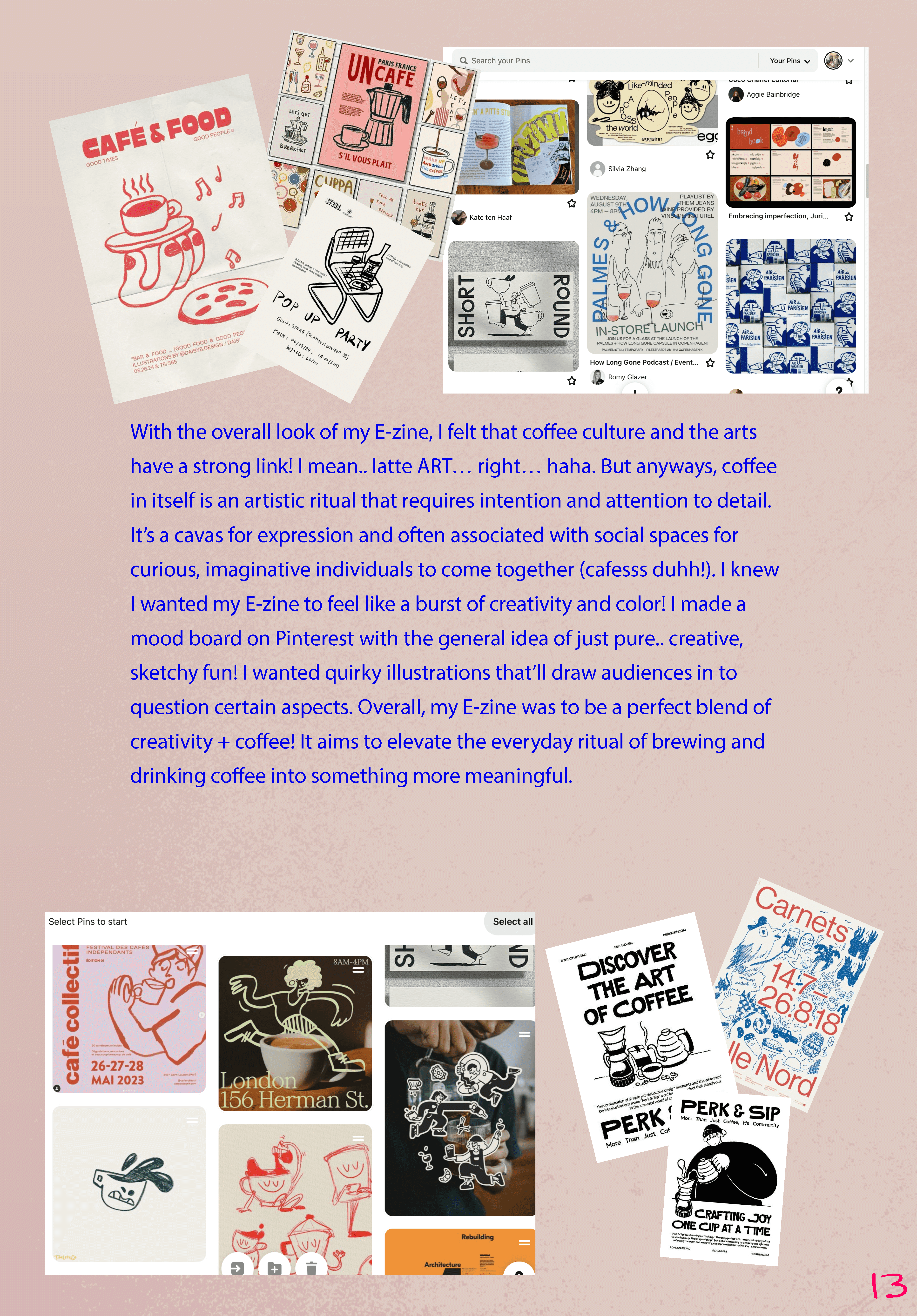
Once I confirmed coffee culture as my theme, I started moodboarding — filling boards with scribbly textures, coffee rings, bold colours, and lots of personality. I knew I wanted a playful, imperfect aesthetic that looked hand-crafted and human.
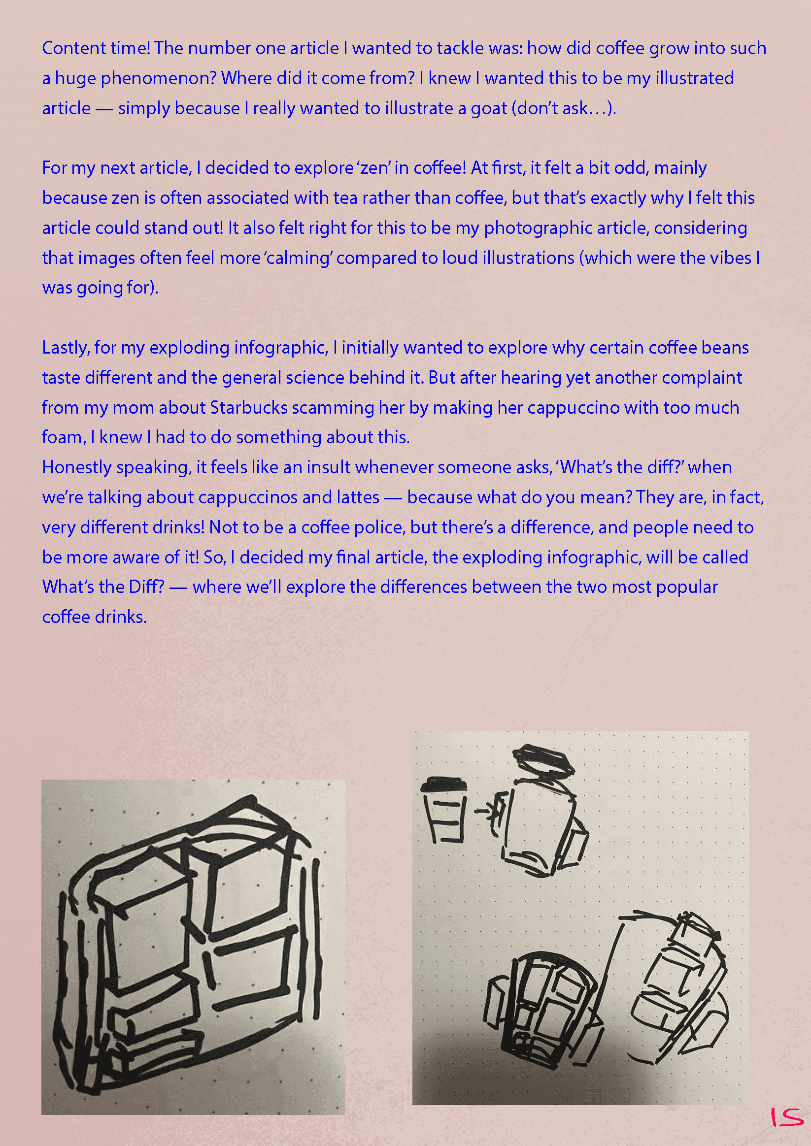
I then came up with three article concepts:
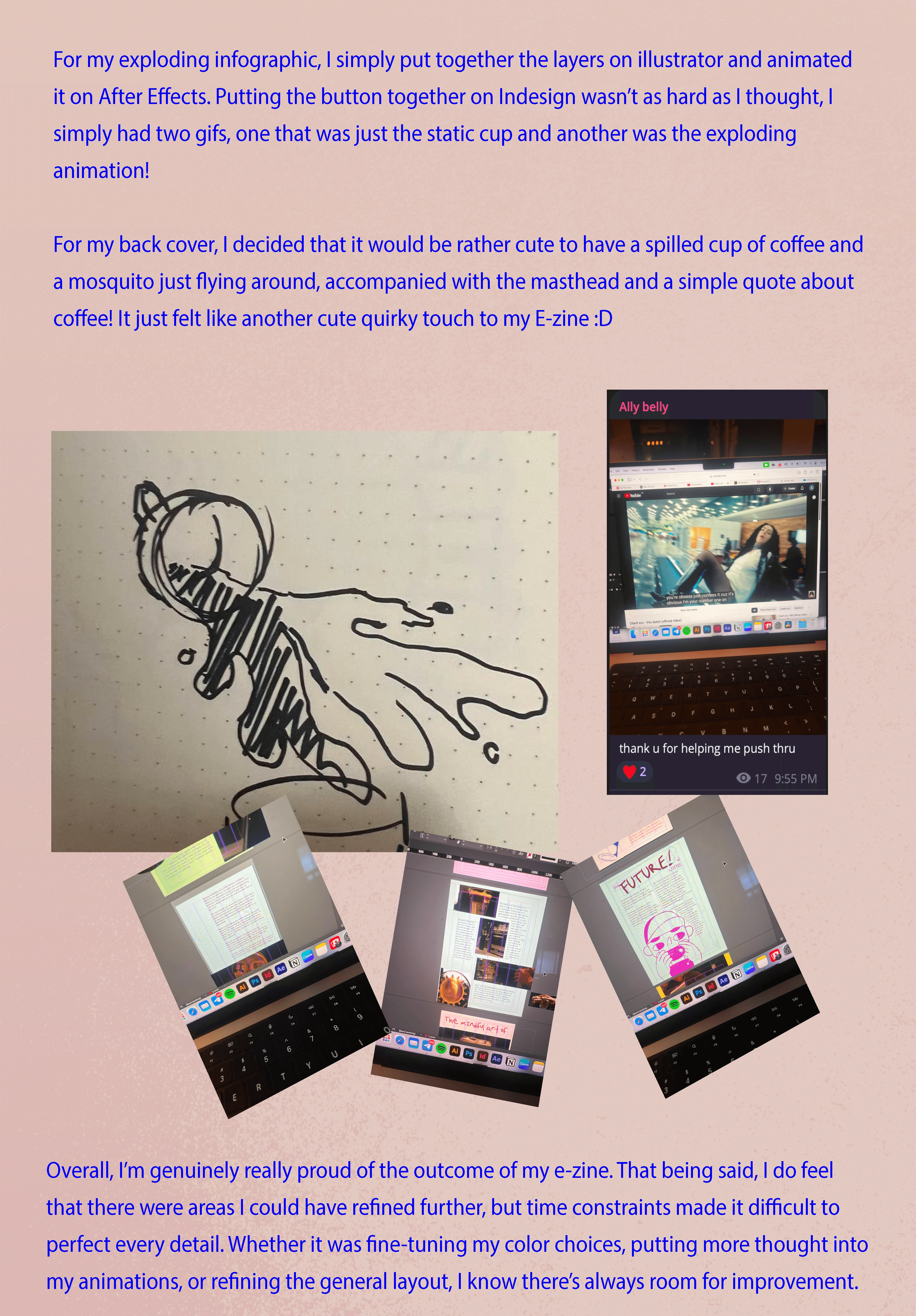
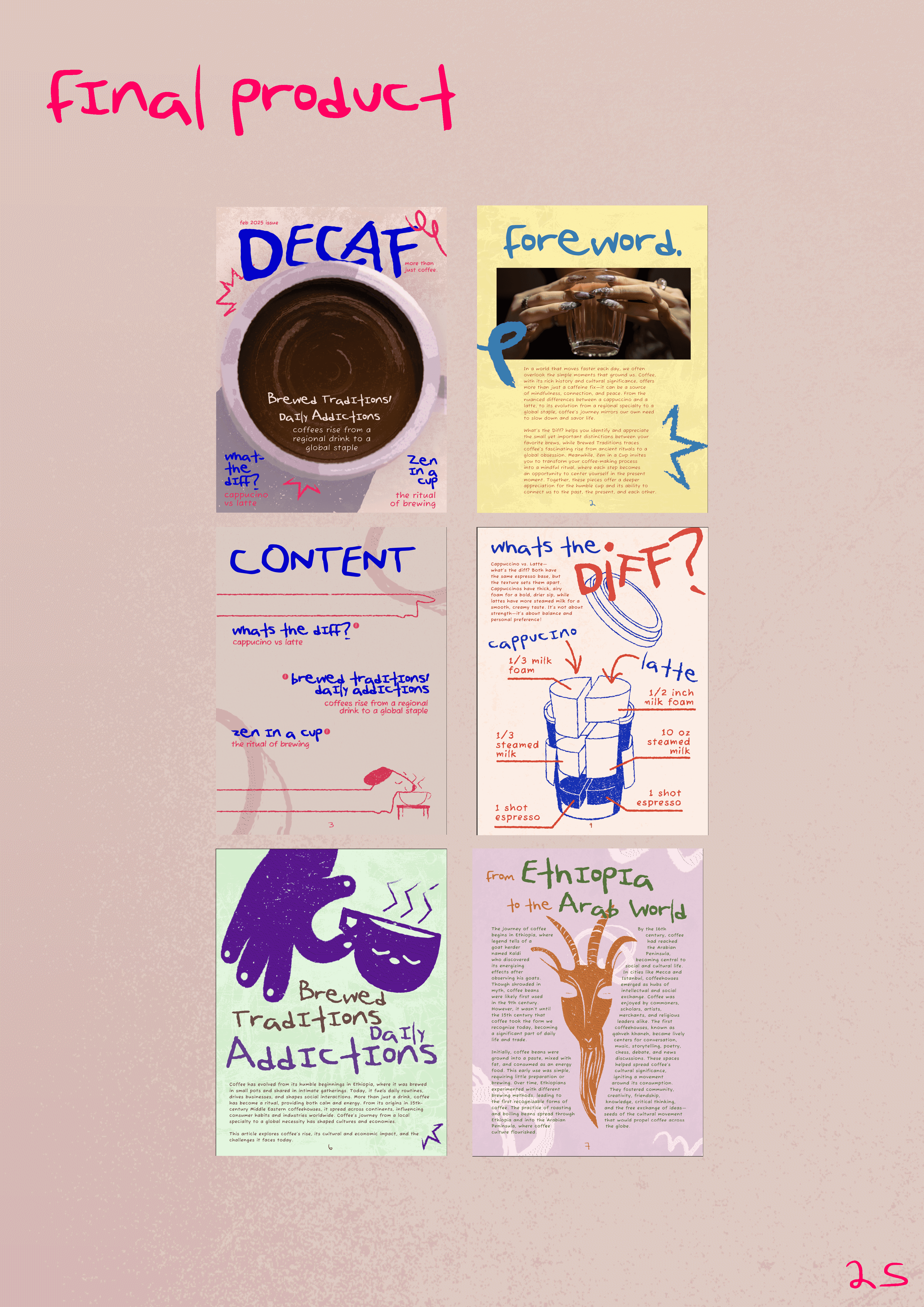
“What’s the Diff?” – an exploding infographic comparing cappuccinos vs. lattes
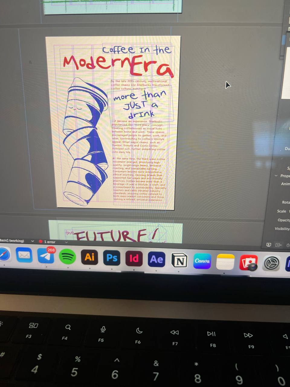
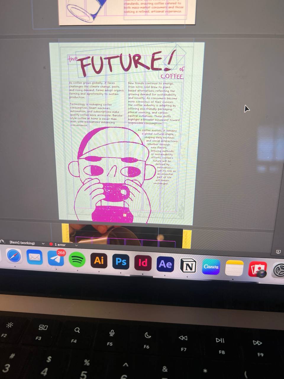
“Brewed Traditions” – an illustrated origin story of coffee
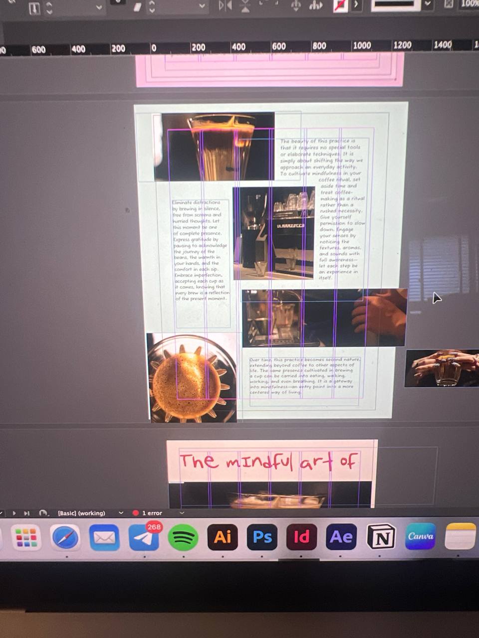
“Zen in a Cup” – a photographic article on mindful coffee brewing
Each section had its own vibe and layout approach, but all tied back to the zine’s visual identity: lively, reflective, and a little cheeky.
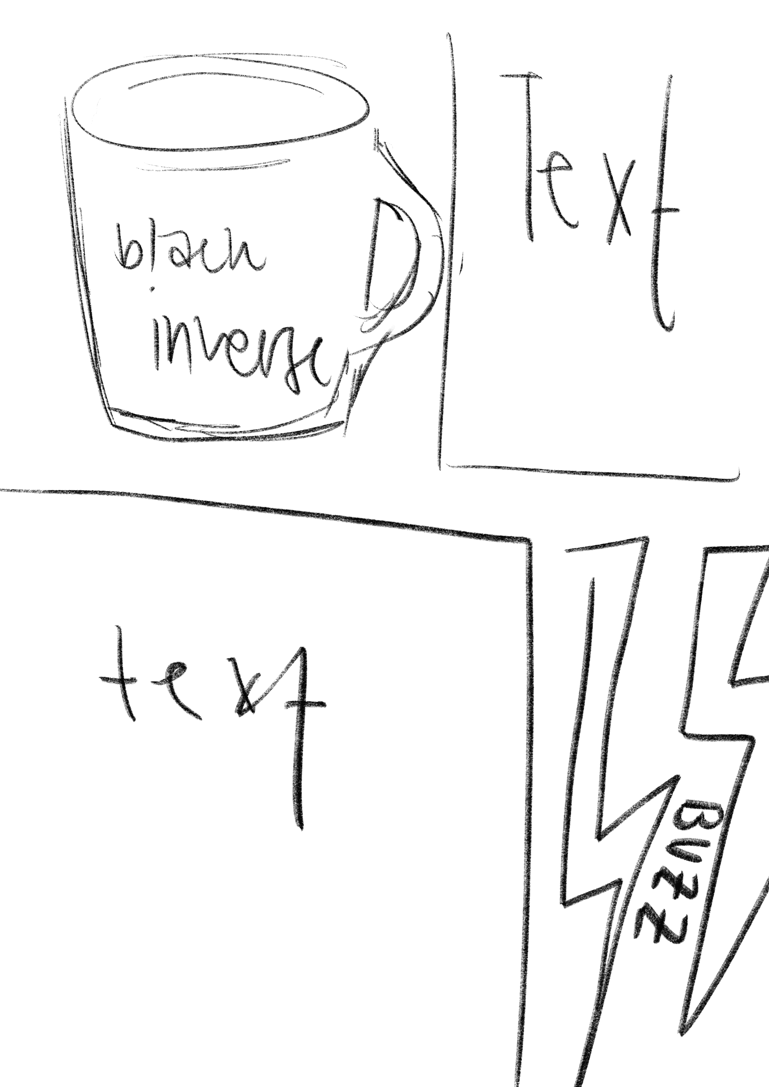
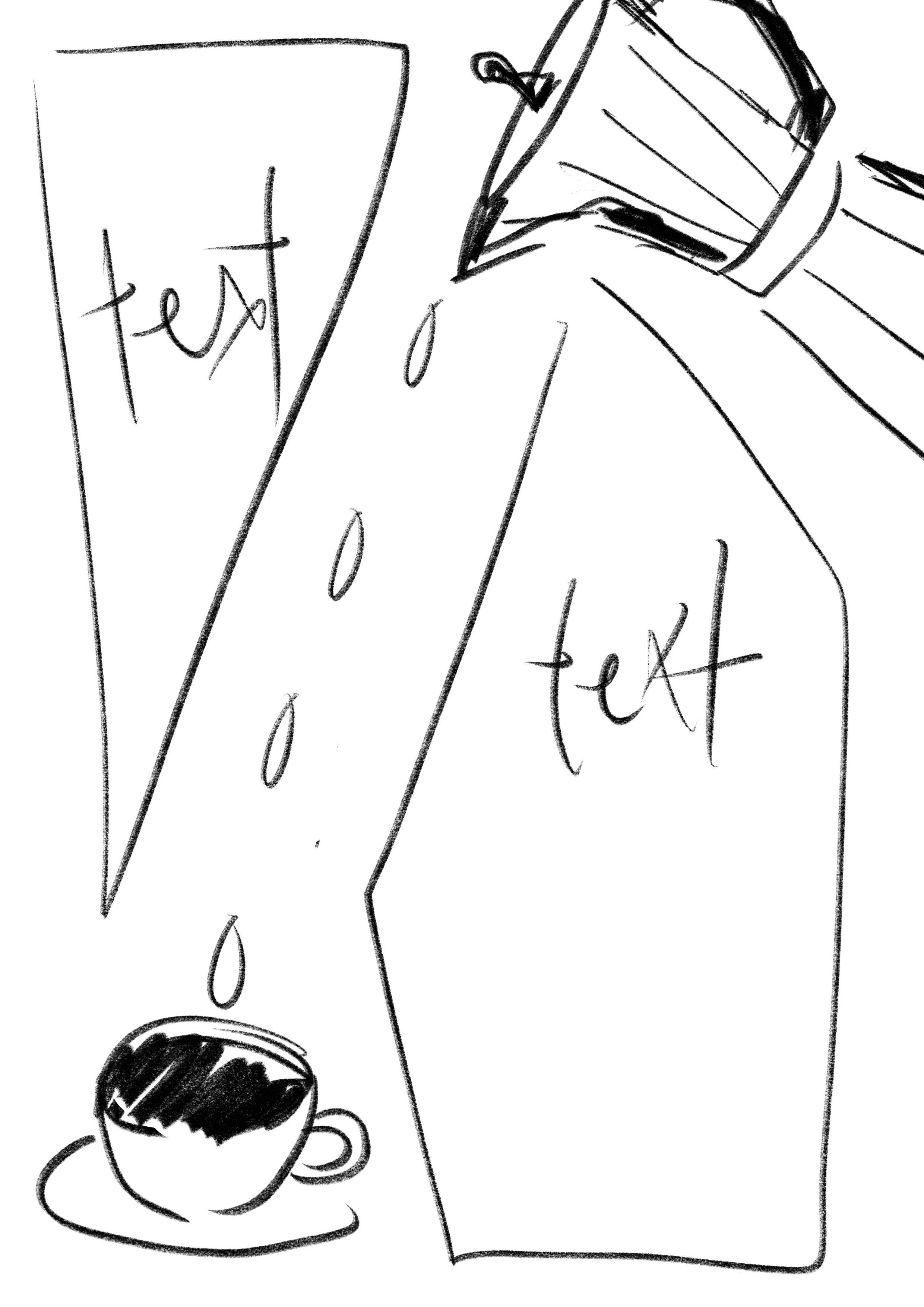
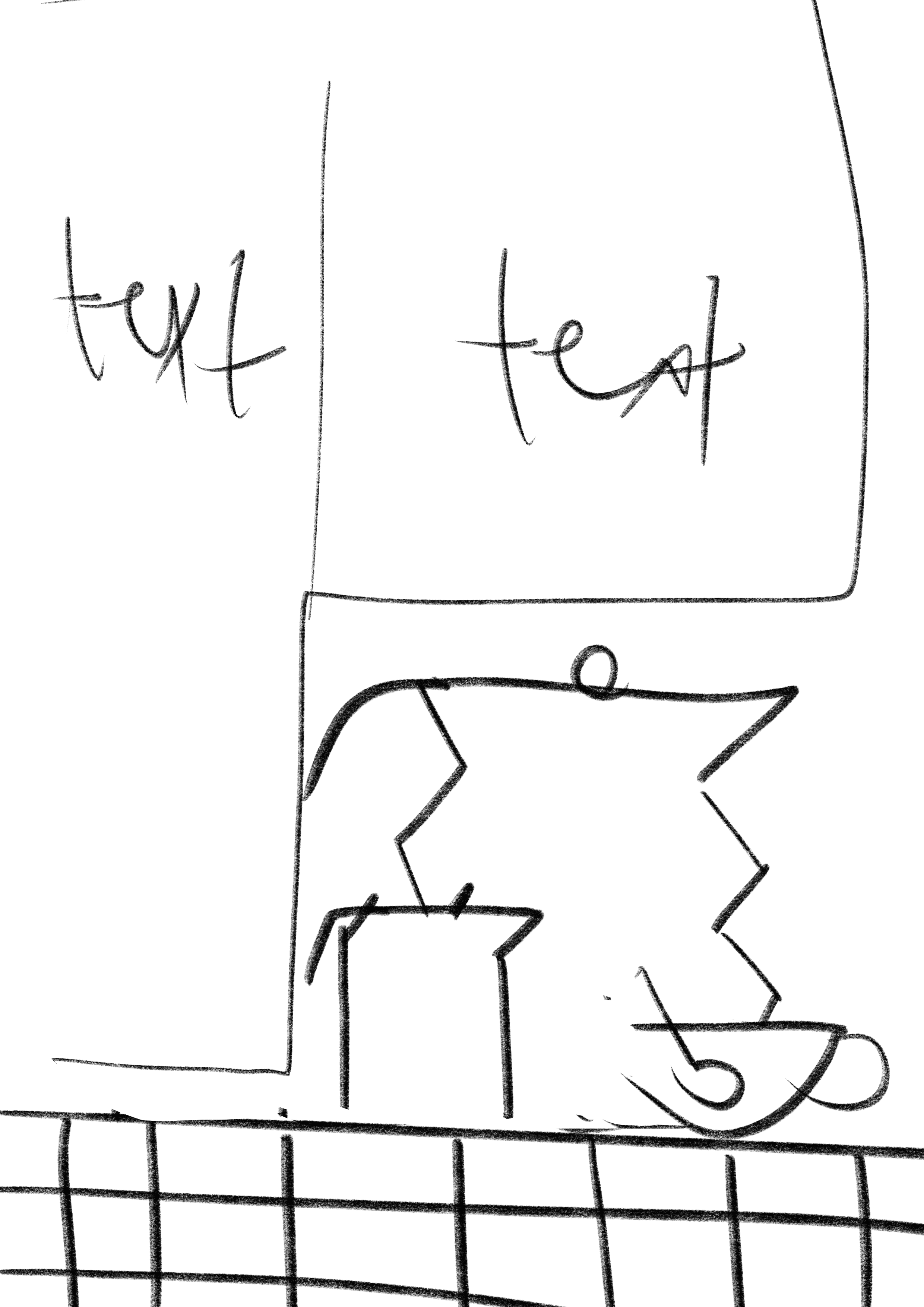
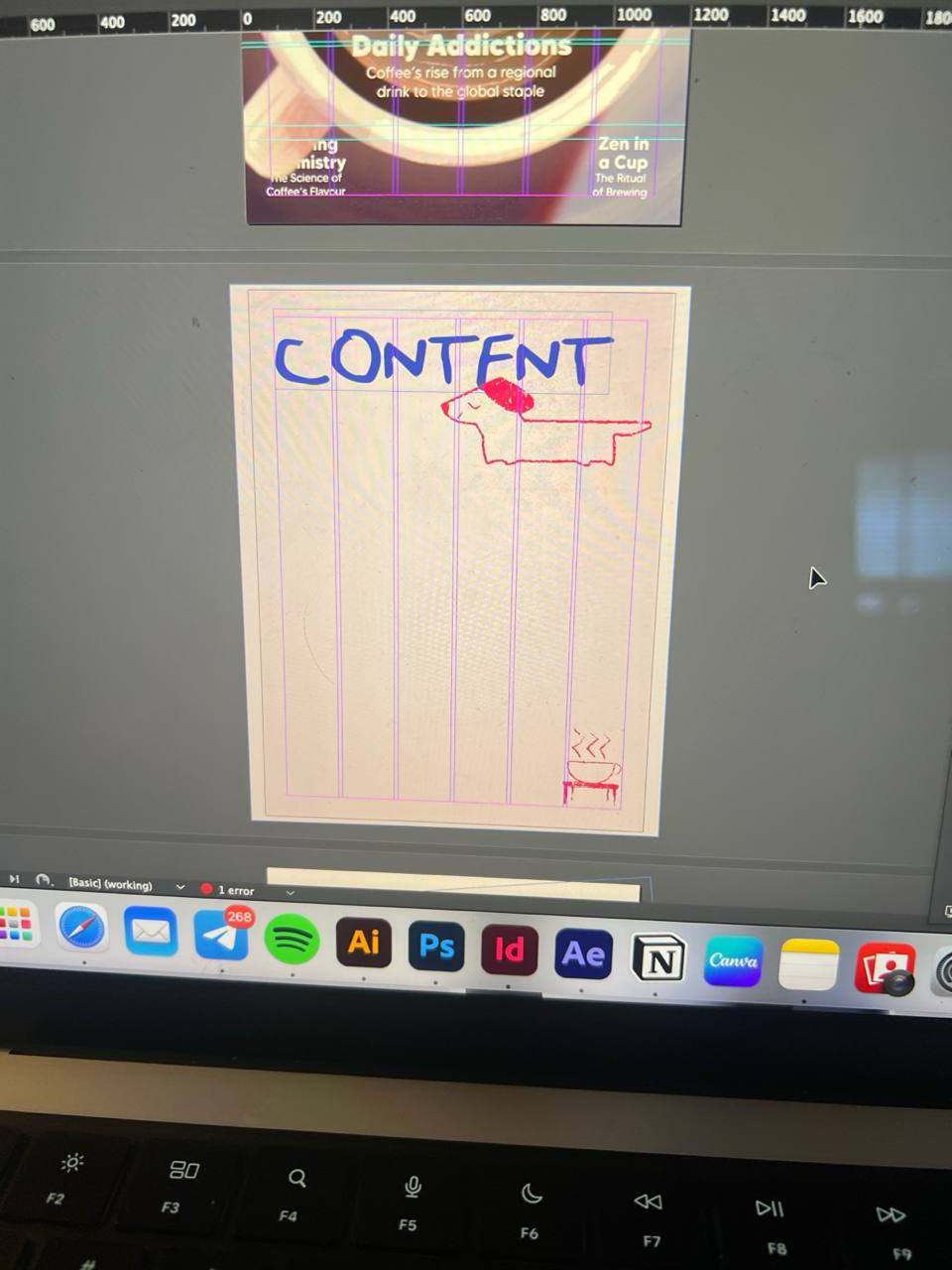
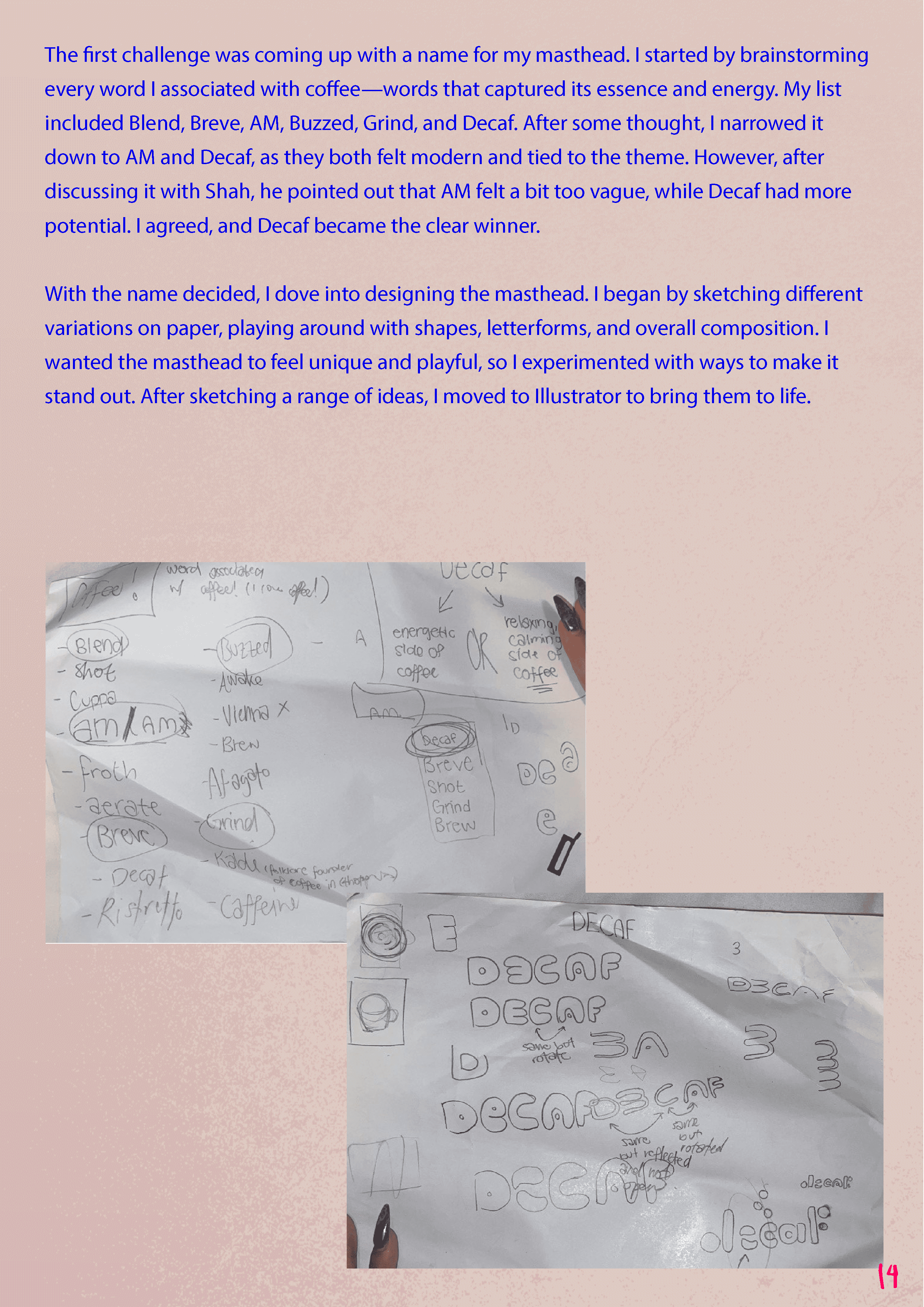
I then started to sketch the potential layouts whilst also playing with different masthead looks.
the making
bringing it all to life.

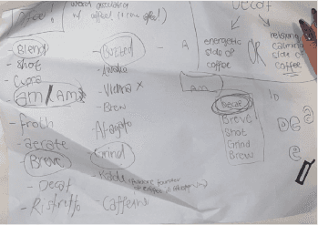
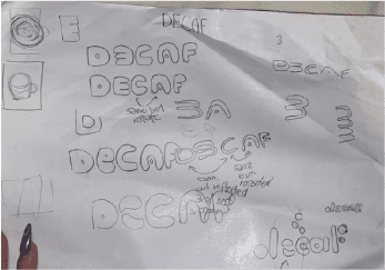
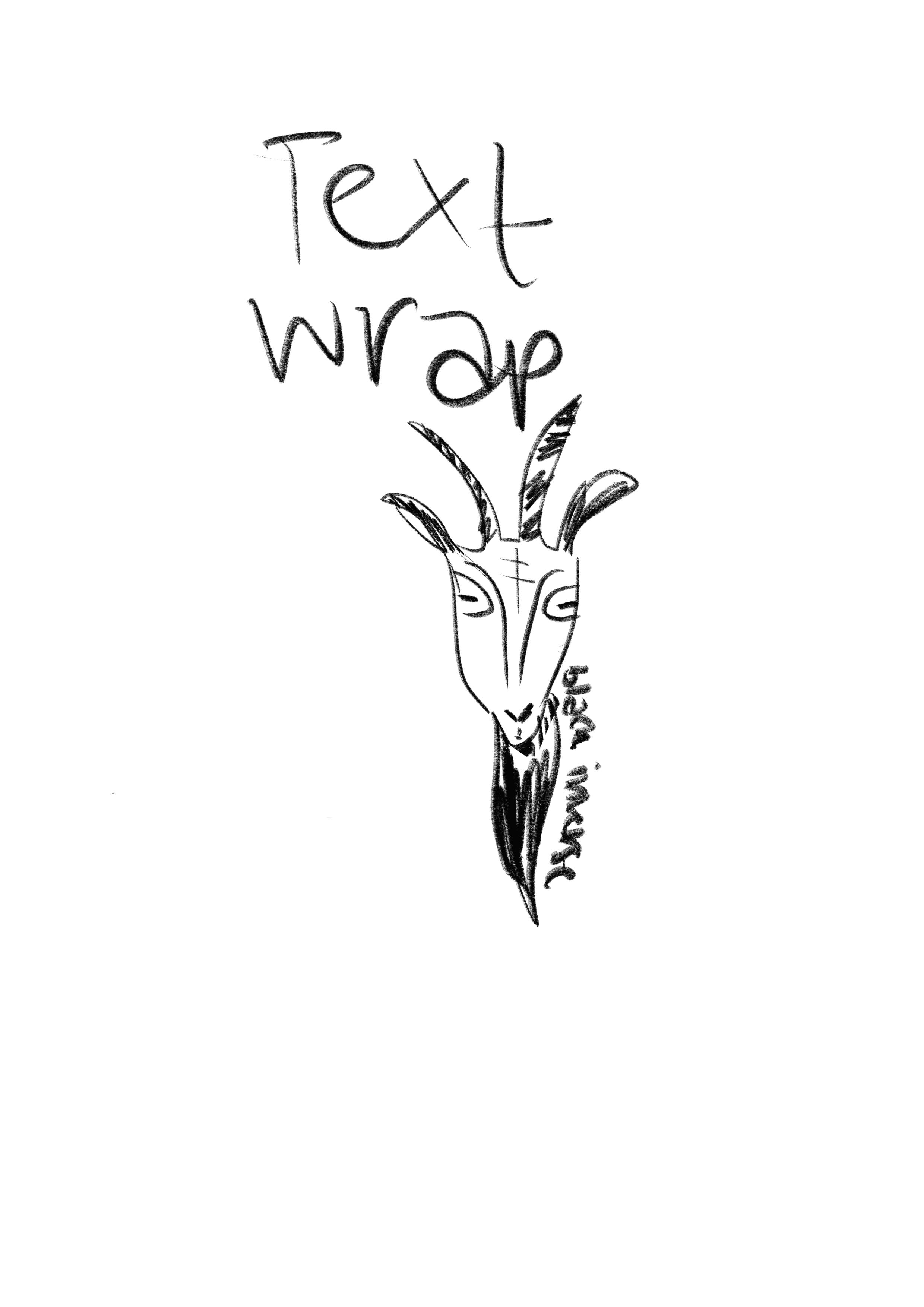
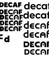
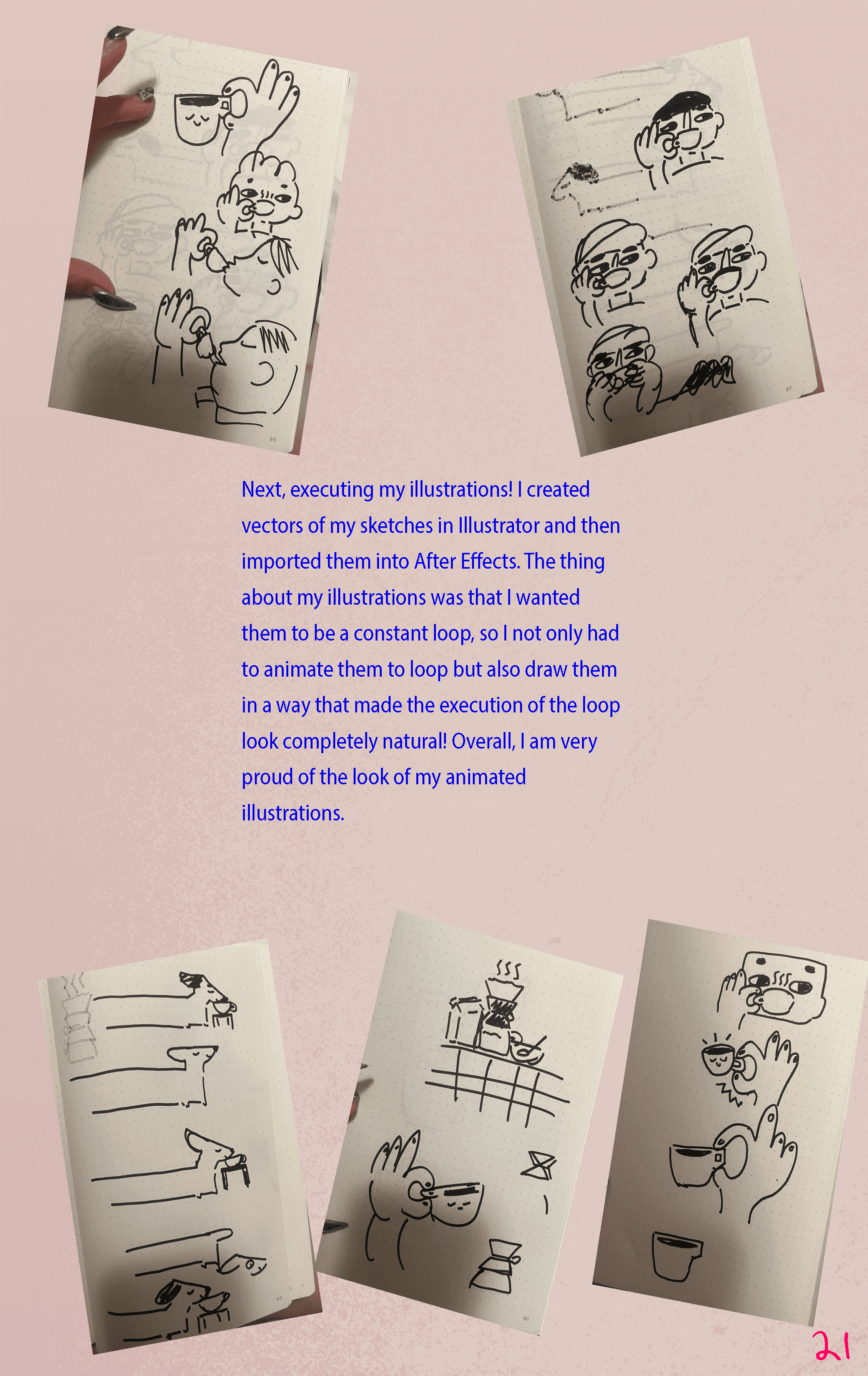
changes in masthead + original sketches + final touchups
Masthead:
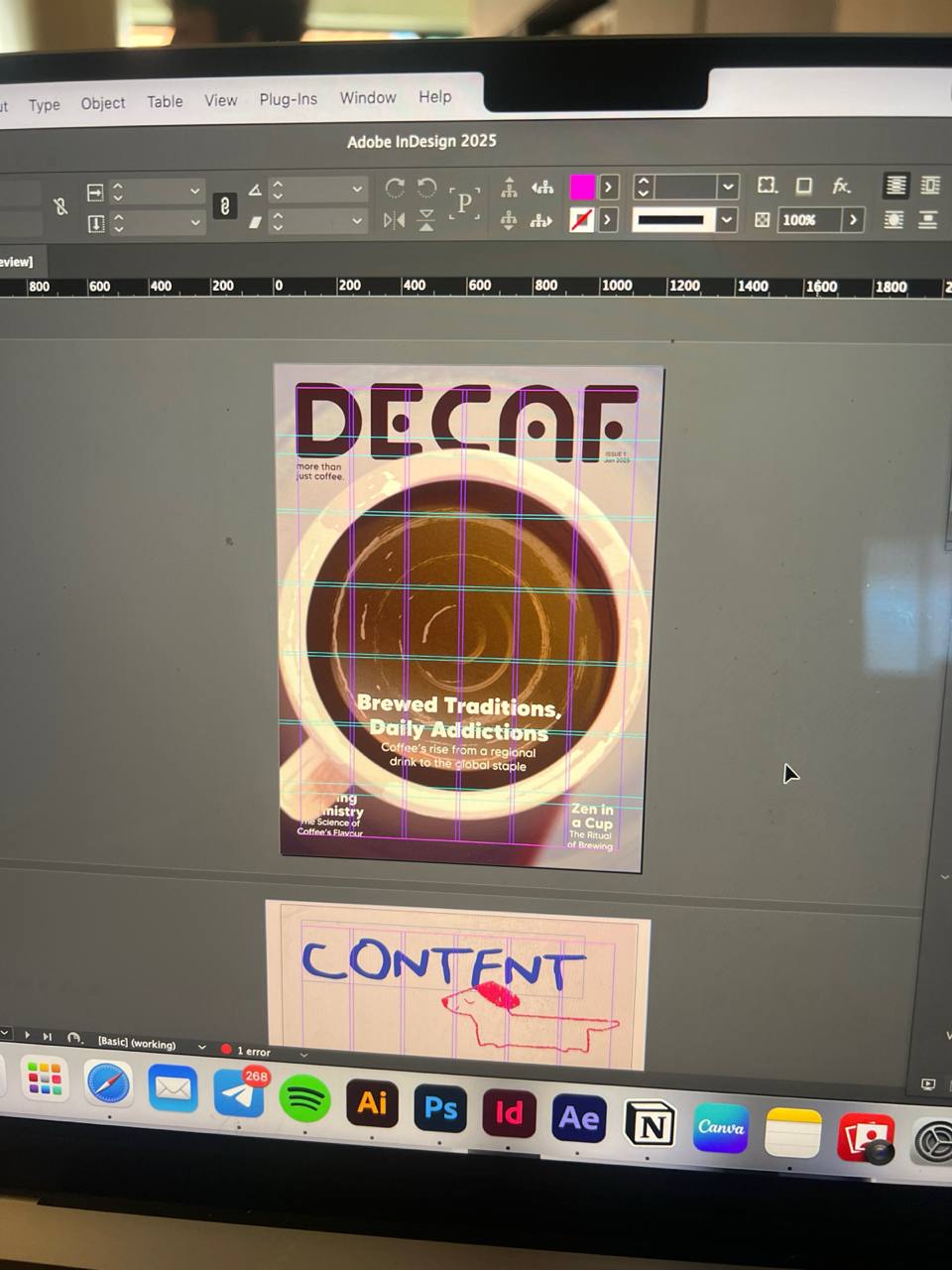
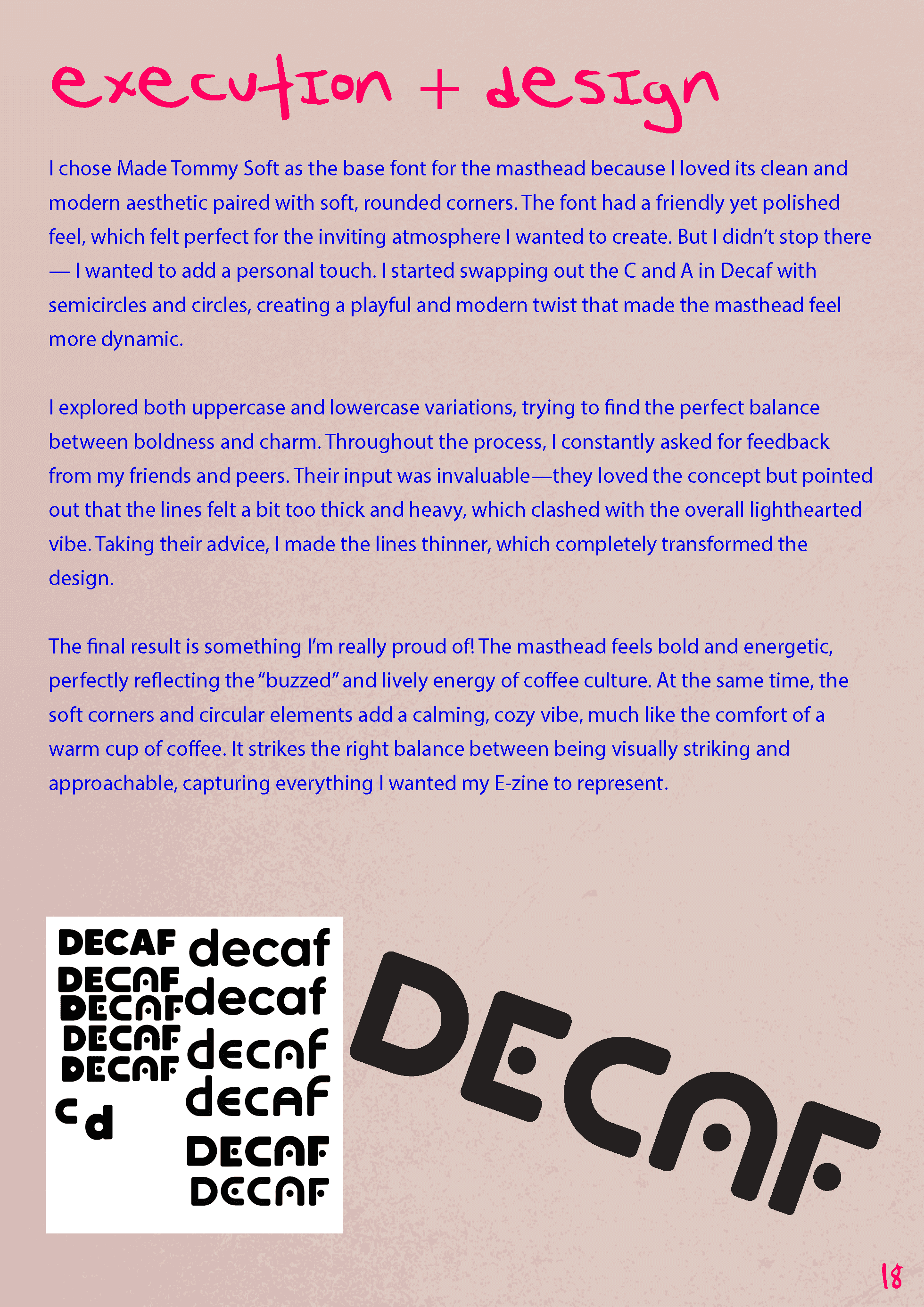
I went through a bunch of name options — Blend, AM, Grind — but “DECAF” stuck with me. It felt short, playful, and a little ironic (especially for someone as caffeine-fuelled as me). The masthead was created using Made Tommy Soft as a base, which I then customized with circular elements to give it a friendly, bubbly feel.
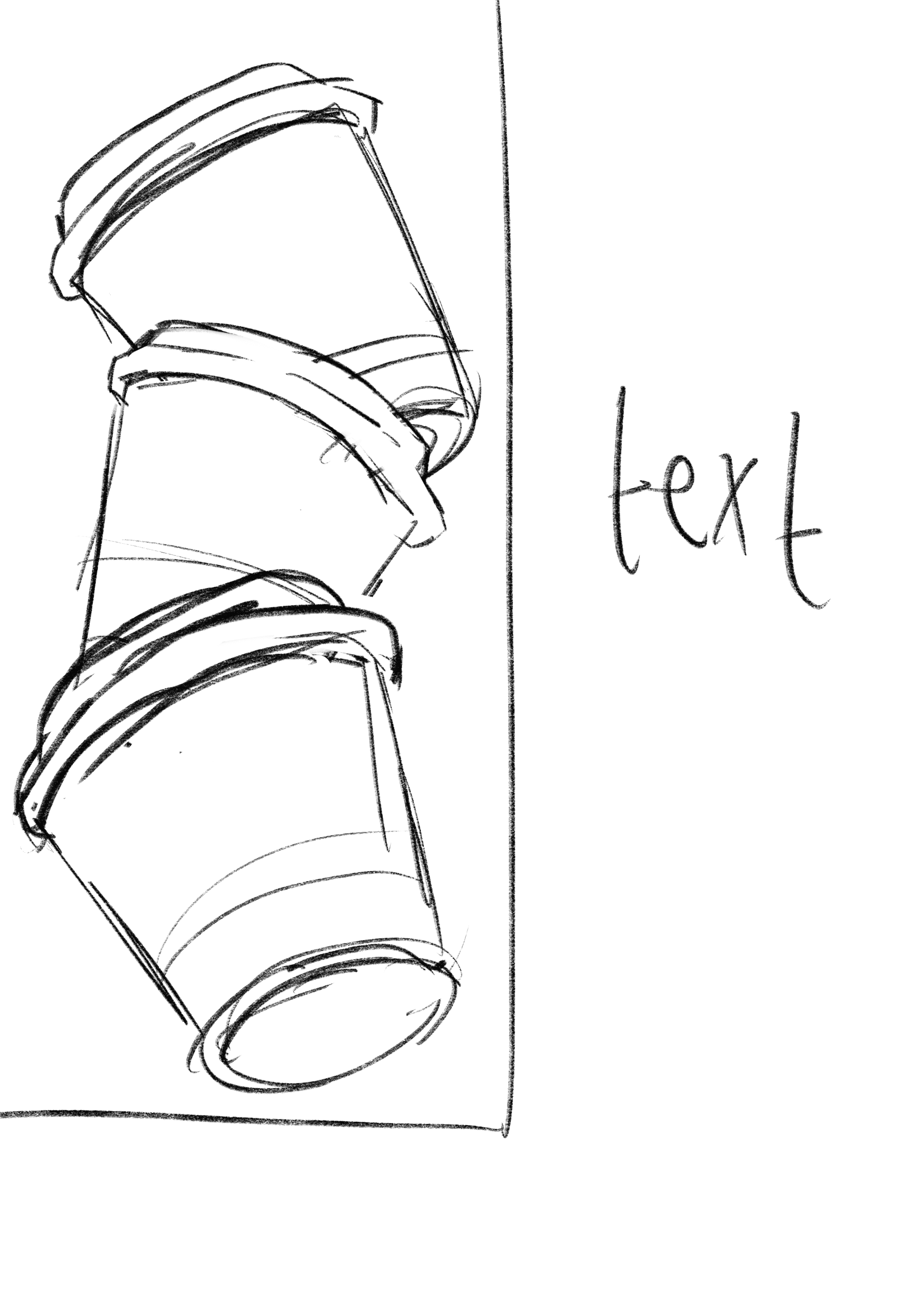
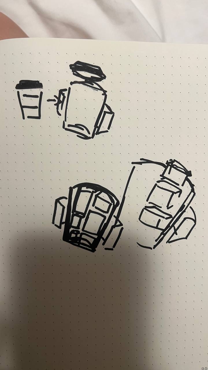
From Sketchbook to Screen:
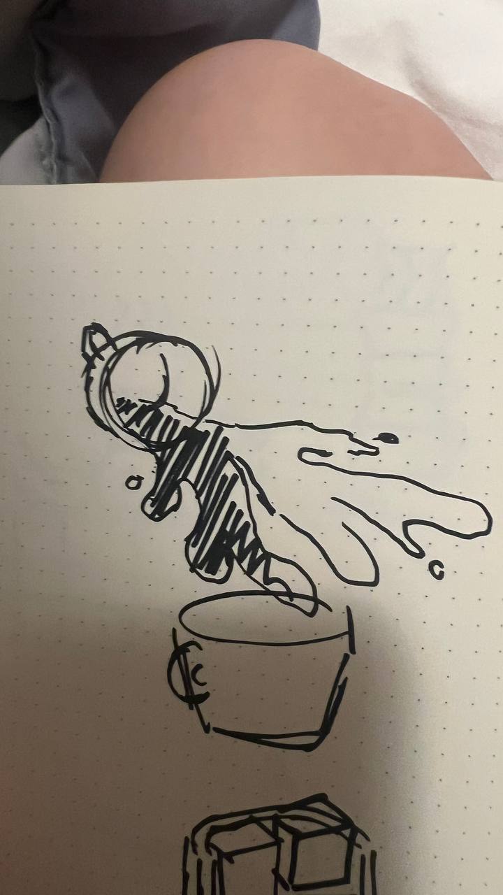
When I first created the cover, it honestly felt flat. The colours were muted, nothing stood out, and it didn’t really capture the vibe I was going for. That’s when I decided to go back to my journal and start sketching everything by hand, from scratch: doodles, animation ideas, supporting graphics — to figure out what felt right.
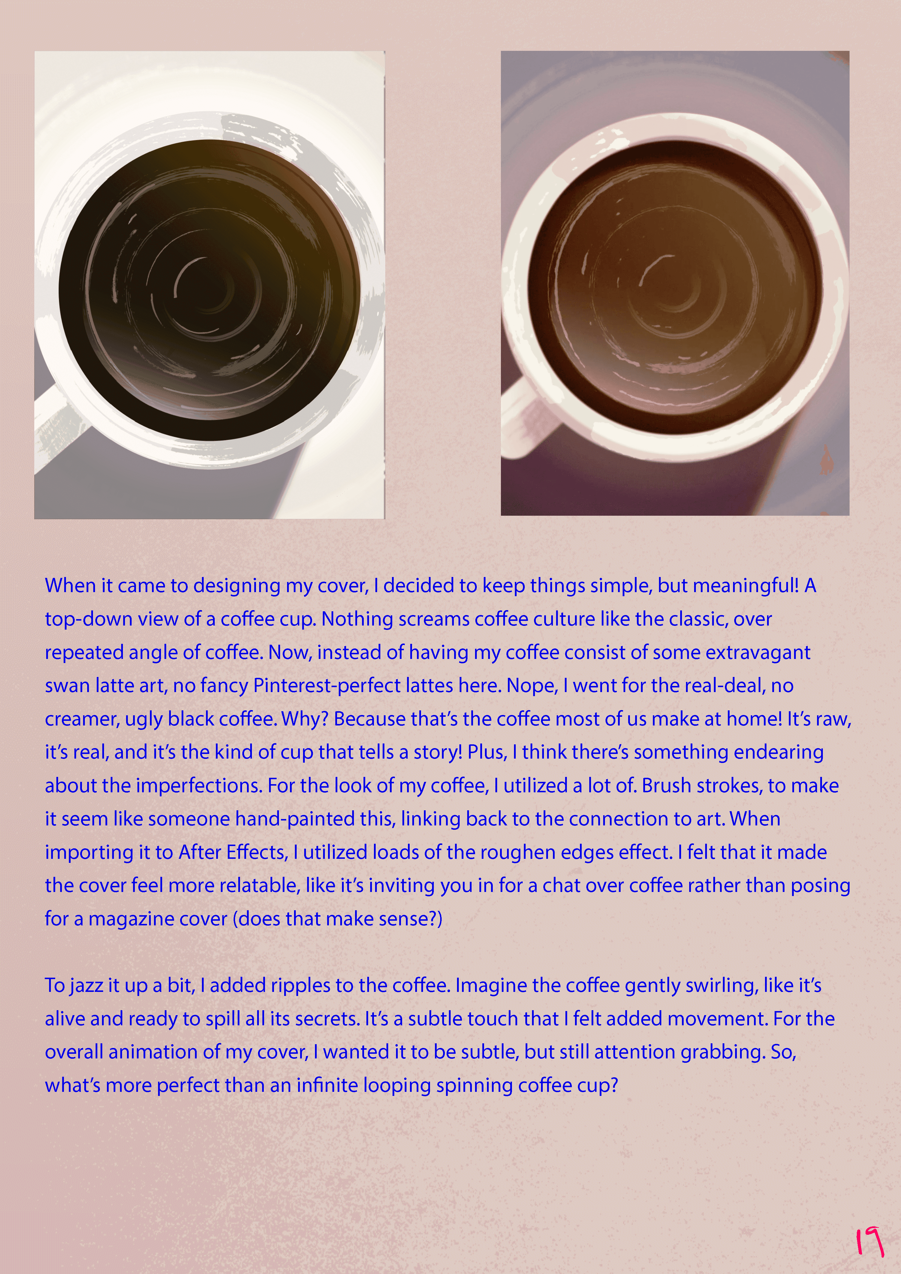
Once I had my sketches down, I translated them into Illustrator, refined the shapes, and added a sweet brush texture to it. I felt it captured the authenticity of the piece — recognising that coffee lovers are often also art lovers, and wanting to bridge that connection.
Typography & Color:
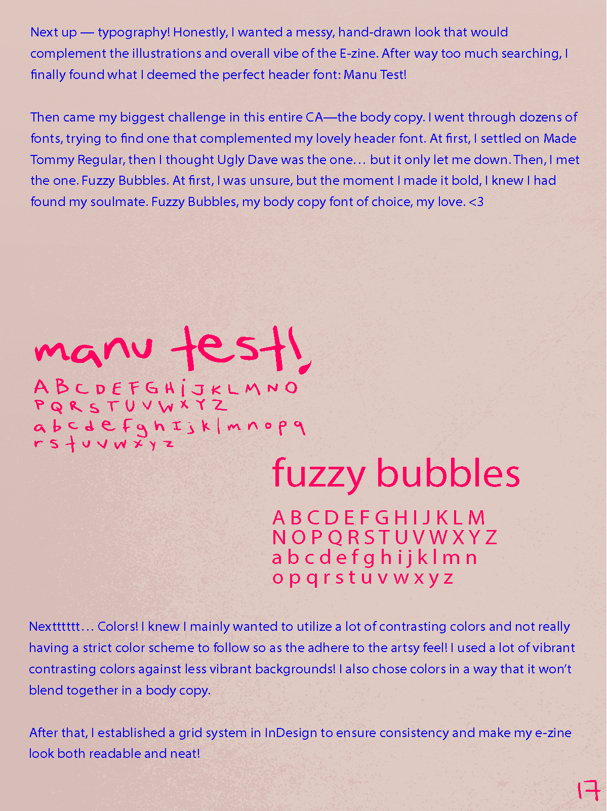
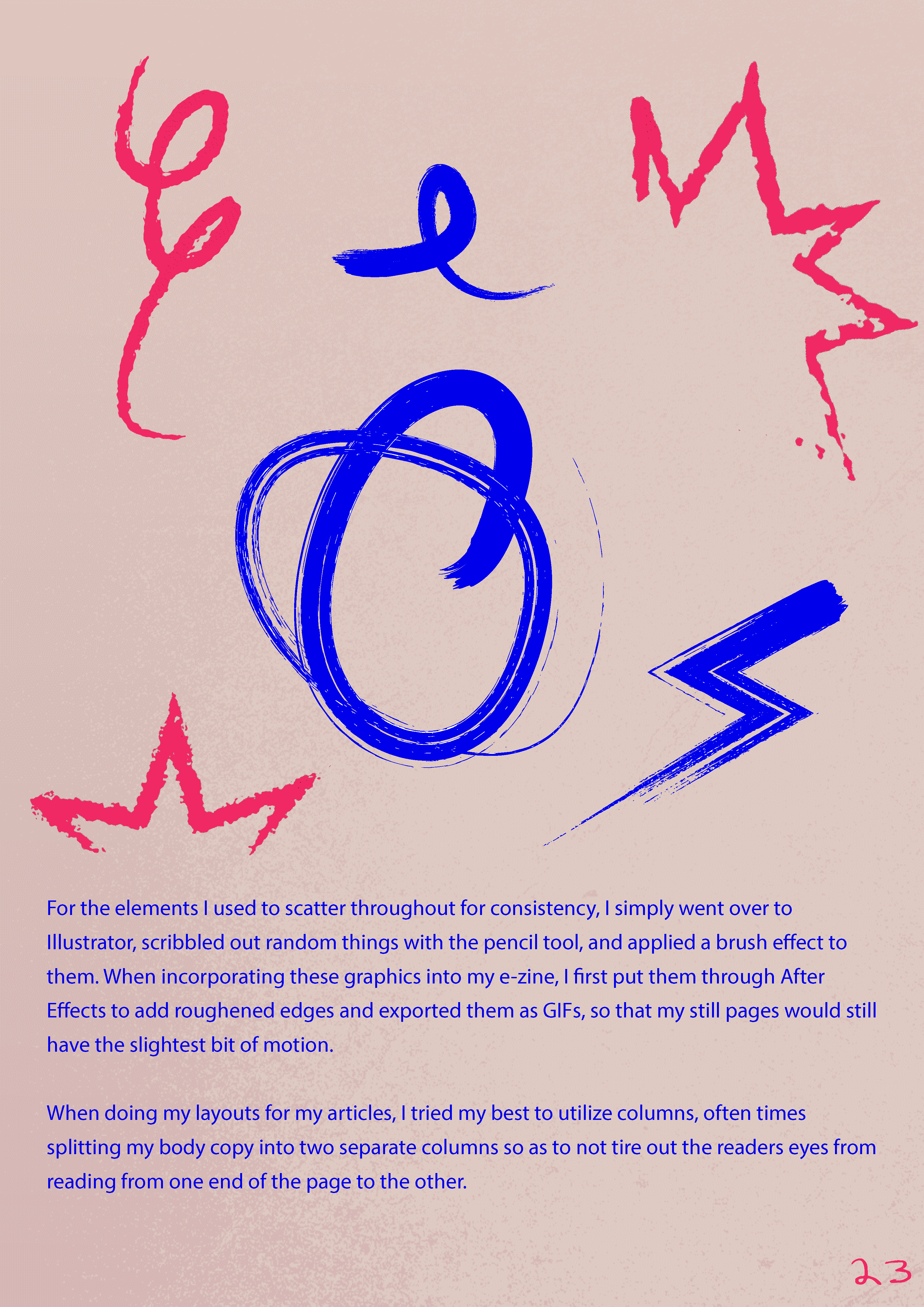
For typography, I picked Manu Test for headings and Fuzzy Bubbles for body text — both had personality but were still easy to read. I didn’t lock into a strict colour palette; instead, I let the contrast and layout guide the vibe of each page. The colours were vibrant, scattered, and intentionally a little unpredictable — kinda like caffeine itself.
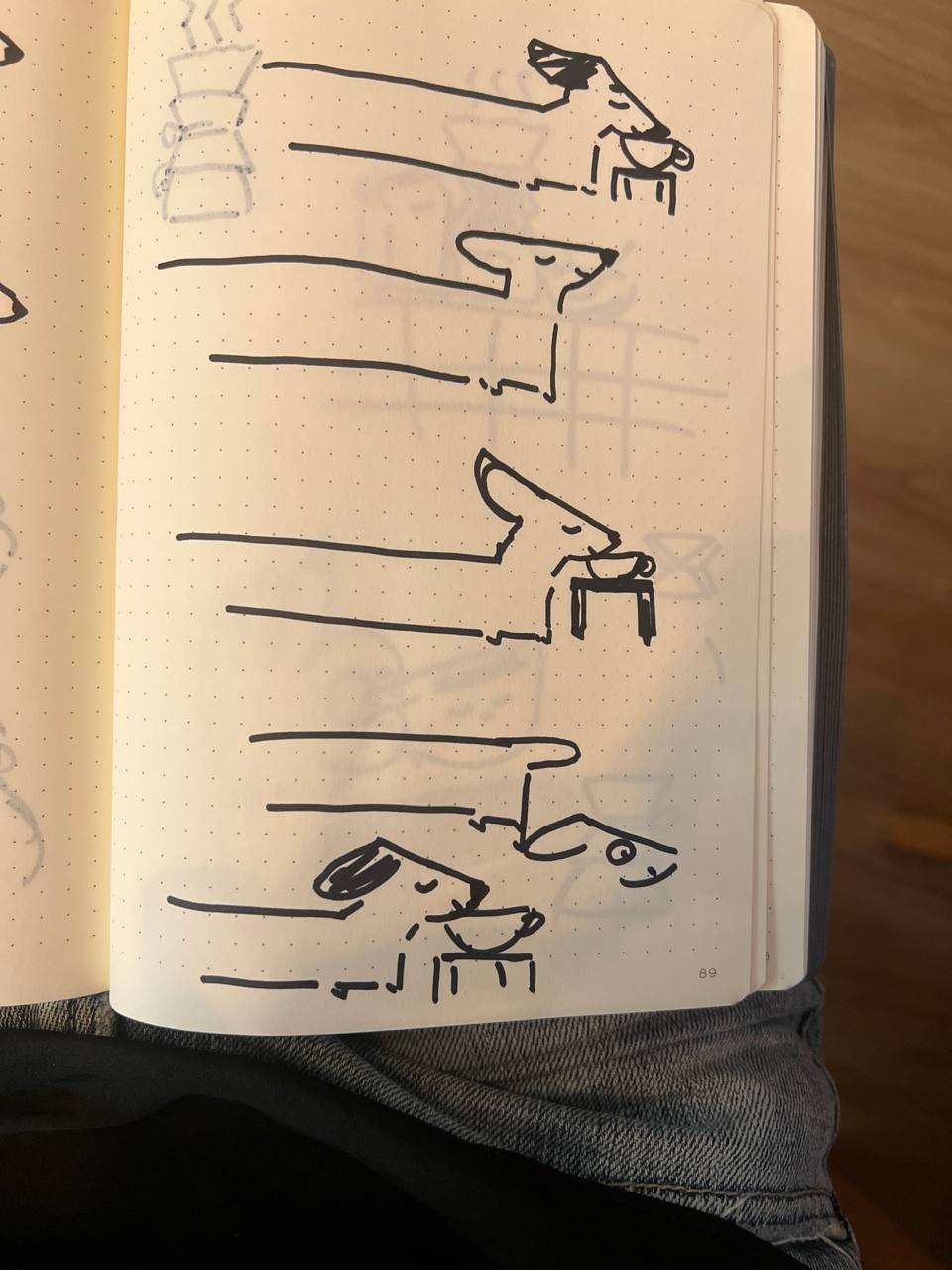
Animation & Motion:
Once the static visuals were locked, I moved everything into After Effects. I animated:
A looping spinning coffee cup for the cover
Scribbly hand-drawn icons that moved like they were alive
Gentle floating gifs across articles to create rhythm and flow
Each animation was short and sweet — more about adding energy than overwhelming the page.
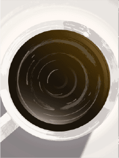
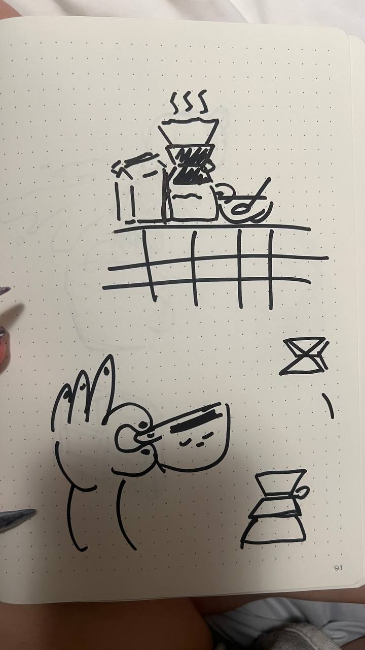
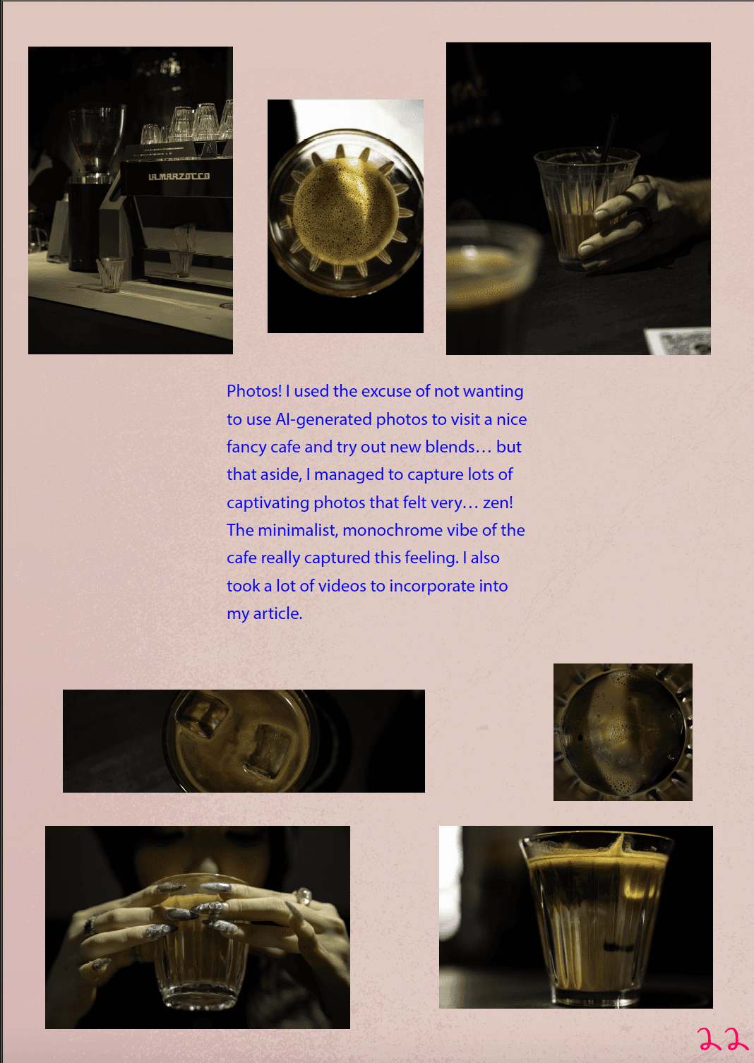
Photography & Illustration:
All photos were taken by me at a local cafes (aka an excuse to drink more coffee) — styled around clean setups, soft lighting, and warm tones. I kept everything minimal to give space for the animated graphics. The illustrations were all based on my original journal sketches, later vectorized and brought to life with motion. I wanted the final zine to feel handmade, playful, and full of texture.
the outcome
what i managed to deliver.
my final e-zine! (do give it time to load)
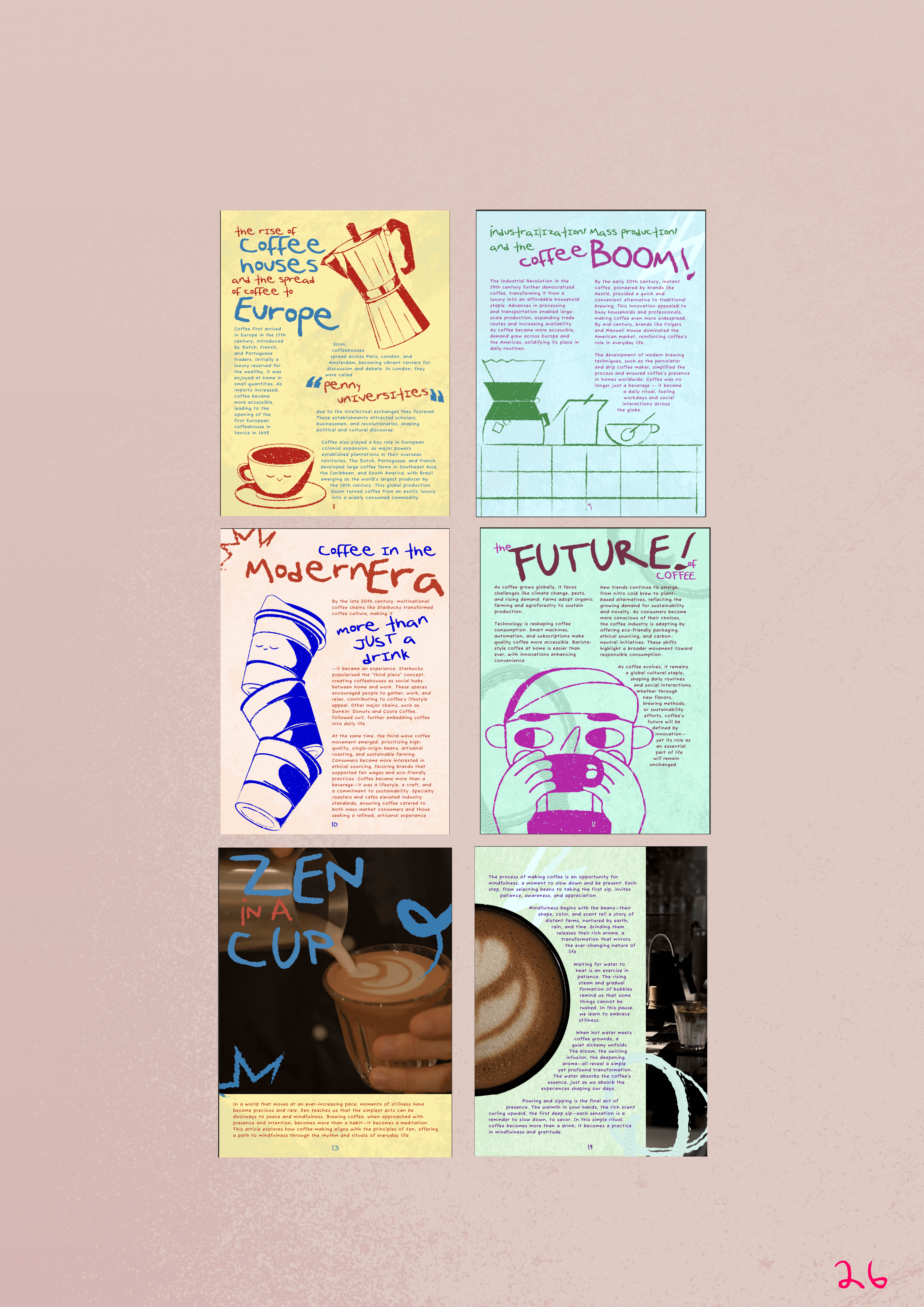
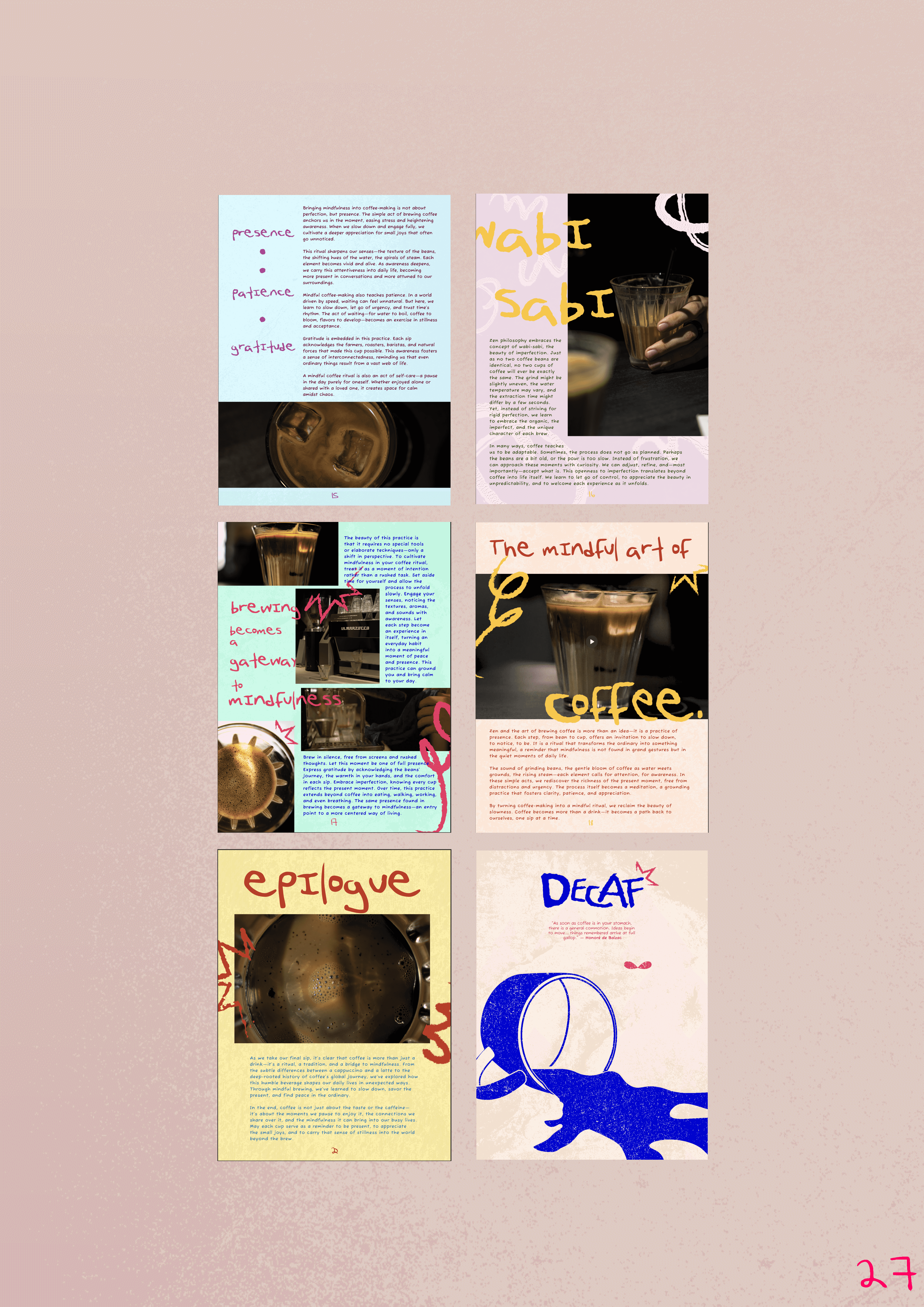
The final DECAF e-zine is a fully interactive digital magazine, complete with:
A bold, customized masthead with unique typographic treatment
3 original articles, each with their own visual style and layout approach
Animations, illustrations, and interactive features that bring each section to life
Custom animated illustrations
Stylised photography and hand-crafted visual accents
A cohesive layout system using columns, white space, and structured hierarchy
Even though the content was fun, the real focus was on visual storytelling — using design, type, motion, and emotion to guide the reader through a playful and calming experience.
the troubles
what almost ruined it — and how i pushed through.
my planning + my old cover page
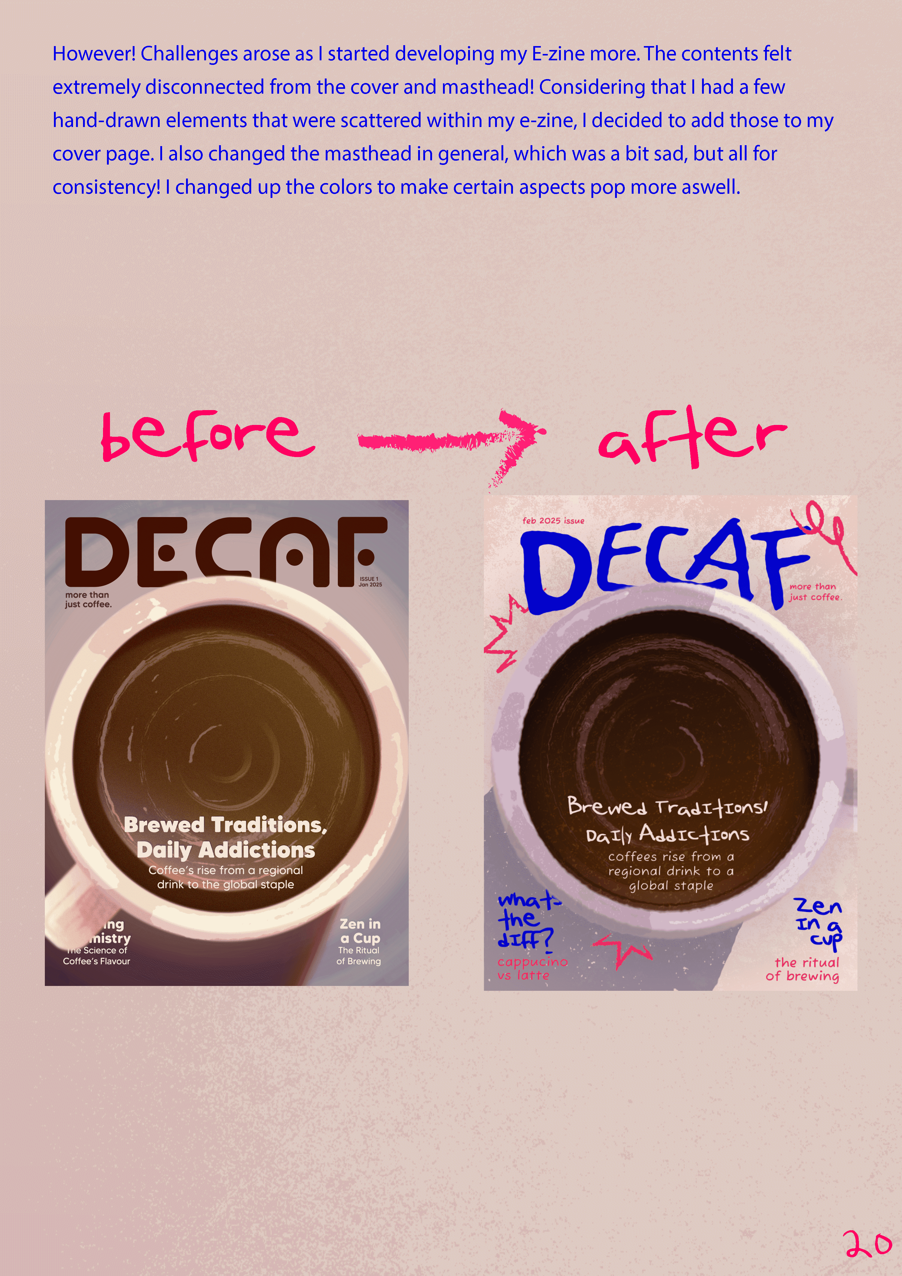
Two things gave me the most grief: layout and consistency. Getting the visuals to feel unified across illustration, photography, and animation was way harder than I expected. At one point, the cover looked like it belonged to a totally different project — so I went back, added hand-drawn elements, and even redesigned the masthead to bring everything back together.
There was also a lot of experimentation with animation loops. Making them seamless and non-distracting while still adding character took trial and error (and lots of hours in ae…)
It was honestly a really stressful time — I did my best to plan everything out and kept going back to make all the necessary tweaks to get things just right.
the takeaways
what i learned; and what i plan to do differently.


my creative process journal (for a deeper insight into this project!)
This project taught me that design doesn’t always have to be polished to be powerful. Sometimes, letting your visuals feel hand-drawn, loose, or a little “off” actually makes it more human. I also learned how motion and layout can work together to guide emotion — when used right, they help tell a story without needing many words.
Next time, I’d give myself more time to refine animations and maybe build in more playful user interactions. But overall, DECAF feels like me — quirky, caffeinated, and full of love for the little things.