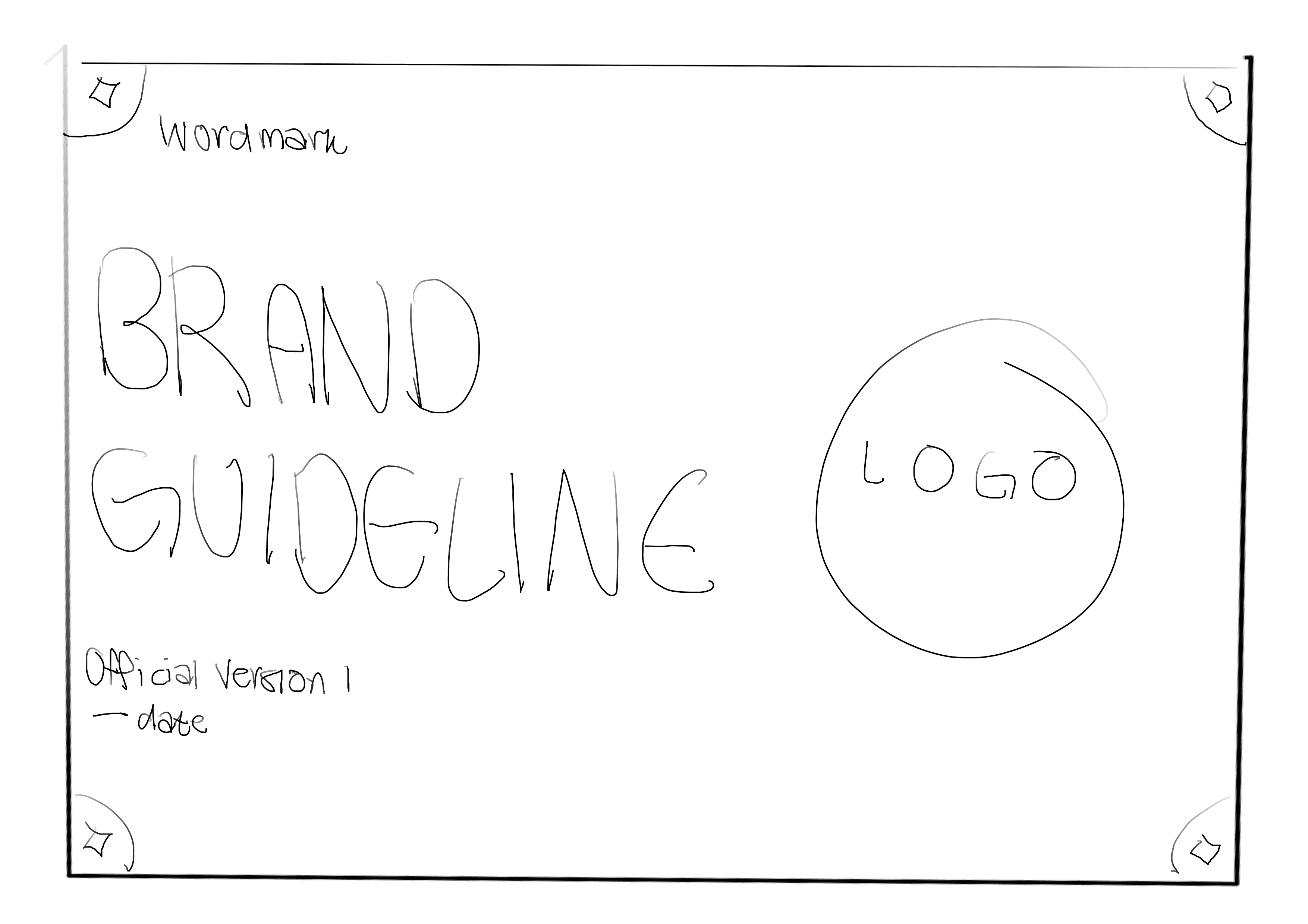
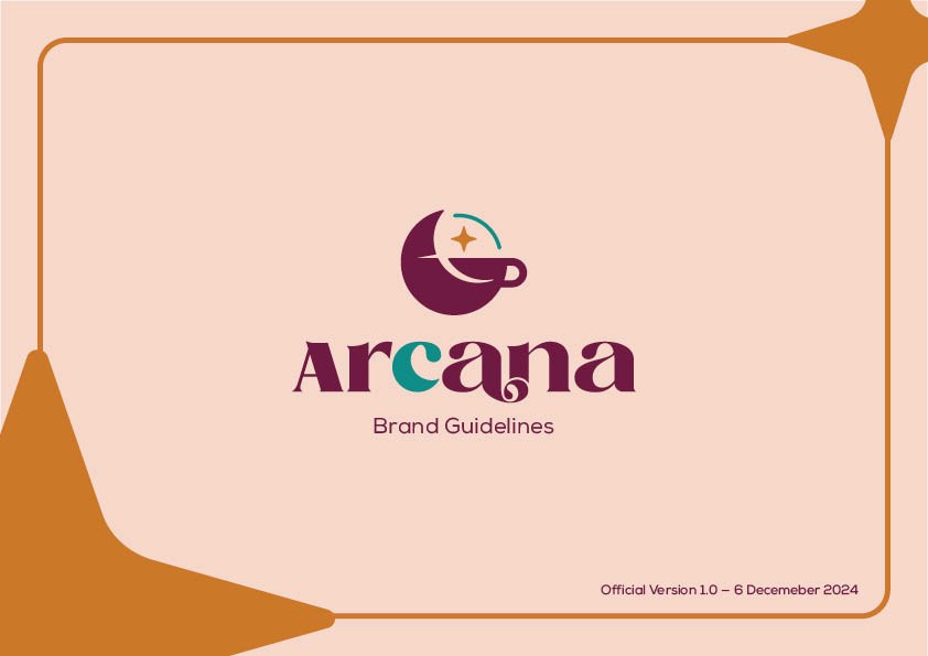
arcana — brand guidelines
the process.
the idea
what i set out to create.
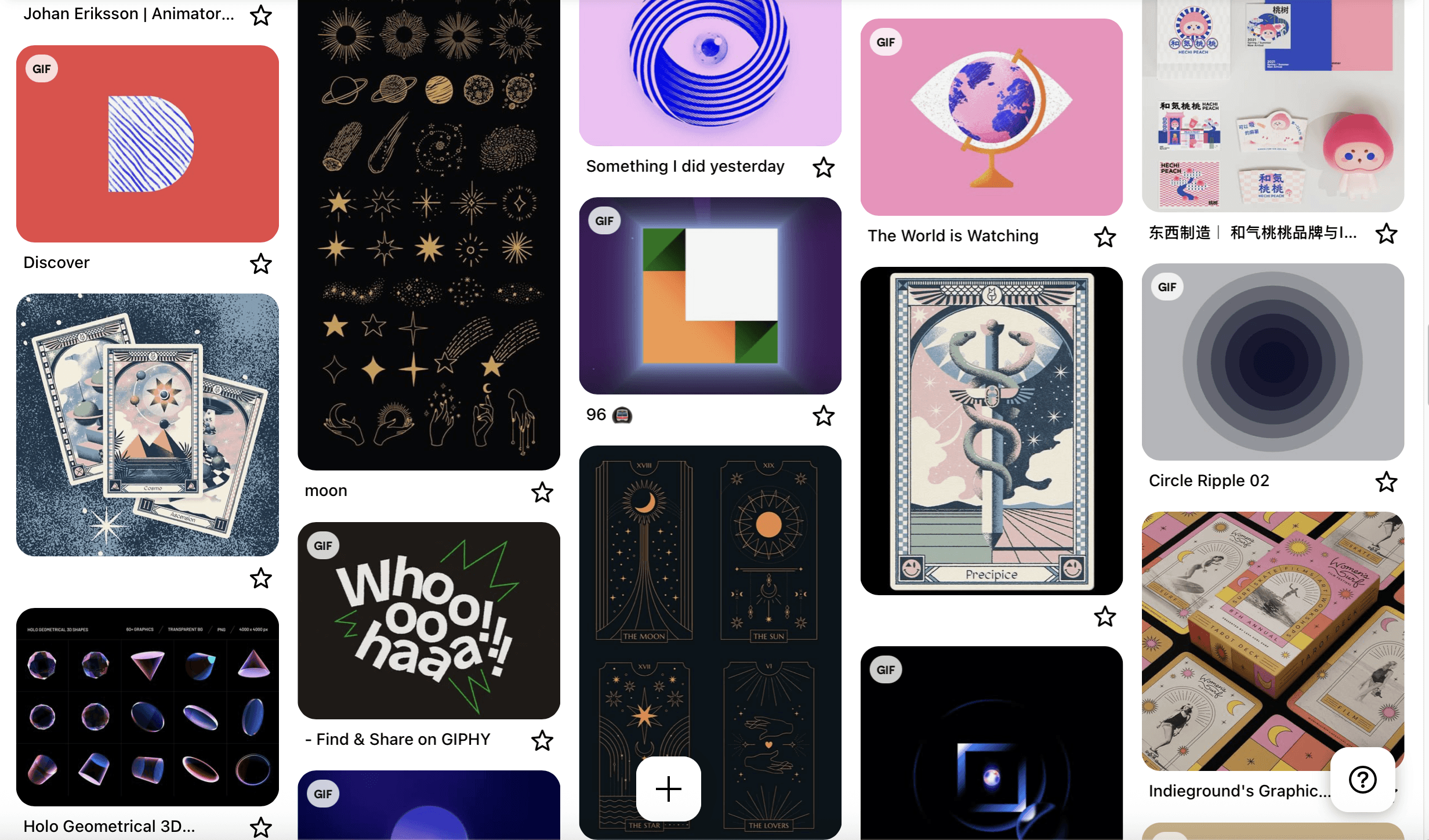
have a look at some fan edits that i made at 13 - 14!
As someone with a borderline obsession with coffee and whose main goal in life is to set up her own cafe, this project instantly got me excited. I was given full creative freedom to build my own cafe brand from the ground up — and not just the visuals, but the whole identity: the name, vibe, personality, and even the little details that would go into a full brand guideline.
I started off with a few fun ideas:
A terrarium workshop café, combining plants and pour-overs
A retro arcade café, perfect for chill games and caffeine fixes
And finally, a mystical, tarot-inspired café — which instantly felt the most me
That’s how Arcana came to life.
Arcana isn’t just about good coffee (though of course, it has that too) — it’s about creating a cozy, magical space where people can slow down, reflect, and maybe find a bit of wonder in their everyday. I was inspired by little moments of calm and curiosity — walking through Haji Lane and stumbling upon tarot readers tucked between shops. It made me want to design a place that felt both mysterious and welcoming.
The goal was to make something that’s not too wow!, but still leans into that dreamy, introspective vibe — fortune cards, astrology-themed drinks, soft lighting, and a wall where people can leave behind their wishes or intentions.
Once I chose the name Arcana (inspired by the major arcana tarot cards), everything just fell into place. The branding direction came naturally: a soft but bold logo, a rich color palette, a mystical little black cat mascot named Trinity, and a design system that all worked together to bring this weird little world to life. Arcana became more than just a café idea — it turned into a space that I dreamed of.
the process
from brainstorms to building blocks.
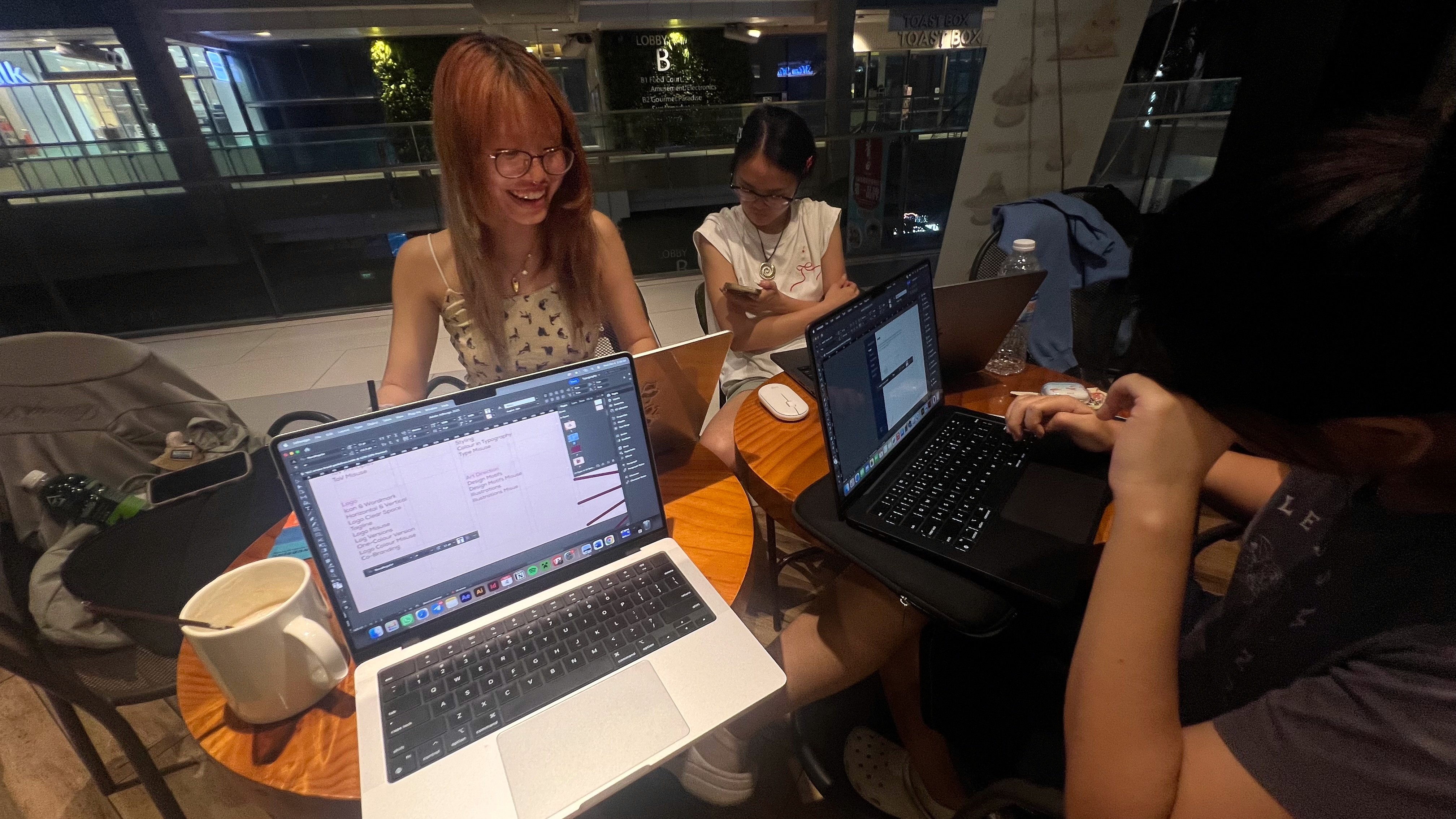
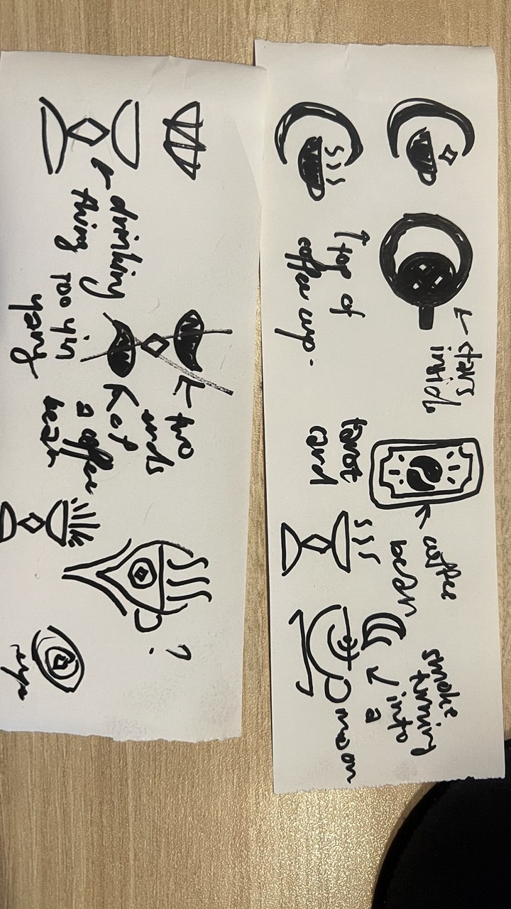
me doing work at coffeesmith at 3am with friends! + sketches of my initial designs
The first step was building the foundation — defining Arcana’s tone, personality, and purpose. My vision for the brand was simple:
A place of reflection and discovery, where every cup brings a little insight.
I built everything around the brand’s core voice: welcoming, curious, and authentic. I also based Arcana’s tone on the Magician and Sage archetypes — wise, imaginative, and a little mysterious.
I explored spiritual cafés, existing tarot designs, and visited cozy café spots for visual inspiration. From this, I created moodboards, drew early logo drafts, and started forming Arcana’s identity — built on gentle textures, celestial symbols, and a sense of inner calm.
Along the way, I asked: How can a café be more than a place to drink coffee?
Arcana became the answer to that.
the making
bringing it all to life.


me doing what i love!
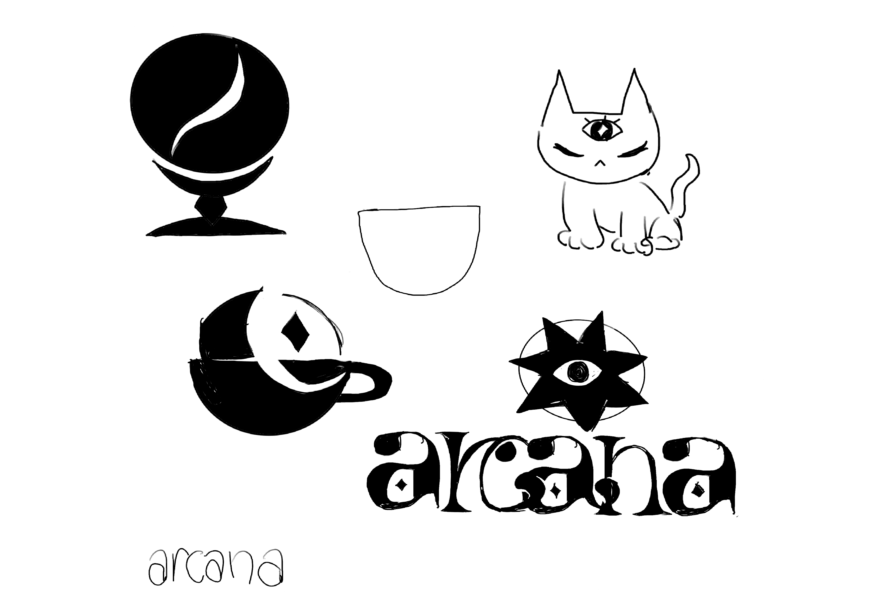
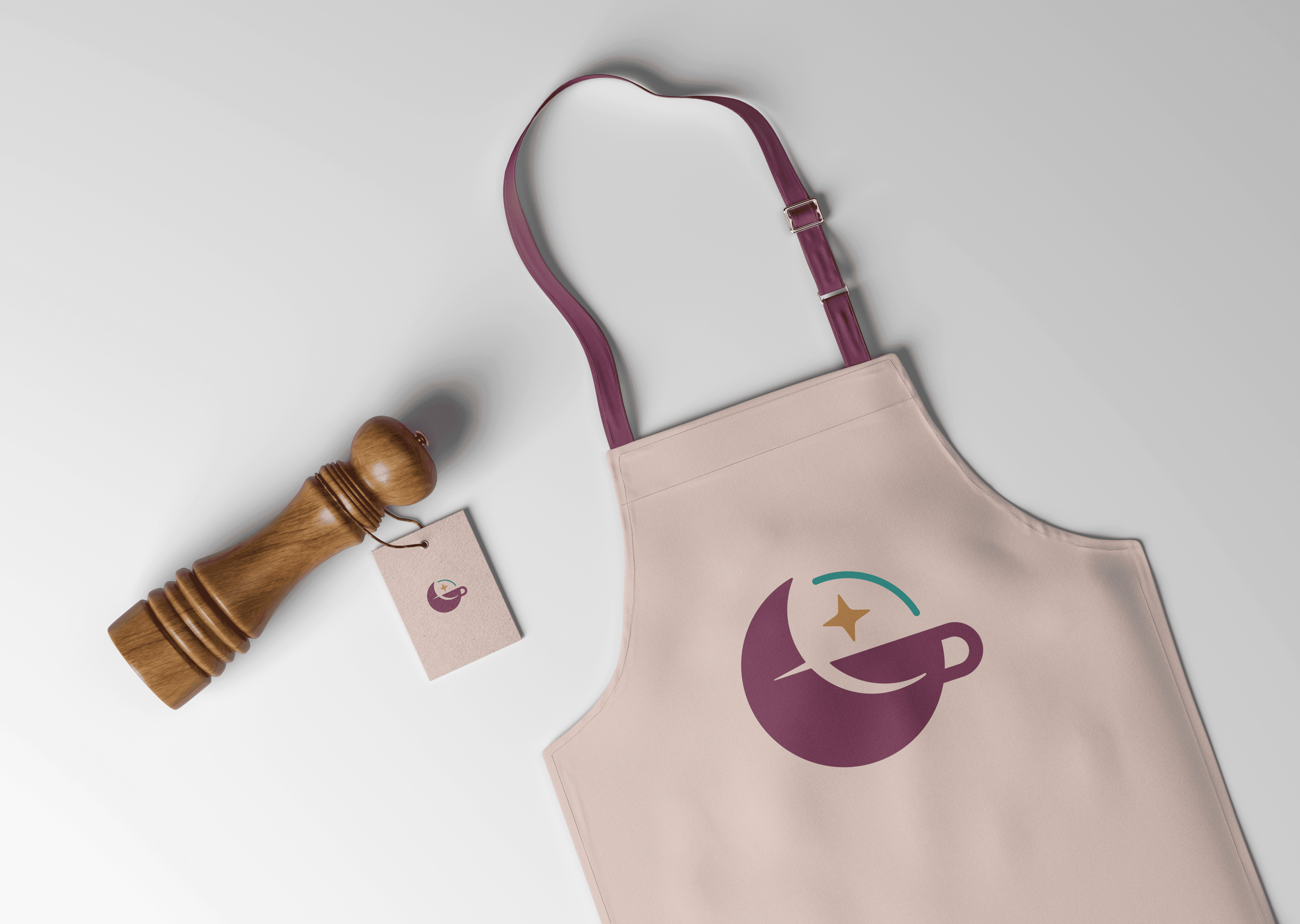
Logo System:
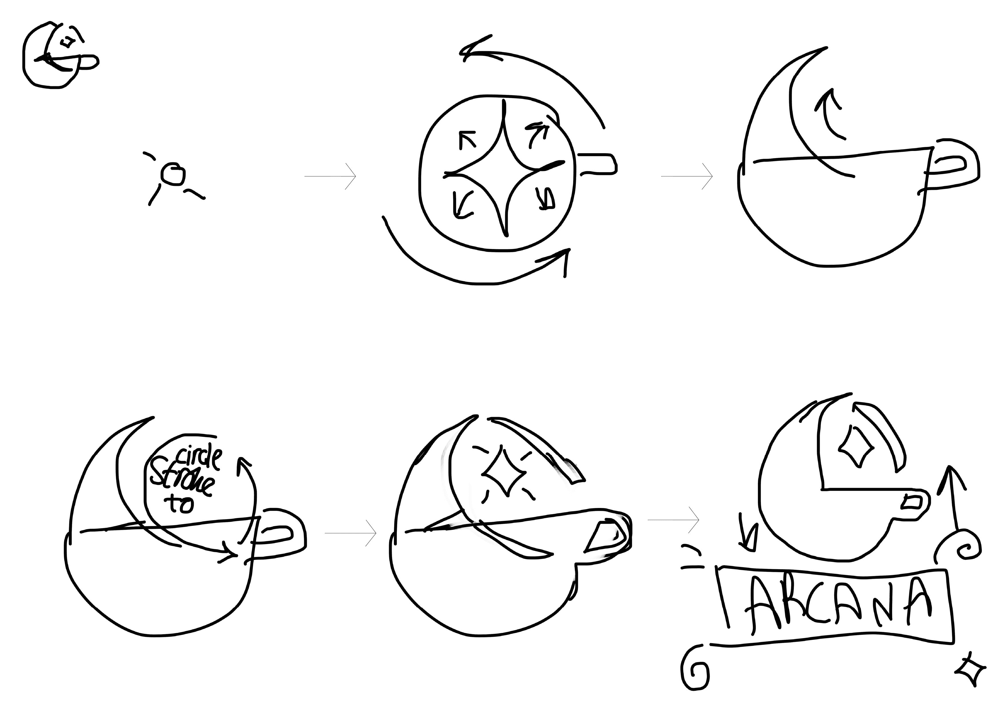
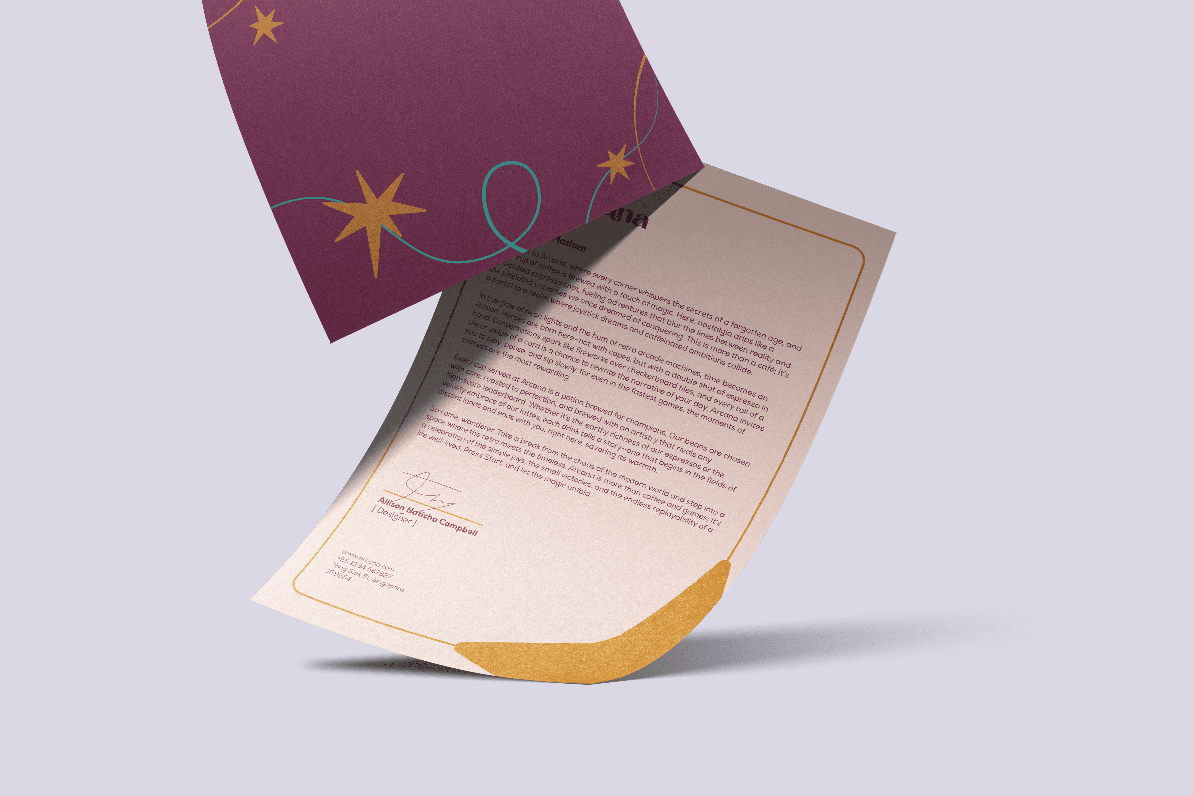
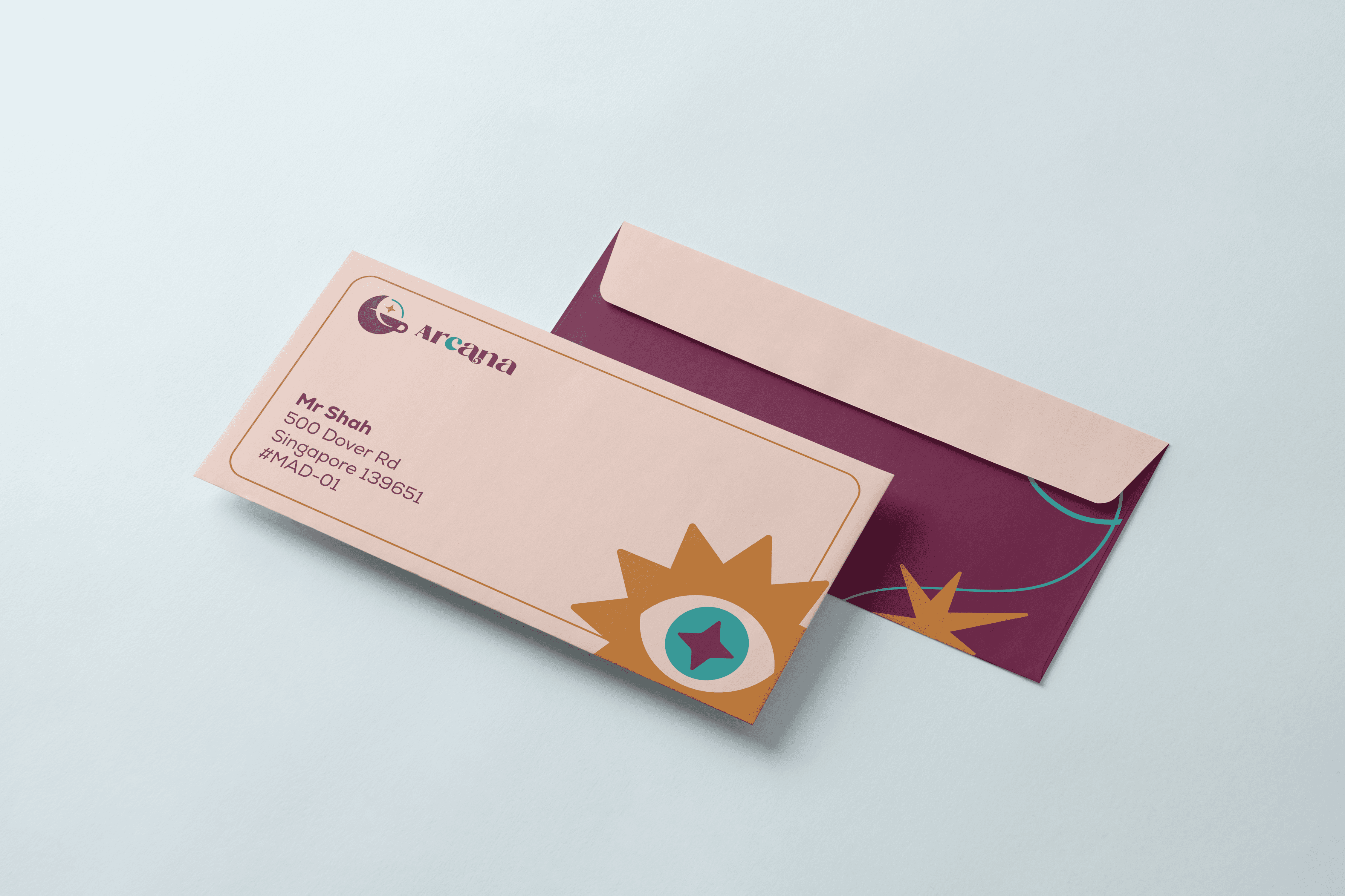
I designed a crescent-moon coffee cup icon paired with a balanced, serif wordmark. The logo had to feel simple but symbolic, and still scale well across small formats like stickers and tags.
I built out:
Horizontal, vertical, and stacked lockups
Light/dark usage versions
Clear space and misuse rules
Tagline integration and dual-branding options
Color & Typography:
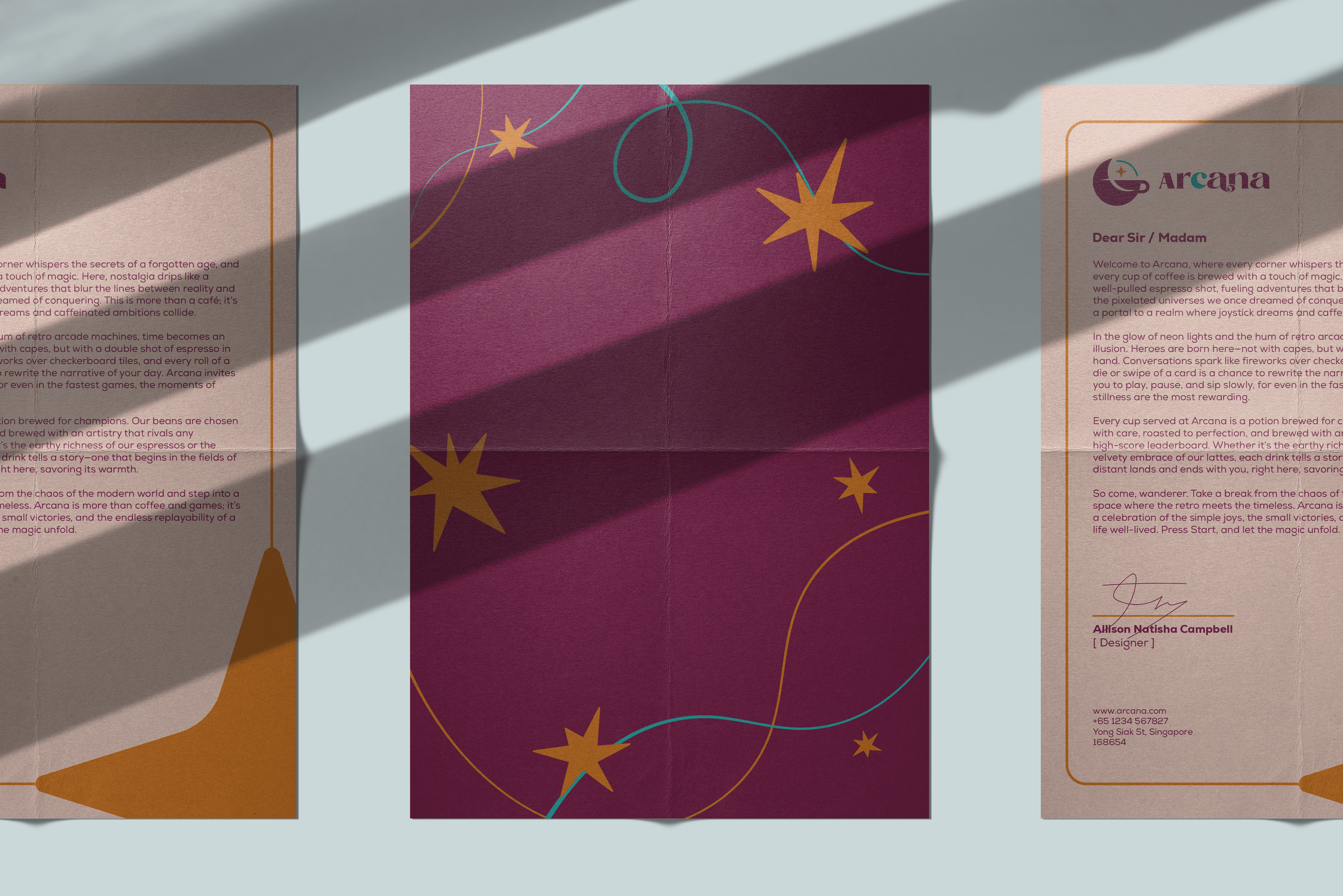
Arcana’s palette balances softness with contrast:
Pale Dogwood – gentle, airy base
Tyrian Purple – rich and dreamy
Ochre & Dark Cyan – provide grounding and accent
Eerie Black – adds depth and clarity
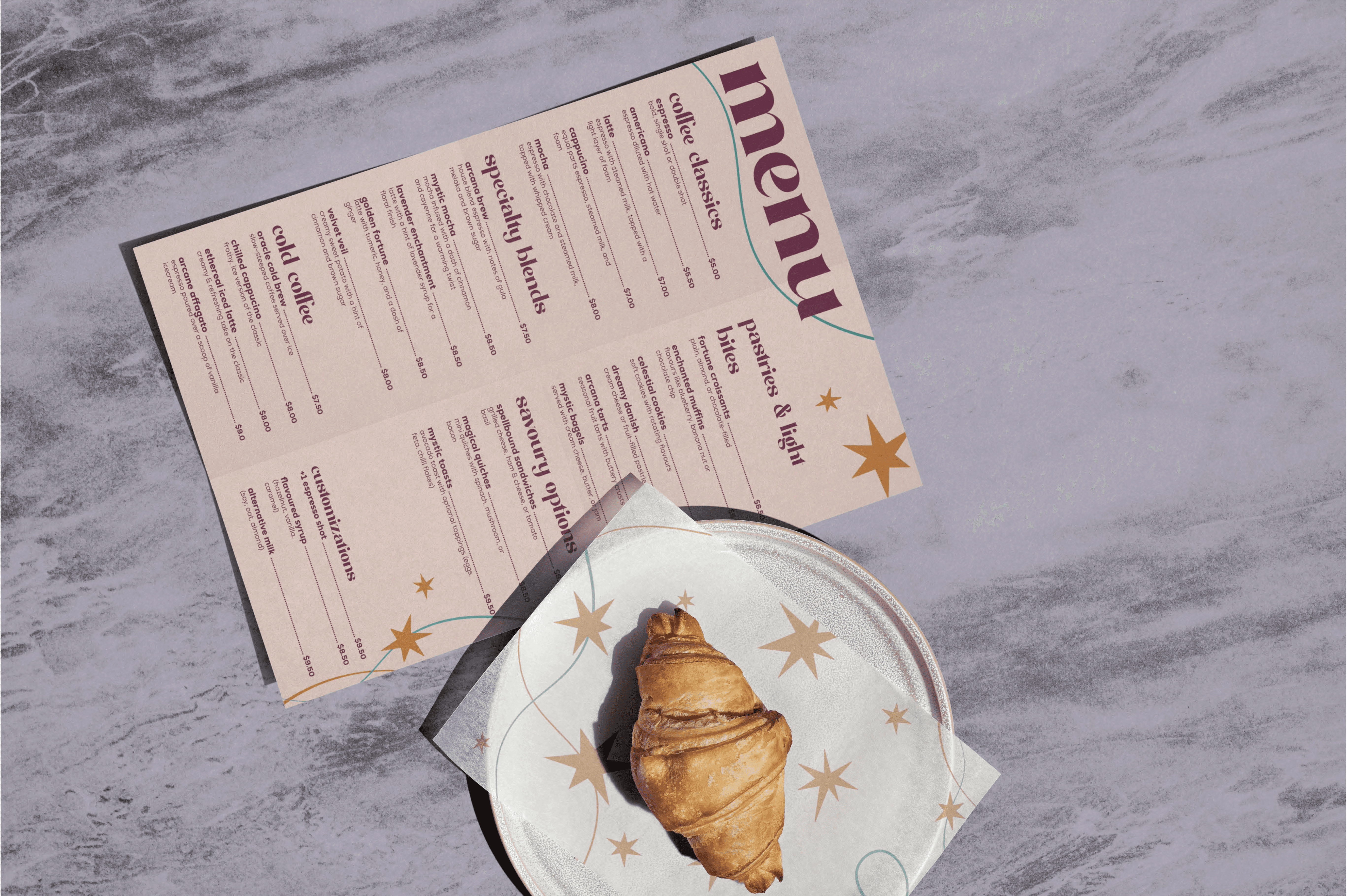
For type, I used Comfort Roads for titles (elegant, a little magical) and Nexa for body (modern and readable), with web-safe backups documented
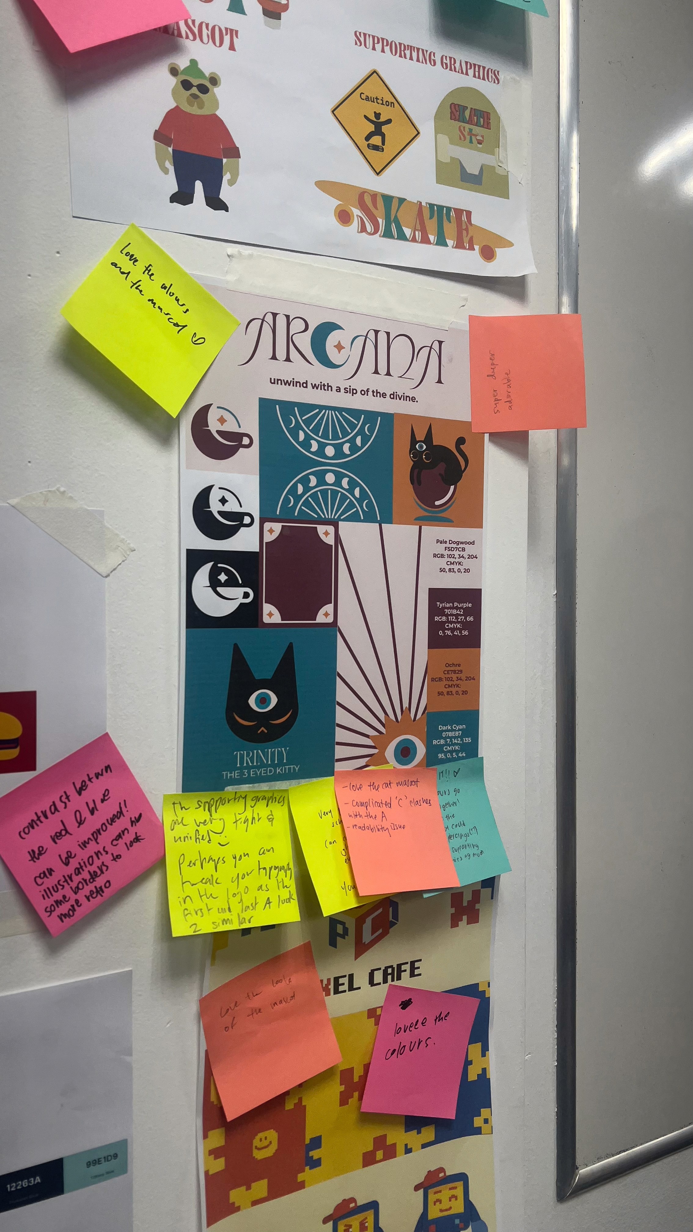
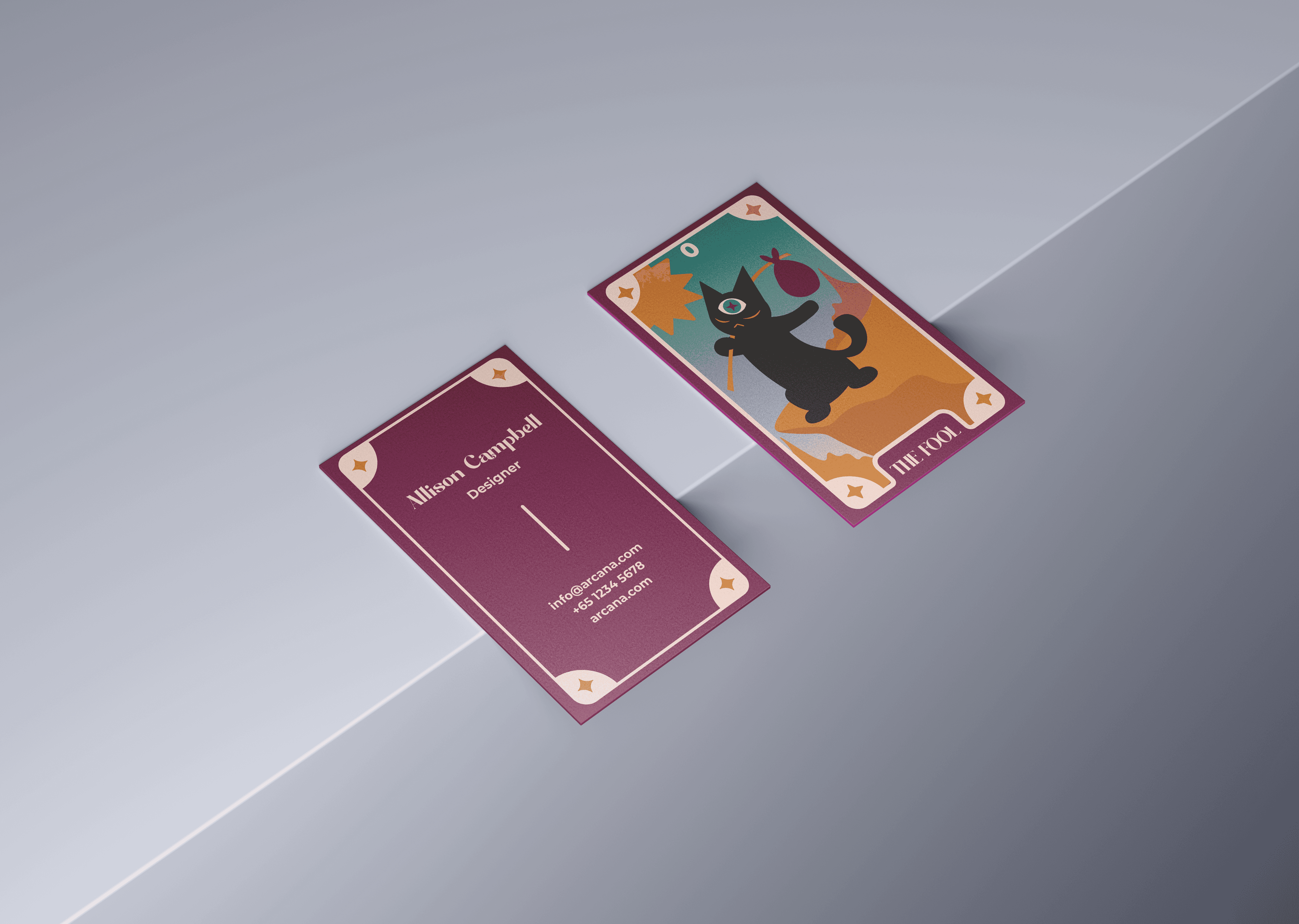
Mascot: Trinity:
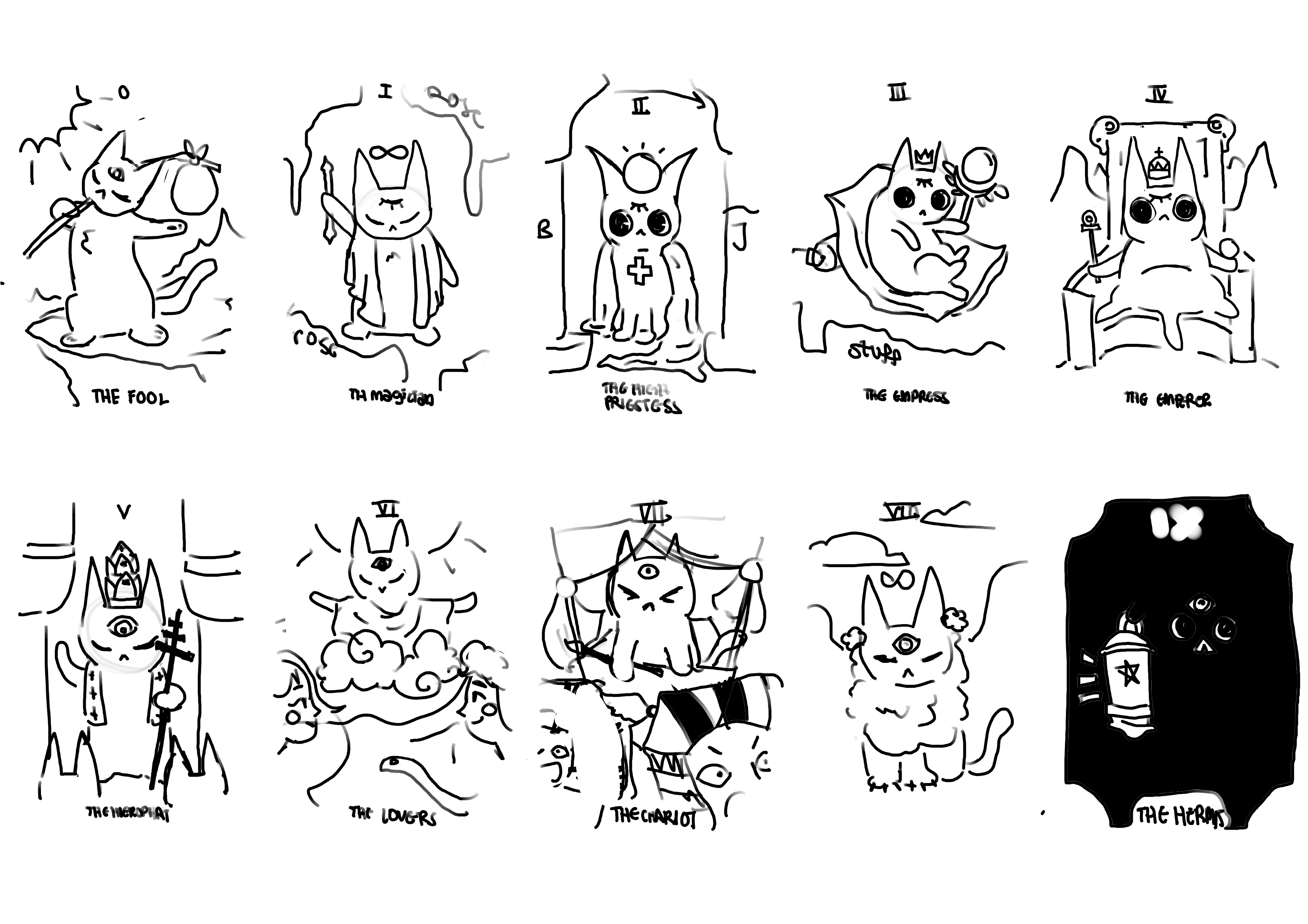
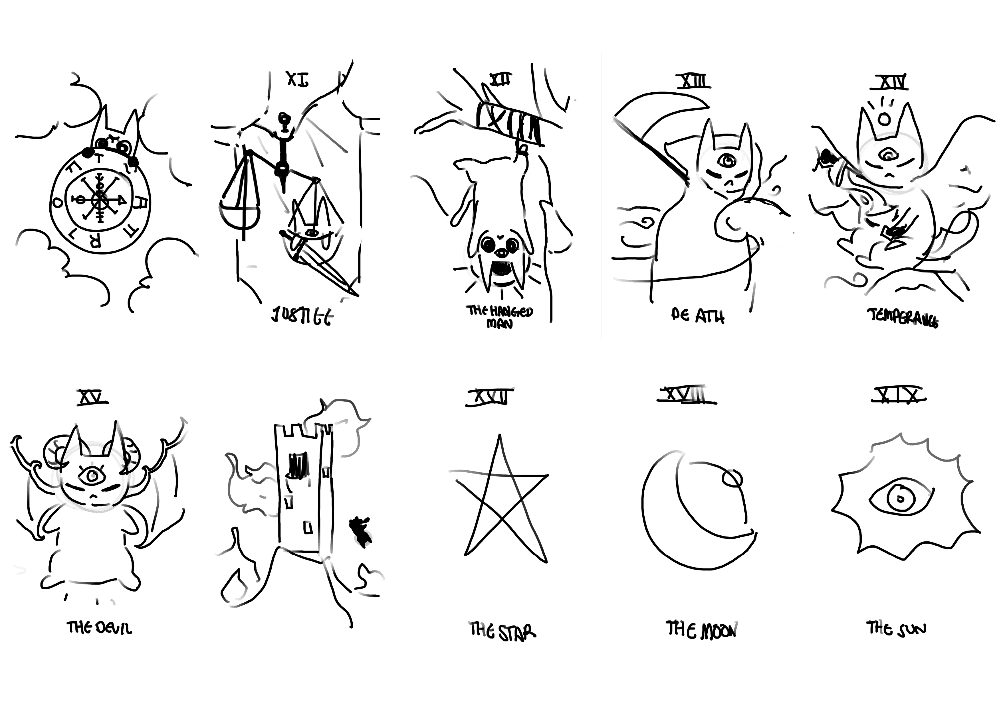
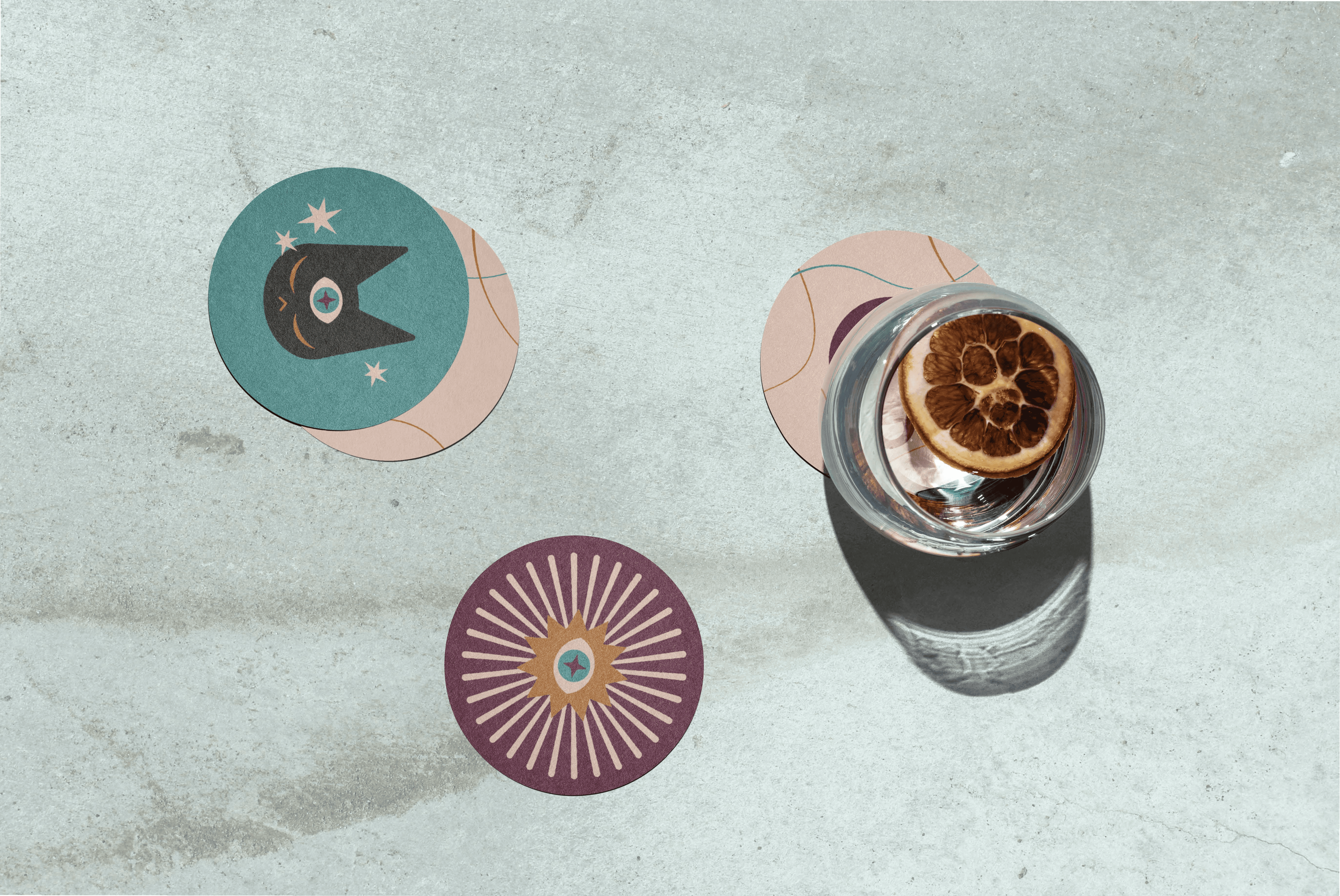
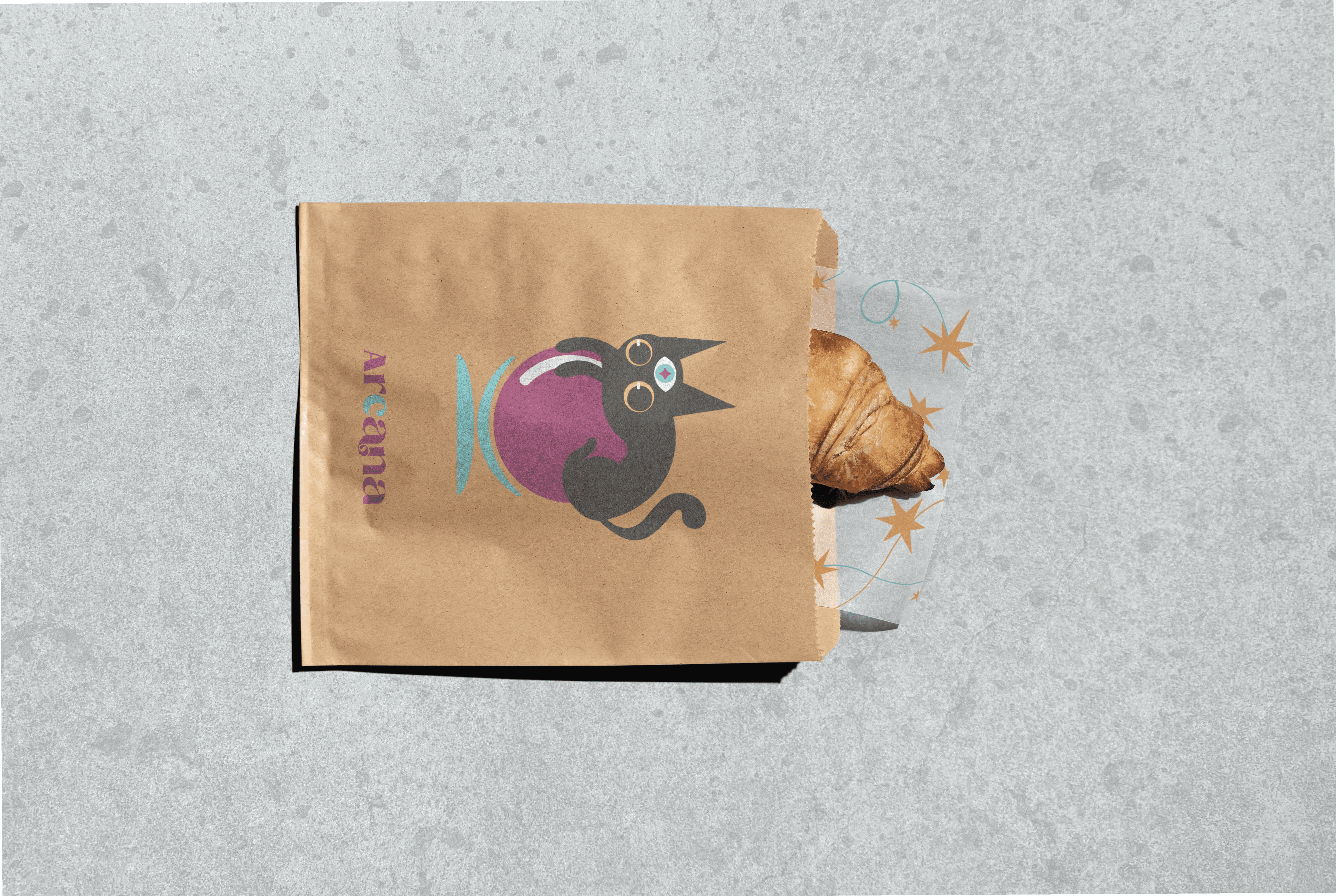
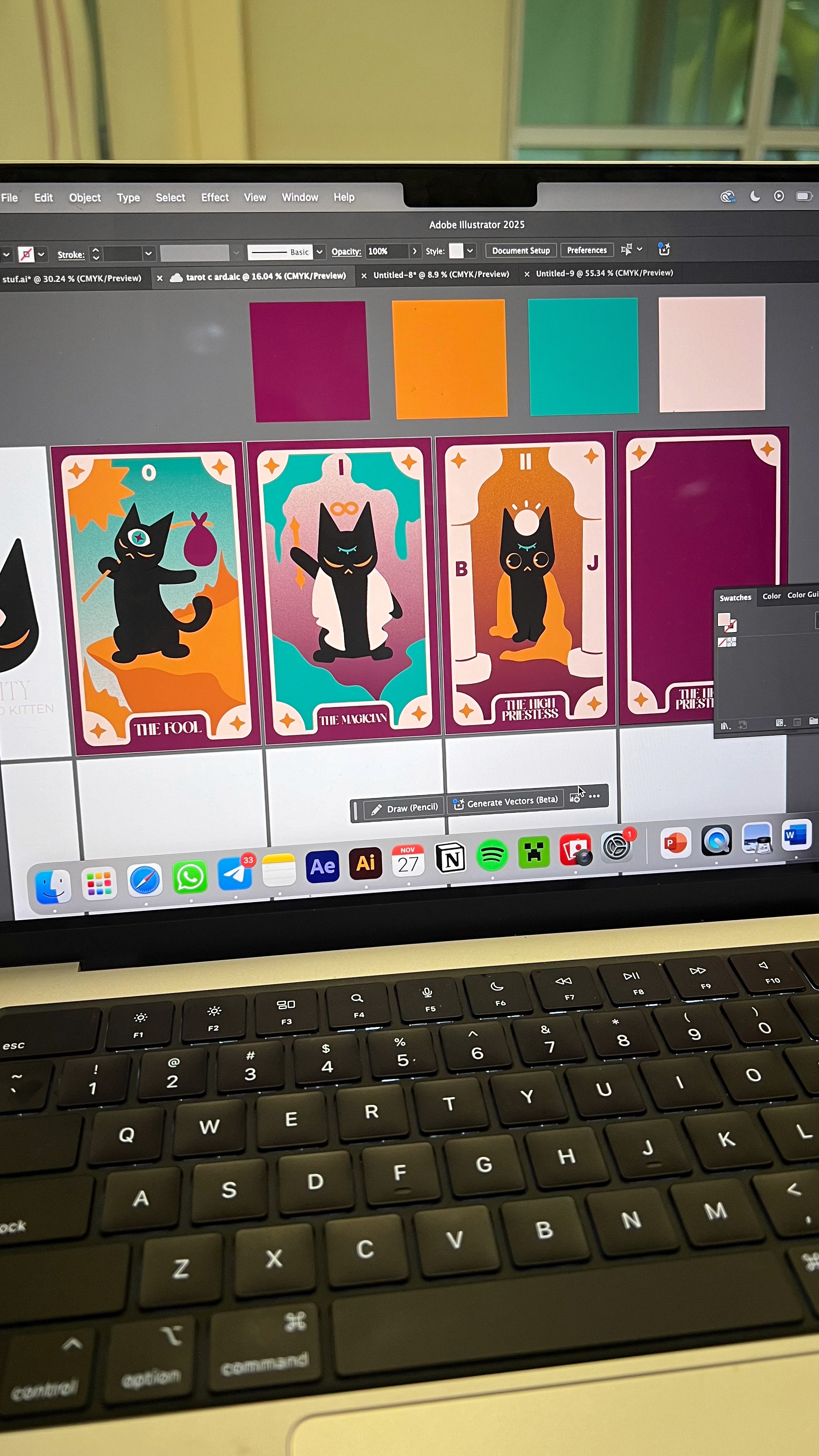
Trinity — Arcana’s mystical three-eyed cat — became the heart of the brand. Her design evolved through multiple sketches and now appears on the tarot card collection, packaging, stickers, and merchandise. She adds soul, personality, and storytelling charm.
Supporting Graphics:
Arcana’s visual system includes:
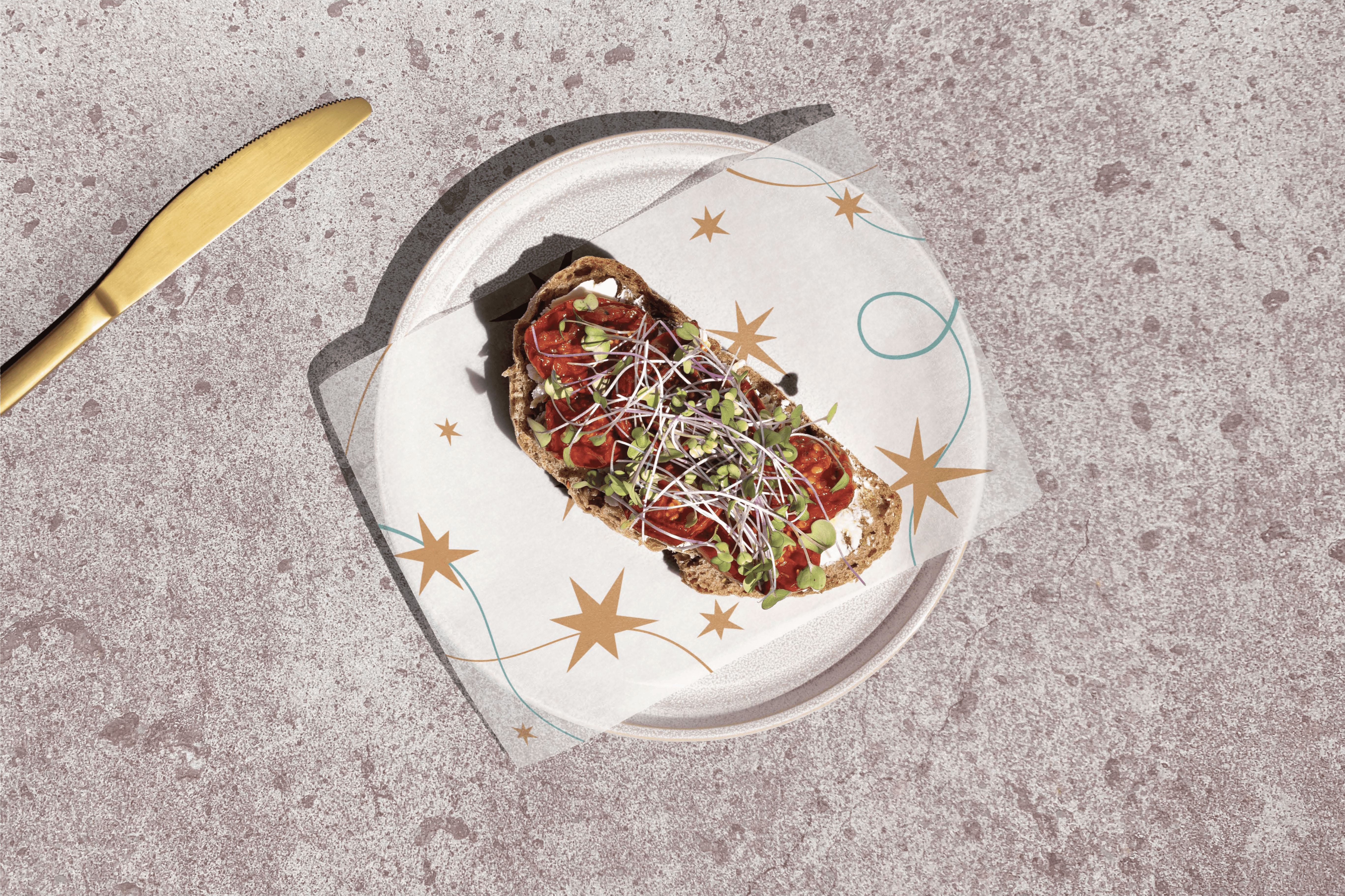
Floating sun-eyes, doodled stars, and minimalist tarot iconography
Gradient overlays and dreamy, layered textures
A 8/22 -card Major Arcana set, each featuring Trinity in a different role (due to the lack of time provided in this project, only 8 out of the 22 major arcana cards were completed)
Brand Applications:
I applied the brand across:
Business cards as collectible tarot cards
Letterhead and envelope designs
Takeaway bags, wax paper, and café coasters
Café uniforms and signage
• • Menus that reflect the brand tone and style hierarchy
the outcome
what i managed to deliver.
me doing what i love!
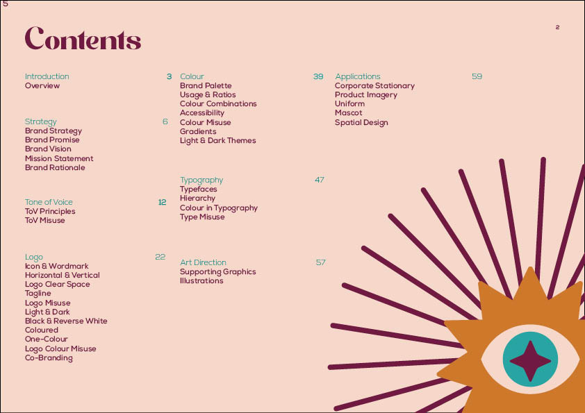
The final product was a 68-page brand guideline that documented every detail of Arcana’s identity
Key highlights included:
Core brand strategy (brand promise, voice, personality, archetypes, mission, tone)
A full logo system with variations, rules, co-branding layouts, and misuse examples
Defined color palette with HEX, Pantone, CMYK, gradient usage, and accessibility tips
Typography system including hierarchy, web-safe alternatives, and usage guidelines
A rich visual system of custom symbols, icons, and branded patterns
Mascot guidelines for Trinity, including use cases and styling
Real-world brand applications across envelopes, business cards, uniform, and classic cafe material
Full documentation of graphic elements, design rationale, and tone guidance
It’s a complete brand identity toolkit — something that could be handed off to a clueless design team, and they would know exactly how to keep Arcana’s magic alive.
the troubles
what almost ruined it — and how i pushed through.
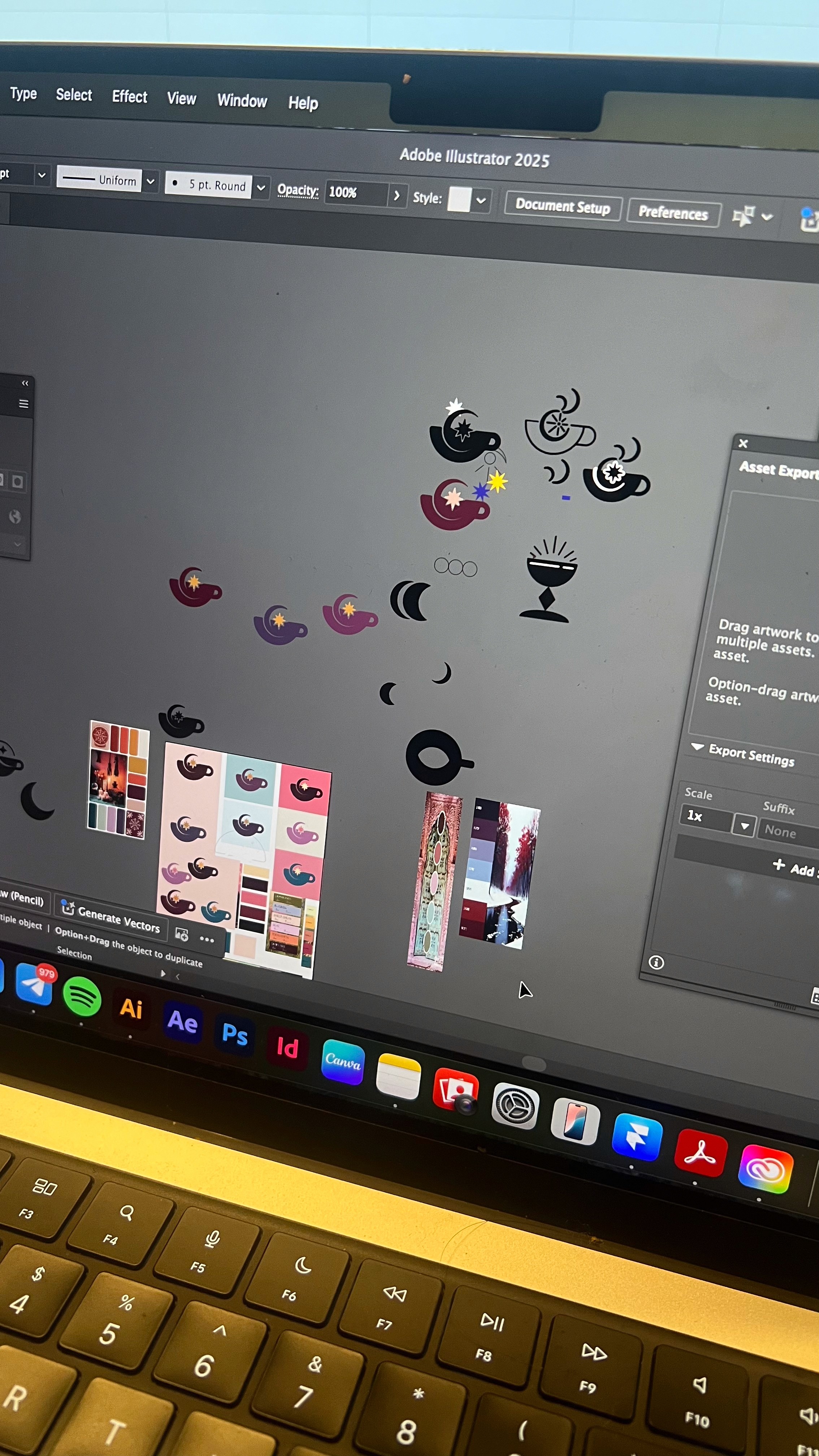
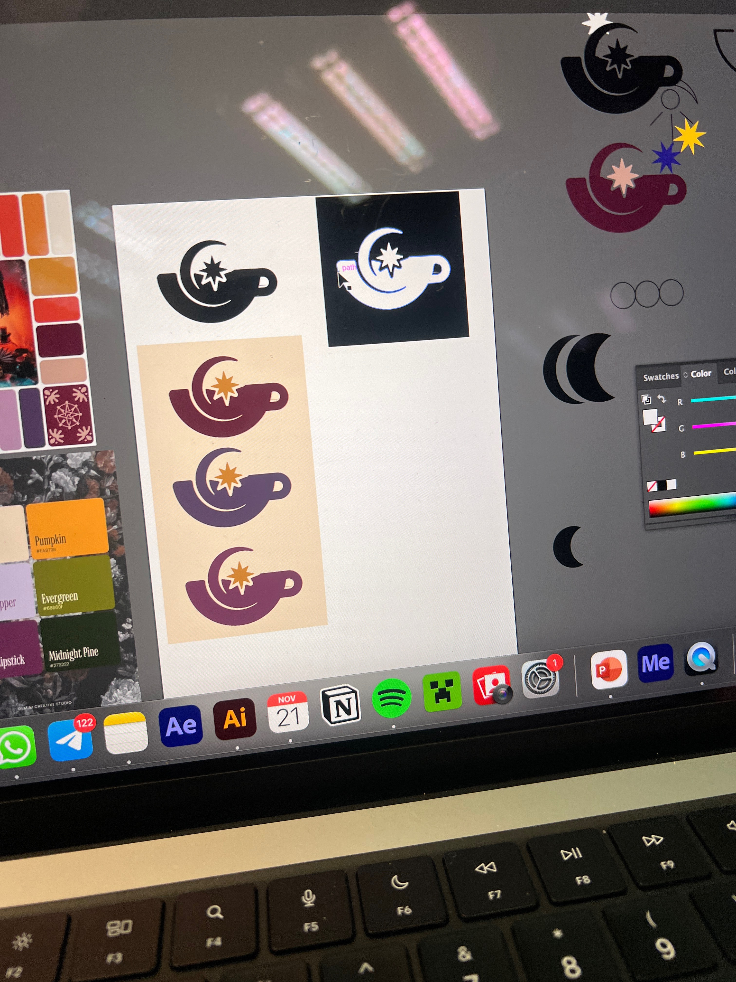
tons of logo work! + tarot card making
One of the trickiest parts was the logo process. Some of my early designs got the same feedback: that it reminded them too much of Deepavali — which I get! I had to simplify it more than I expected and let go of some ideas I was attached to.
Another challenge was the sheer amount of documentation. The guideline required so many sections, and managing time between building visuals, creating mockups, and writing everything clearly got overwhelming fast. There were definitely some late nights, especially in the last stretch. It was also upsetting that I didn't get nearly enough time to fully illustrate all of my Trinity-themed tarot cards.
What helped was breaking things down and tackling one section at a time — and reminding myself that progress over perfection is what would carry the brand through.
the takeaways
what i learned; and what i plan to do differently.
my creative process journal (for a deeper insight into this project!)
This project showed me just how much thought and care goes into building a proper brand system. From color ratios to symbol alignment, every detail had to support the same story. I learned that brand guidelines aren’t just about rules — they’re about helping other people tell your story the right way.
If I were to do this again, I’d experiment more with different brand tones (maybe something bold or quirky), and I’d give myself more time to refine copy and mockups without the last-minute rush.
Still, I’m really proud of how Arcana turned out. It feels like a brand I’d want to see in the real world — warm, dreamy, and just a little bit magical.