fathers of constructivism — a brochure
the process.
the idea
what i set out to create.
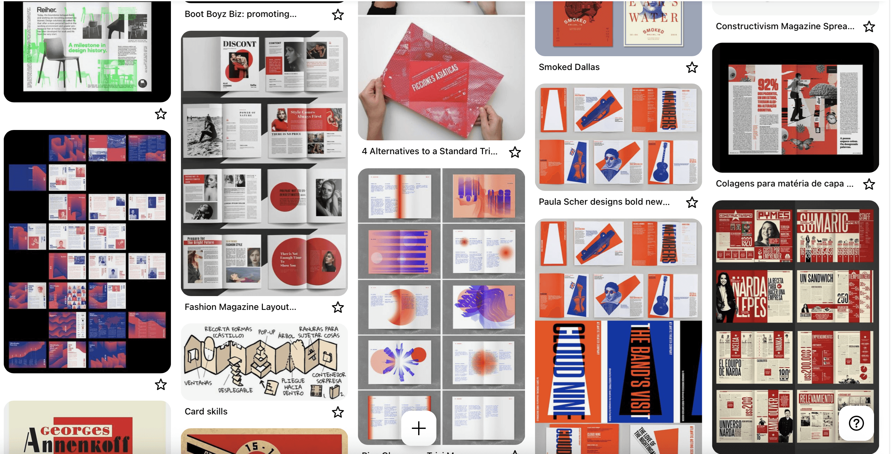
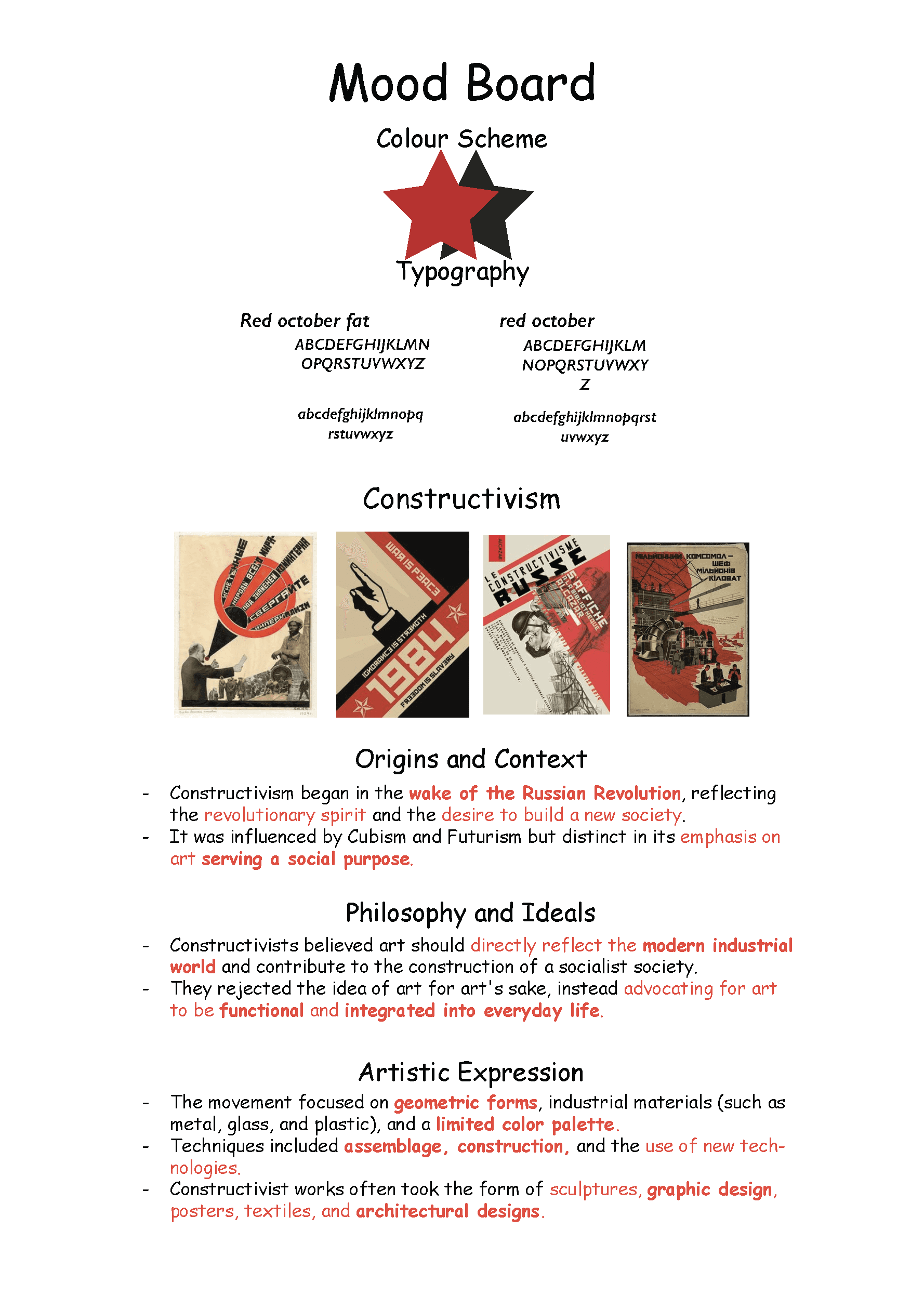
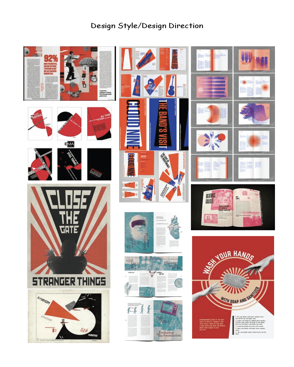
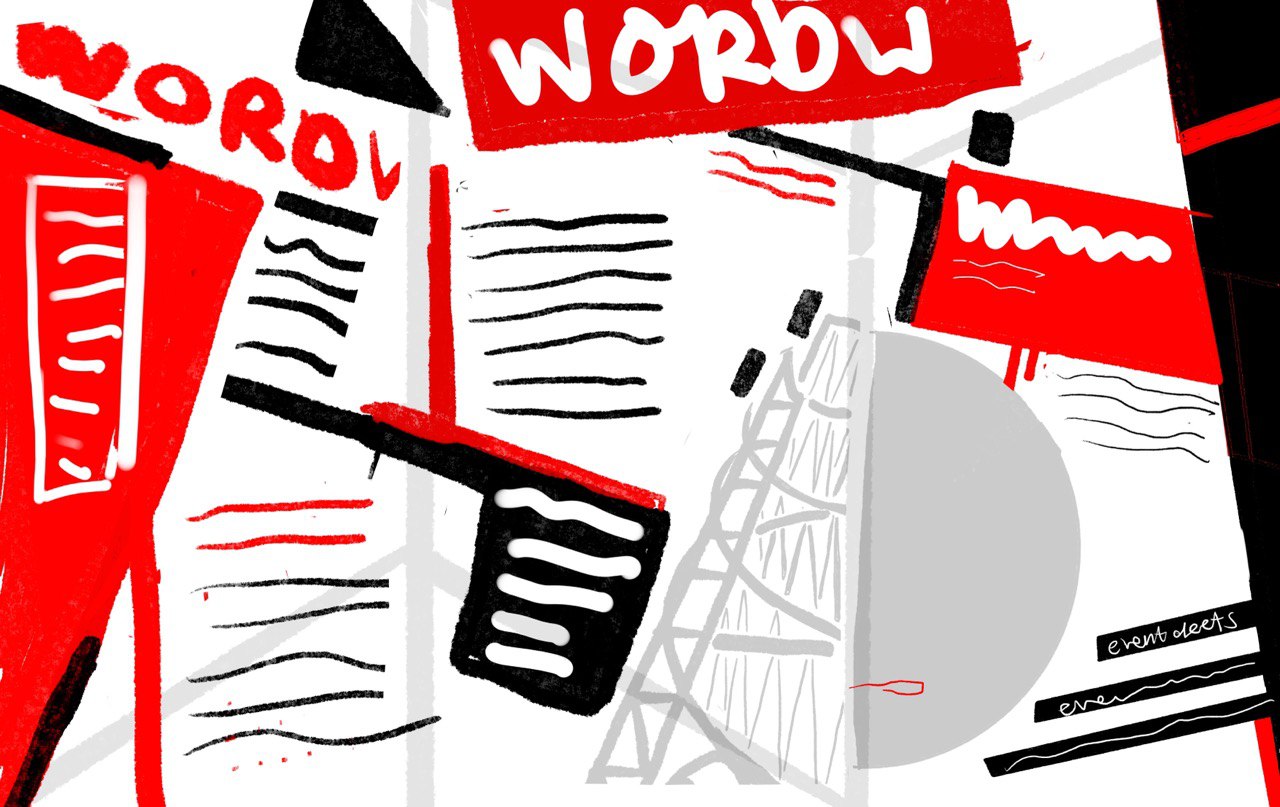
moodboard
I knew I wanted to do something bold — and Constructivism immediately felt like the perfect match. It’s sharp, dramatic, filled with energy, and honestly, super underrated.
I decided to center the exhibition around two major figures: Tatlin and Rodchenko, and call it:
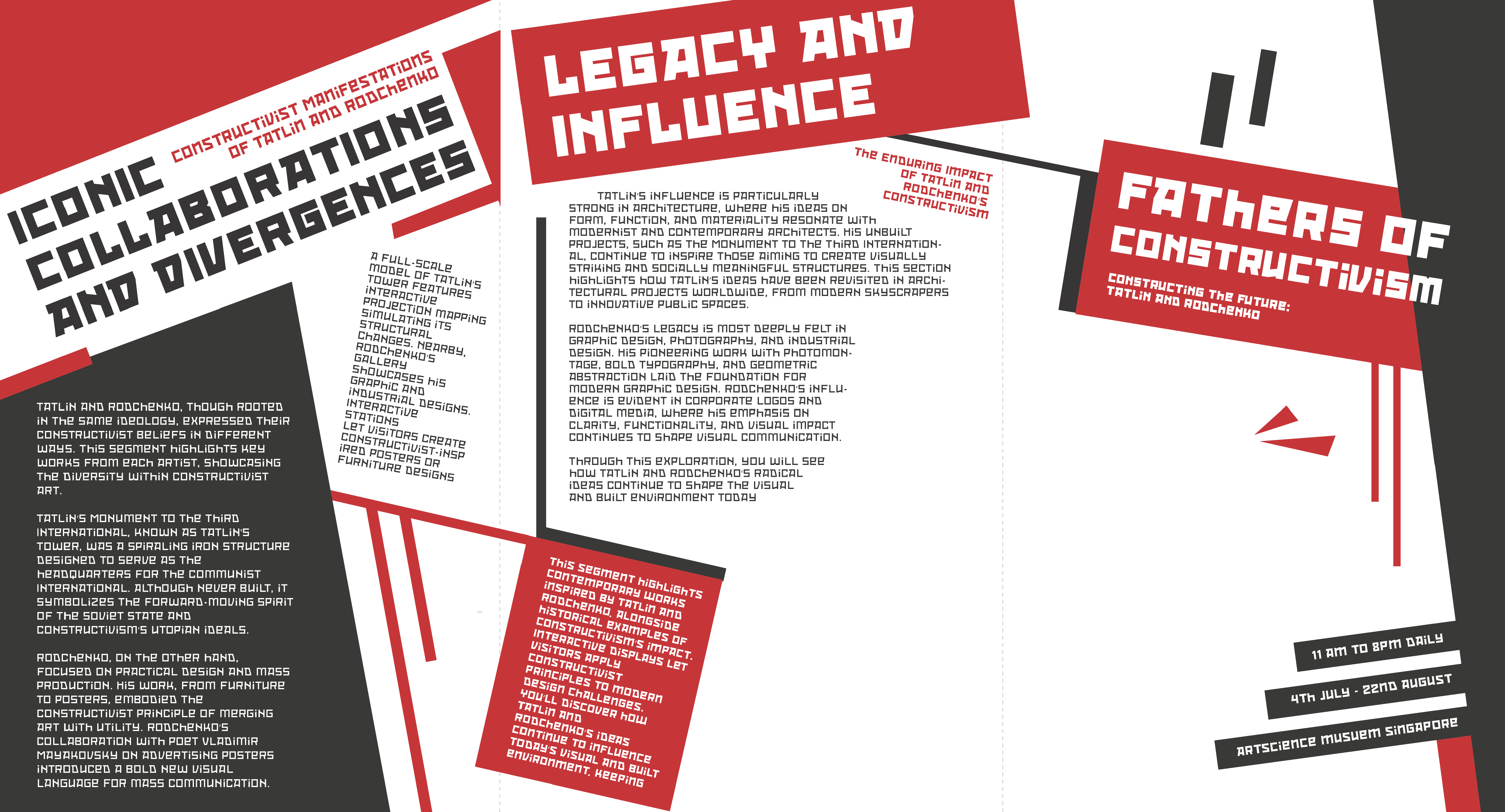
“Fathers of Constructivism: Constructing the Future.”
My idea was to create a brochure that felt like an actual part of the exhibition — not just a takeaway, but something that visually echoed the era and movement it represented. I started thinking about how I could include dramatic folds, stark geometry, and even die cuts — something that looked structured but still full of motion.
the process
from brainstorms to building blocks.
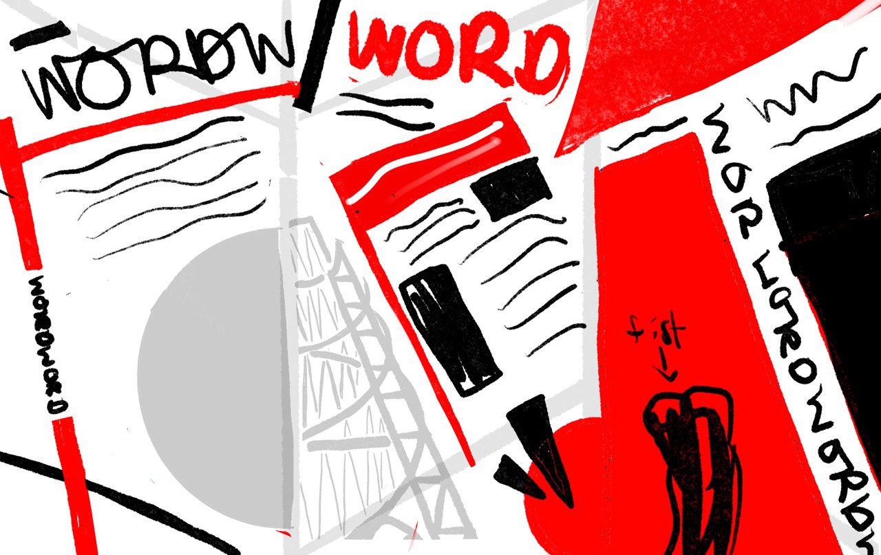
sketches of the layout — front and back — on my ipad
The process for this brochure was a mix of impulsive sketching, strategic problem-solving, and lots of folding experiments that I probably looked a little too excited about. I didn’t want this to be just another flat brochure — I wanted it to feel like something that belonged in a Constructivist exhibition. Something sculptural, structured, and unapologetically bold.
I started off by researching the core values of Constructivism — function over decoration, design with a purpose, bold geometry, and a belief that art should serve the people. That immediately gave me the direction to strip back any unnecessary visual fluff. Everything had to serve a role: whether it was to guide the reader, evoke the movement’s spirit, or physically interact with the viewer through the fold.
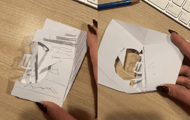
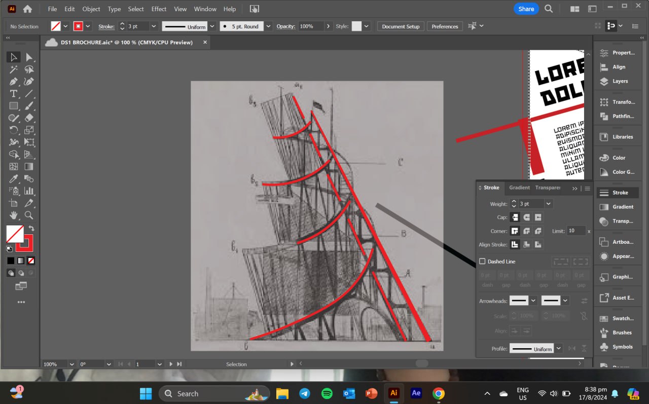
From there, I dove into early form testing. I used scrap paper at work to fold, cut, and test out layouts until I landed on a structure that felt balanced but dynamic. I didn’t want it to be too complicated — the goal was something visually interesting but still realistic to reproduce. That’s when the die-cut idea emerged: a functional cutout that not only felt Constructivist in form, but also allowed the brochure to unfold with a sense of rhythm and reveal.
I also started building a moodboard — collecting Constructivist posters, old Soviet propaganda, and works by Tatlin and Rodchenko. This helped me map out the kind of colour palette and composition rules I’d need to stick to. I noticed the heavy use of diagonals, repetition, and layered hierarchy — all things I later incorporated into my layout.
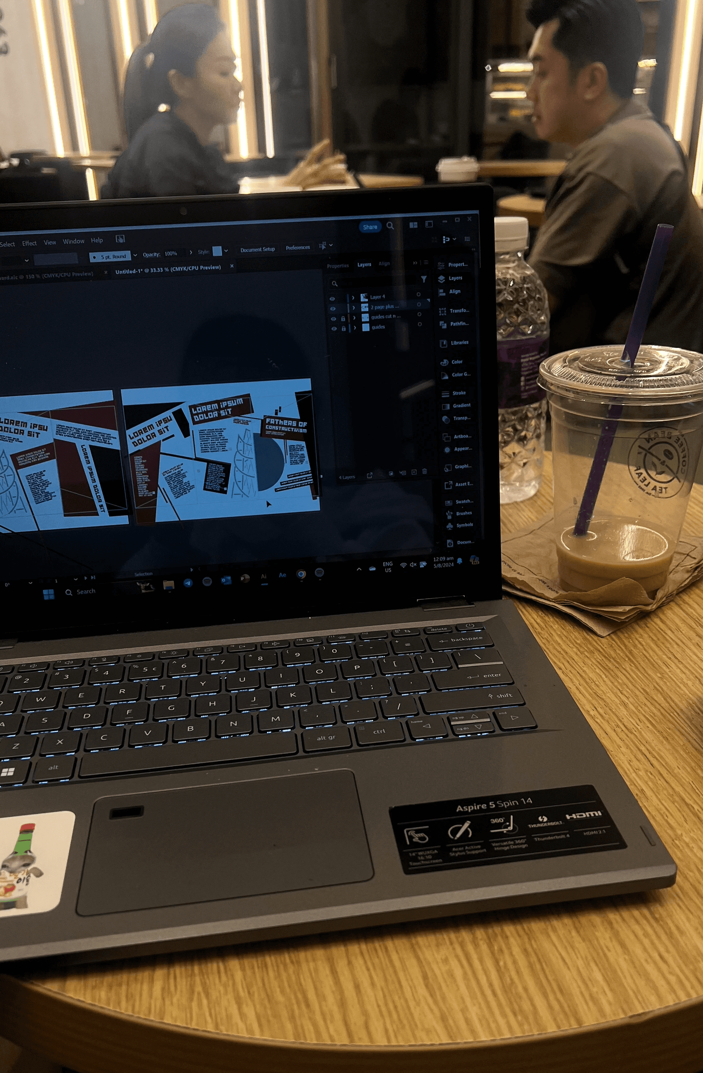
While I was working out the visuals, I sketched everything out on my iPad — especially the content structure and type flow. This helped me visualise how the cutouts would reveal content, how much space I actually had on each panel, and where I could afford to push the grid. Once I was happy with the layout logic, I brought everything into Illustrator and started refining — locking in the grid, defining text styles, and testing how each panel would “breathe” once printed and folded.
This process wasn’t just about making something that looked cool. It was about building a brochure that felt like a mini experience, where each fold, shape, and colour choice played a part in telling the story of Constructivism — not just explaining it.
the making
bringing it all to life.
the final illustrator print
Once the structure and concept were in place, it was time to bring the actual brochure to life — and honestly, this part was just as much about problem-solving as it was about designing. I didn’t want this to just look like Constructivism — it needed to feel like it was built with the same intention and purpose the movement stood for: functional, accessible, and impactful through simplicity.
Layout & Format:
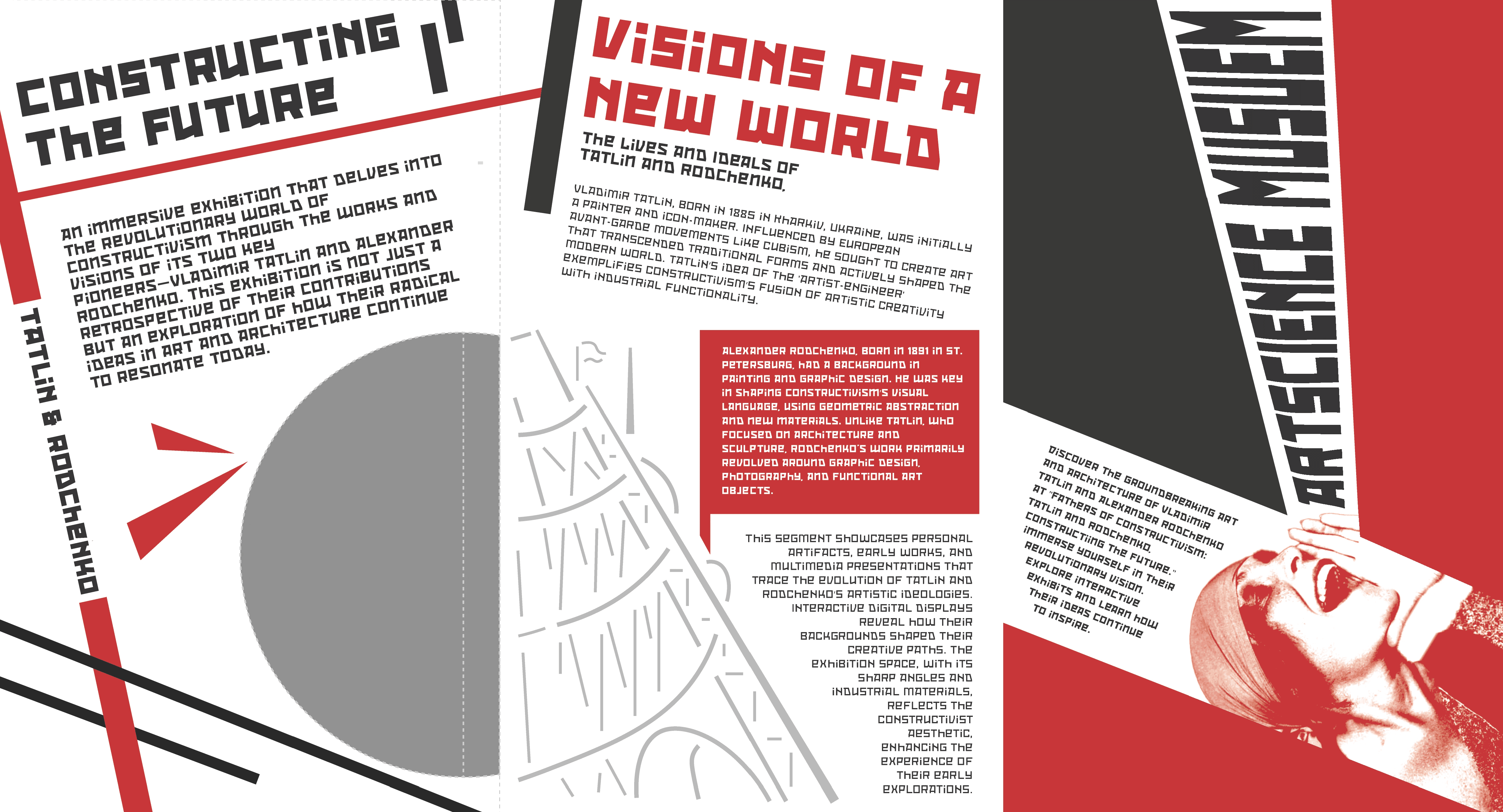
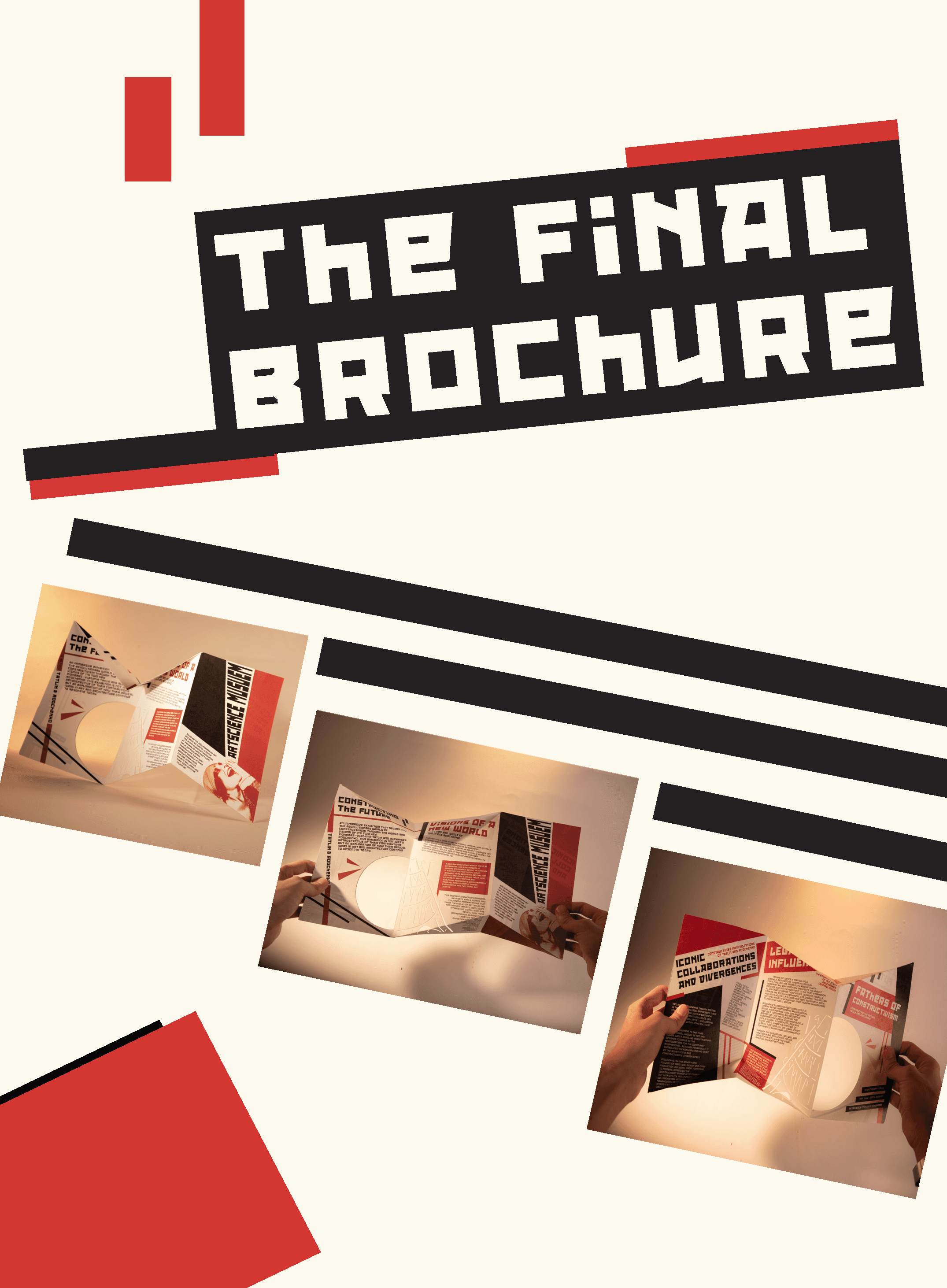
I finalised the fold structure into a clean, angular tri-fold with strategically placed die-cuts. One was a circle, chosen as a geometric contrast to the sharp folds, and the other was the outline of Tatlin’s Tower, acting as both a visual focal point and a nod to one of Constructivism’s most iconic unrealised designs.
Even though it looks sculptural, I intentionally kept the layout simple enough for mass production. The cuts are precise but repeatable, and the folds are straightforward — meaning it could be realistically printed and assembled in bulk without becoming overly expensive or delicate. I didn’t want the brochure to be a one-off art piece. I wanted it to feel like it could be distributed at the front door of a real exhibition — something that’s both expressive and practical.
Colour & Typography:
Sticking to a strict duotone palette of black and red was a core part of staying true to the Constructivist aesthetic. But instead of printing on bright white, I chose Maple White stock, which had a warmer, slightly aged tint. It toned down the harshness and gave the entire piece a more tactile, vintage quality.
For type, I went with Red October — a heavy, condensed typeface that matched the graphic intensity of the movement. It wasn’t just chosen for vibes either — its bold forms stood up well to the layering, folds, and die-cuts, holding visual weight even in small, tricky spaces. The layout used modular alignment and repetition, echoing Constructivist poster design with blocky text groupings, angular captions, and slanted headers.
Production & Assembly:
The real test came during printing. I did several mockups using A4 and A3 test runs, mainly to get a sense of how the folds would behave and how the die-cuts would line up when the piece was closed or opened. I tested different paper weights — 140gsm was too soft and wrinkled easily, 250gsm couldn’t fold smoothly, and eventually I settled on 170gsm as the perfect balance between structure and flexibility.
The final version was entirely hand-assembled. I cut each piece with a pen knife, folded them one by one, and aligned the layers to make sure the die-cuts landed exactly where they should. It was repetitive, sure — but also satisfying to see it all come together physically. There’s something really rewarding about taking a digital layout and turning it into a tangible object.
This wasn’t just about making a brochure that looked like Constructivism — it was about designing something that embodied it: bold, honest, and built to do its job well.
the outcome
what i managed to deliver.


high quality photos i took of my brochure!
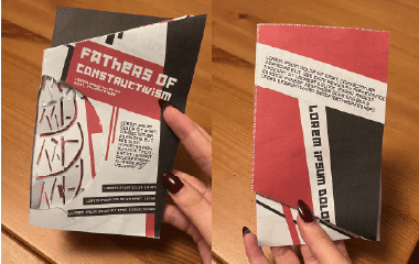
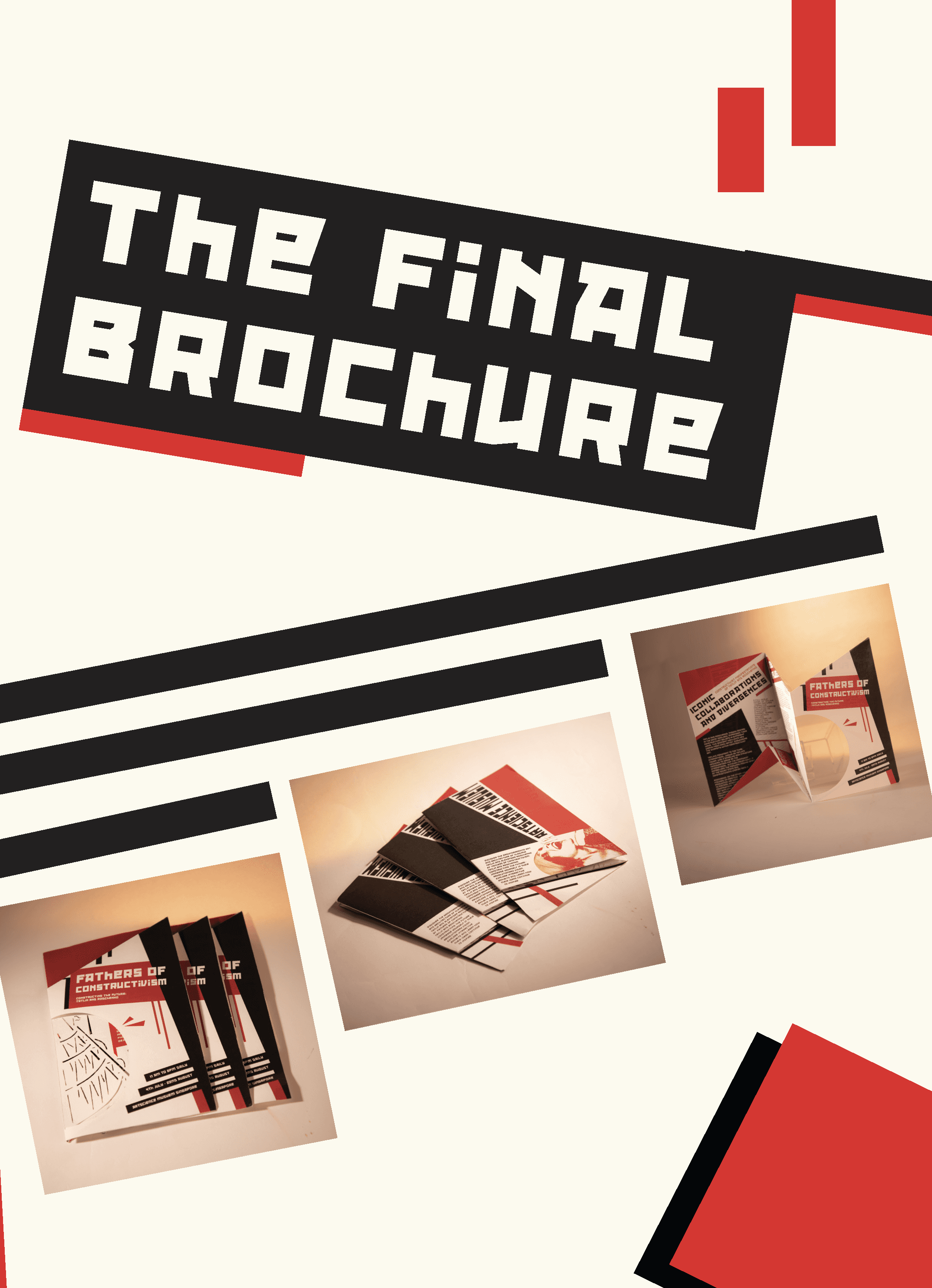
In the end, I created a fully printed, foldable, die-cut brochure that could sit alongside an actual gallery show.
Highlights include:
A front cover with custom die-cuts and layered depth
Three clear sections: intro, artist breakdown, and modern impact
Full Constructivist-inspired composition with rhythm, angles, and visual hierarchy
Inclusion of Rodchenko’s iconic "Books" poster image, added at the last moment to bring the piece to life
The brochure’s look and feel reflect the very essence of Constructivism — from the bold palette to the layered storytelling in its folds.
the troubles
what almost ruined it — and how i pushed through.
the struggles of the tower + my cutting process / lining up of pages
One of the biggest challenges was definitely getting the fold and die-cut to work together. What seemed like a cool idea at first quickly turned into a layout puzzle — making sure the text still flowed properly and didn’t get awkwardly sliced or hidden took a lot of trial and error. I also found myself going back and forth between paper options more times than I care to admit. Every print run revealed something new: one weight was too flimsy, another too stiff, and I spent a ridiculous amount of time standing at the print shop debating GSMs with myself.
Then came the wall of text problem. I didn’t fully realise how much content I had until I was already deep into layout — and trying to fit around 1,500 words into a design that still felt breathable and balanced was, frankly, a struggle. I kept editing, reflowing, and nudging elements just to make it all fit without overwhelming the visuals. As a last-minute instinct, I added Rodchenko’s iconic shouting woman poster into one of the panels. At first, I wasn’t sure if it would clash or feel too on-the-nose, but it ended up pulling everything together — adding that final bit of Constructivist energy the whole thing needed.
the takeaways
what i learned; and what i plan to do differently.
my creative process journal (for a deeper insight into this project!)
This one taught me that even the smallest design decisions — like a paper tone or fold direction — can totally change the experience of a piece. It also reminded me that print isn’t dead — when done right, it can still surprise and engage in ways a screen can’t.
If I could do it again, I’d leave more buffer for text fitting and fold tests. But overall? Super proud of how sculptural and true-to-movement this turned out. It feels like a little piece of Constructivism you can hold in your hands.